Important: the article appeared 10 years ago (the date above is not the date of writing, but the date of the last edition). The article is terribly outdated and we do not remove it at all because, for some unknown reason, no one has written better and newer in Russian over the years.
Usability testing has appeared in highly bureaucratic areas - in the military industry and in the area of risky civilian production (aircraft, power plants, etc.). As a consequence, usability testing itself was extremely bureaucratic - not just finding a problem, but more importantly, proving that the problem really exists. In addition, usability testing inherited the techniques and rules of scientific research, in which it is not only important to detect a phenomenon, but also to make sure that it is not the result of extraneous circumstances. Due to the forced complication of the testing process, entire teams of narrow specialists were engaged in testing: one writes test tasks, the other actually tests, the third analyzes the data, and another one drags and pulls the respondents.
It is easy to understand what testing is, for all its merits, it is very time consuming and unacceptably expensive.
In recent years, the situation has begun to change: instead of extremely formal and extremely expensive tests, informal and cheap tests are becoming popular. Instead of a small crowd with a bunch of expensive equipment, a single person with a minimum of things comes to the fore. The quintessence of this approach is described in the book Web Design: Steve Krug's Book or Don't Make Me Think! .
Of course, simple tests are not universal. For the dashboard of an airplane, they probably won't fit. But for ordinary software, simple tests are much better, if only because more of them can be done.
Here you will learn how to conduct usability testing, using just rapid testing techniques. More complex and more formal methods can be found in specialized literature or you can invent yourself.
What is usability testing
Usability testing is any experiment aimed at measuring the quality of an interface or looking for specific problems in it.
The benefits of usability testing are many. Testing allows:
- Understand how badly or well the interface is performing, which may either motivate you to improve it, or, if it is already good enough, calm down; in any case, benefit is achieved.
- Compare the quality of the old and new interfaces and thereby justify changes or implementations.
- Find and identify problematic fragments of the interface, and, with a sufficient sample size, also evaluate their frequency.
At the same time, usability testing cannot turn a bad product into a good one; it just makes the product better.
The first testing of large systems always shows that the interface works much worse than its owner or creator thinks, and much better than the tester initially believes.
Why on the cheap
Three approaches can dramatically reduce the labor intensity, and hence the cost of usability testing:
- Some simplification of the concept of usability.
- Refusal to collect quantitative data.
- Reducing the cost of equipment and reducing the payment for the time of respondents.
The third approach is to use only mobile laboratories, which is detailed in the section . The remaining two approaches are described below.
Efficiency and efficiency
In the main and most commonly used interpretation (ISO 9241-11 standard), the concept of usability is defined as
The extent to which a product can be used by specified users to achieve specified goals with effectiveness, efficiency and satisfaction in a specified context of use.
My translation of this wording into Russian:
The degree of efficiency*, effort** and satisfaction with which a product can be used by certain users in a certain context of use to achieve certain goals.
* For example, the speed of work or the number of human errors and the duration of their correction.
** For example, the number of operations that need to be performed to achieve a result or the amount of information that needs to be processed to make a decision. Term efficiency still often translated into Russian as productivity; in my opinion, this is a gross mistake, since in the original ISO 9241-11 standard under efficiency something close to the concept of efficiency is understood.
The main performance indicators are user speed, learning speed and the number of human errors (for a more detailed list of metrics, see the section). These are the necessary indicators, as well as influencing the design. What's nice is that measuring them is not particularly problematic.
With indicators of labor intensity, everything is somewhat more complicated. This group includes:
- Success, i.e. the ratio of completed test tasks to those not completed or completed completely incorrectly.
- Power, i.e. the ratio of tasks from the user's activity to the tasks for which this product is intended.
- Load on the user (both mental load and, for example, the number of user actions per test task).
There are two problems here. Power is not a measurable indicator at all (more or less power of a product is entirely a matter of design). The load on the user is either hard to measure or irrelevant, since it still manifests itself in performance indicators - with an intense load, the speed of work decreases. Thus, from all indicators of labor intensity in practice, only success remains.
There is nothing seditious in this simplification. In real testing, anyway, the entire set of indicators is never collected - after all, only some of them are important for each specific system. However, the principal consequence of this simplification of the wording - a significant simplification of the usability testing methodology - cannot be achieved in any other way.
The degree of efficiency, success and satisfaction with which a product can be used by specific users in a specific context of use to achieve specific goals.
No quantity!
The second possibility to reduce the labor intensity of usability testing is to stop collecting most of the quantitative data. This is done for two reasons:
- Each specific test can be aimed either at obtaining quantitative data or qualitative data. Qualitative data, as a rule, is more in demand in the design, so it is better to plan the test based on it.
- Quantitative data is still unreliable. They can be measured reliably, but the matter is extremely laborious.
Quality or Quantity?
Usability testing can be focused either on obtaining quantitative data (needed to measure the usability of an interface) or on obtaining qualitative data (necessary in order to understand what exactly is bad and how to fix it). As a rule, it is impossible to achieve both goals in a single test.
Suppose we measure the speed of work with the system. In this case, the test should be planned in such a way as to exclude any user slowdowns that are unusual for real work. For example, when a user makes a mistake, it will not be possible to ask him any questions to find out the reasons for this error. On the other hand, if you focus on qualitative data, all quantitative results will be questionable.
In fact, quantitative data is generally a luxury of usability, since it is more pleasant than it is really needed. Need more dynamics, i.e. the degree of change in these data, which greatly simplifies life. No matter how accurately the errors are calculated - if before and after the interface optimization they were calculated in the same way, the dynamics seem to be correct. For example, if the number of human errors was halved in counting, you can expect (just don’t ask me to substantiate this judgment) that they actually halved, although it is impossible to say exactly how many there were and how many there were in reality.
Unreliable numbers
In addition, the question of whether to trust the results of usability testing at all deserves consideration. After all, testing is not magic, so assuming that testing can be bad, one must conclude that testing can also be bad.
The answer to this question is simple and sad - there is no reason to believe in the results of usability testing at all.
Indeed, despite the fact that in usability testing we have absolutely real data as input, our inevitable voluntarism does not allow us to fully trust them. We have too many potential sources of errors:
- Actual users may differ from our selected respondents. In a small sample, even a slight fluctuation in the behavior of respondents can lead a usability specialist to false conclusions.
- Test tasks may not adequately reflect the real activities of users in the system.
- A usability specialist may miss parts of the problems or misunderstand the essence of the problems noticed.
Rolf Molich regularly benchmarks usability testing itself. The results are shocking. So, in the second test, in which nine groups of usability specialists of various levels tested the HotMail service, the scatter of results was very large, even though the test items were identical. All groups found a total of 310 interface issues. But three-quarters of the problems were found by only one group and not found by the rest of the groups (these percentages include twenty-nine really serious problems).
In general, usability testing may be scientific research, to which all the requirements for scientific research in general are fully applicable.
For example, let's compare usability testing with sociological research. The sociologist takes special measures, I note - "complicated and labor-intensive" - to ensure the correctness of the choice of respondents. We - no. The sociologist uses proven, statistically correct tools, both in collecting data and in analyzing them. We - no.
So whenever we try to measure something accurately, we are wrong. When we don't even try to be accurate, we are also wrong, maybe not so much, because the bar is already set almost to the floor.
What does this mean specifically? As a rule, we cannot say with certainty, for example, that we have removed all the causes of human errors from the interface. Simply because with other, perhaps more correctly matched, respondents, we would - again perhaps - - find more errors. The same consideration is true for other interface quality indicators, and even more so for other test items. And what would happen if the testing was planned and conducted by someone more experienced than us! And it's scary to imagine.
Thus, we must measure ergonomics only to compare with the new interface, while recognizing that our measurements are in no way correct. They are needed only for planning the next optimizations. We can only say one thing with certainty - no matter how much we test, there is always room for improvement. As a reserve for improving the interface itself, as well as our testing methods.
Why do we need numbers anyway?
Having scolded quantitative data as uninteresting and unreliable, I cannot but point out their true purpose. Quantitative data is absolutely essential in comparative usability testing. If there are several solutions to choose from - there is simply no alternative to quantitative data, it is imperative to collect them and take all possible measures to ensure their reliability (especially since comparative usability testing does not need qualitative data at all). However, comparative testing - rarity, respectively, this topic is not considered here at all. If you need to do benchmarking, please contact .
What exactly to measure?
The number of indicators measured in a particular test can be quite large, but all of them, as a rule, come down to a set of five basic characteristics. Below is a list of these characteristics with examples of metrics based on them.
- User speed. Metrics: the duration of the operation; time spent on error detection; time spent correcting errors; the number of commands executed during the operation (it is understood that the more commands, the longer it takes to issue them); the duration of the search for information in the documentation; the number of commands that are more efficient than those used by the user; decrease in performance during prolonged operation.
- Mistakes. Metrics: percentage of operations that caused an error; the average number of errors per operation for experienced users (precisely for experienced users, because for inexperienced factors from the learning rate group can also act); the number of bugs not detected and not corrected by users.
- Learning how to work with the system. Metrics: number and frequency of references to the help system; the duration of the period between the start of using the system and the point at which the speed of work / the number of user errors stops increasing; the difference in the number of errors / speed of work for users with experience in using the system and without such experience.
- Subjective user satisfaction. The measurement of this characteristic is associated with certain difficulties that deserve separate consideration. See the metrics for this property below.
- Preservation of skills in working with the system. Metrics: difference in speed/error rate between a user after an hour of using the system and the same user at the start of using the system after a long break.
As you can see, measuring the quality of an interface can be quite difficult, for example, a skill retention test can take more than a month. But these are only tests for the second and third components of usability, namely efficiency and satisfaction. In addition to them, there is also success, which is more important and much easier to measure - you just need to calculate what percentage of tasks the user either completes completely incorrectly or cannot complete at all. This greatly simplifies the life of a usability specialist.
How deep is the satisfaction?
Unlike other characteristics, satisfaction is not in the real world, but in the user's head. As a result, it is impossible to “feel” it, and therefore objectively measure it. But at least it can be measured indirectly.
There are two possible courses of action. First, the respondent can be asked how satisfactory the interface seems to him. Secondly, by the behavior of the respondent it is possible to determine whether he likes or dislikes the interface at any particular moment in time; by counting the number of reactions shown, satisfaction can be assessed. Of course, these estimates are relative; their value is only shown in comparison with the new interface or in comparison with competitors.
The following are some methods for measuring satisfaction.
Questionnaire
If you try to determine satisfaction through a survey of respondents, you can not do without formal questionnaires. Indeed, if the survey format is not fixed, there can be no certainty that the respondents are asked the same question, which means that the answers become doubtful.
Unfortunately, questioning has a major drawback in Russian conditions - reliable questionnaires simply do not exist. Despite the fact that many fully functional questionnaires have been created in the countries of the decaying West (SUMI, QUIS, MUMMS, IsoMetrics, etc.), none of them has been translated into Russian and has not been tested again. As a result, these questionnaires, while, by the way, very expensive, are not more reliable than any questionnaires that you can come up with on your own.
Unfortunately, the development and testing of reliable questionnaires is a very long and laborious process, so one cannot count on the rapid appearance of high-quality domestic questionnaires.
Below are two workable, albeit unreliable, questionnaires.
Questionnaire by words
This questionnaire was first proposed by researchers at the Microsoft Usability Laboratory as a way to very quickly, albeit notoriously unreliable, measure satisfaction. The questionnaire is very simple. The respondent is presented with a sheet of paper with a set of randomly selected adjectives, one half of which is rather positive, the other half is negative. The respondent is asked to underline the words that, in his opinion, are applicable to the product (the similarity of the questionnaire with the questionnaires used in the semantic differential method is not significant - these are completely different methods). After the questionnaire is completed, the difference between the number of negative and positive terms is calculated.
I use the following set of adjectives:
Outdated - Effective - Fuzzy - Uncomfortable - Zamuorous - Dull - Bright - Clean - Straight - Clear - Inconsistent - Unforgettable - Attractive - Standard - Managed - Good - Intuitive - Cheerful - Amateur - Ineffective - Dangerous - Boring - Joyful - Safe - Hard - Irritating - Triangular - Unpleasant - Comfortable - Cool - Smart - Useless - Haltural - Warm - Light - Consistent - Mysterious - High-quality - Interesting - Unreliable - Flexible - Beautiful - Ugratous - Unattractive - Useful - Stupid - Convenient - Comfortable - Clear - Unpredictable - Clear - heavy - modern - light - friendly - non-standard - bad - reliable - complex - simple - dark - professional - slow - round - sad - unfriendly - predictable - incomprehensible - fast - puzzle - sad - pleasant
Please note that the words are not randomly given mixed up, this is how they should be presented to the respondents.
Formal Questionnaire
Unlike the questionnaire by words, this questionnaire cannot be used without adaptation for a specific project. Some of her questions are sometimes irrelevant, sometimes in need of a change in wording. In any case, for female respondents, it is necessary to change the gender of the questionnaire wording.
The questionnaire consists of several questions, for each of which the respondent can choose one of five answers. Please note that I designed this questionnaire only as a post-test, its use in any other capacity is doubtful.
Questionnaire questions:
I made mistakes during the tasks No/Yes
The system is able to do everything I need and even more No/Yes The system is fast enough No/Yes
I like the look of the interface No/Yes
I feel that if I get to know the system better, I can do things in it that I don't even know about now No/Yes
The system can be easily customized to my needs No/Yes
Getting started was easy; I have not encountered significant difficulties No/Yes
Whenever I made a mistake, I easily noticed and corrected my mistake No/Yes
I am satisfied with my work speed No/Yes
I felt quite confident during the tasks No/Yes
At any given time, I knew what I had to do next No/Yes
The system seems useful to me, I would be happy to use it to solve my problems No / Yes
The results should be calculated according to the following algorithm: the central value gives zero points, the extreme values give either -2 points (left answer) or +2 points (right answer), intermediate values either -1 or +1 point, respectively. The score is the value being compared.
Watching emotional reactions
In addition to the survey, you can count the emotional reactions of the respondent. For example, the respondent smiled - put a plus, swore or grimaced - put a minus. The number and sign of reactions is the desired value of the indicator.
There are problems with this method as well.
First, it is not clear how to count reactions of different strengths. How many times does the respondent have to smile to balance eight seconds of cursing? And nine seconds of scolding?
Secondly, the same person should count the reactions of all respondents, since it is impossible for several people to synchronize their ideas about what, in fact, is included in the concept of an emotional reaction. As a result, the resource intensity of the test increases greatly.
Don't take this quiz if you're a little unsure about your ability to pick up other people's emotions (for example, if you're Em and not Jo).
The second problem is the uncertainty of the test. Only operational satisfaction, that is, pleasure, is observed, and perceived satisfaction, which is almost always more important, remains behind the scenes.
What you need for testing
Now that the fundamental issues have been sorted out in general, we can move on to practice. You should start with a list of what you need to collect in one place for usability testing (these items will be described in more detail below). So what do we need:
- respondents
- test method
- test scenarios
- workplace for the test and a well-established method of fixing the material
- tested test.
Respondents
When choosing respondents for testing, it is first convenient to determine the general requirements for respondents, and only then select respondents from the target audience, using the generated requirements.
Keep in mind that selecting respondents who are not in the target audience is much more dangerous than it seems at first glance. You will either identify non-existent problems, or you will not identify existing ones. In the worst case, you will simplify the interface so much that it will be difficult for even average users, who are in fact the majority, to use it.
General requirements for respondents
The first item is whether respondents need experience with the system. The general rule is that if the interface of an existing system is being optimized, half of the respondents should have work experience (they can identify relearning problems during implementation), and half should not (they determine the learning rate). If there are competing systems, another proportion is better: a third with experience with the previous version, another third with experience in using competing systems, the remaining third with no experience with the system.
The second point is the level of computer literacy. Other things being equal, the preferred choice is the real one, i.e. coinciding with the experience of the target audience, the level of three-quarters of the respondents and a low level - - for the remaining quarter (it can identify more problems).
The level of computer literacy is conveniently determined by the following scale:
- Tall. The respondent has a computer at work and at home, most of the work is done on the computer, the respondent uses the computer as a means of self-development, actively uses Internet services (for example, regularly buys goods and services in online stores).
- Above the average. The respondent has a computer at work and at home, most of the work is done on the computer, but the respondent does not use the computer to solve tasks that go beyond his main activity (works on the computer "from call to call" and no more).
- Middle. Computer use has been part of normal (work or personal) activities for two years or more.
- Short. Either at work or at home there is a computer, but the experience of working with a computer does not exceed two years and the computer is not a significant tool in the work.
- Very low. The experience of using a computer is sporadic, the duration does not exceed three years. The computer is not used either at work or at home.
In third place is age. Optimal proportion: three quarters of the respondents are of the age of the target audience of the system, the remaining quarter is older (more problems can be identified on it).
The gender of the respondents has less influence on the results, but this does not mean that it is not necessary to select respondents of the correct gender. It is worth increasing the number of women among respondents compared to the proportion in the target audience, since it is easier to identify problems during implementation on women (women, in general, learn more slowly, but, having learned, work better).
The last significant characteristic is the level of emotional openness of the respondents. The more constrained the respondent, the less he is able to tell you valuable. Even if you determine that there is a problem, you will not be able to get any information from him about what caused this problem. There is a great way to solve the problem of insufficient emotional openness - it is worth having a base of respondents and using them again. A respondent who already knows from experience that there is nothing wrong with usability testing is much more willing to make contact and is generally more talkative.
Finally, when the properties of users desired for the test have already been determined, it is time to select such respondents who not only meet the above requirements, but also belong to the target audience of the system.
How many respondents do you need
In 1992, Robert Virzi in Refining the test phase of usability evaluation: how many subjects is enough? assumed that five respondents were sufficient for the test. A year later, Jakob Nielsen and Thomas K. Landauer took over the baton with the article A mathematical model of the finding of usability problems, in which they argued that five respondents are enough to catch 70% of the problems and three more respondents are needed in order to bring the effectiveness to 85%.
The usability community loved these numbers with all their hearts. Since then, the phrase "5-8 respondents" has become almost a mantra. Alas, this mantra is false.
First, all three authors wrote only about testing small systems. What if the system is too large to fit the test on each respondent in an hour and a half (this is the maximum that a person, both respondent and experimenter, can endure; tests of 40 minutes are much better). In this case, you will have to perform several different tests on different respondents; without this, it will be simply impossible to cover the entire interface of the system. How many respondents will be needed in this case depends on the system, there can be no clear gradations here. So, to test a large corporate site, in a good way, you need twenty people in several series of 5 people.
Secondly, eight people - this is too little to talk about at least some accuracy in measuring ergonomic characteristics. You need at least twelve people to measure.
Thirdly, eight people cannot accommodate either gender, age, or any other diversity of respondents. If you want to test an interface designed for several distinct audience groups, each group should get its own five to eight respondents.
On the other hand, after all, the first few respondents make it possible to identify the lion's share of problems. Therefore, the only really possible way out is testing in series: the first series passes, the identified problems are solved, then the second series, the problems are solved again, and so on. If all types of respondents are used in the first series, the rest of the series can be safely interrupted when the amount of data to be identified drops significantly. The first series should be larger, the rest smaller.
Organizational matters
In addition to the actual requirements for respondents, the question remains: how to convince a potential respondent to participate in testing?
If you are designing an interface to order, try to shift the search for respondents to the customer. Almost always, the system has real or potential users with whom the customer has a special relationship and who - which is nice - particularly interested in the new interface, which is why they are very sociable.
If you are designing an interface for a system with a wide (normal) target audience, do not neglect your loved ones. They are both communicative and easily accessible.
Many recruiting companies are recruiting for focus groups, so they can recruit respondents for usability testing as well. Unfortunately, the focus group is a one-time, relatively short event. Usability testing will require scheduling interviews with respondents in turn, one person at a time, which makes the process very difficult.
Maintain a database of people you have already used for testing. As a rule, it is easier to negotiate with them than with those who do not have experience in participating in testing.
When arranging a meeting with the respondent, be as flexible and accommodating as possible. The respondent, even if his time is paid, is doing you a favor by agreeing to participate in testing.
If you found the respondent yourself, even if it is your friend or relative, he should be rewarded for the time he spent (you can do without remuneration if the respondents were provided by the customer of the interface, but if you used the services of recruitment services, the remuneration should be discussed with the representative of the service) . For a non-specific audience, the best incentive is money - the optimal amount of payment is twice the hourly rate of a particular respondent, taking into account the time that the respondent spent on the road. For a specific audience, very large amounts of rewards are often needed, in such conditions it is reasonable to reward respondents with valuable gifts, for which you can get a large wholesale discount (I personally prefer to use expensive alcohol).
Test Methods
There are only three main methods of usability testing: passive observation of the execution of test tasks, stream of consciousness and active intervention; the first one is for collecting quantitative data, the last one is for qualitative data:
- Passive monitoring of test tasks. The essence of the method is very simple: the respondent performs test tasks, his actions are analyzed (during the test or after, according to protocols), which allows both finding problematic fragments and measuring the ergonomic characteristics of the interface.
- Stream of consciousness (think aloud). Corresponds to a passive observation test, but the respondent is also asked to verbally comment on their actions. The comments are then analyzed. The method is rather unstable, but sometimes gives interesting results (very much depends on the talkativeness of the respondent). A major minus of the stream of consciousness - Measurements of the ergonomic characteristics of the interface is highly questionable.
- active intervention. In this method, the usability specialist does not expect favors from nature in the person of the respondent, but tries to take them himself. After each action of the respondent, the experimenter asks him why the respondent acts in this way; on each screen, the experimenter asks how exactly the respondent understands the purpose and functions of this screen. This method is closer to a focused interview than to actual testing - for example, the method can be used even without test items, as long as there is an interface for discussion. It is clear that with active intervention, no measurements are simply possible, but the amount of qualitative data obtained is the largest.
Test Scenarios
A test case - is the testable aspect of the system. In my opinion, adequately selected test scenarios are the most important prerequisite for quality testing.
Scenarios consist of a custom task and its companions:
- significant ergonomic metrics
- test tasks for respondents (there may be several tasks)
- signs of successful completion of the task.
Let's analyze them in detail.
Custom task
The first step in defining scenarios is to identify meaningful user tasks. These tasks are the source material for scripting.
What is a custom task? This is the task that their activity poses to users, and which has an independent value for users. A custom task is executed as one or more operations (a custom operation has no independent value). For example, for a mail client program, the tasks are:
- writing and sending a letter
- receiving messages from the server
- customizing the program to suit your needs (for example, setting up automatic mail reception at specified intervals).
But choosing an addressee from the address book when writing a new letter is no longer a task, because this action is not valuable in itself. This is an operation consisting of many actions (click on the To... button > select a contact > confirm the selection).
When choosing tasks for testing, two considerations should be taken into account:
- All tasks must be realistic, i.e. revealed from the actual activities of users: the desire to make tasks more difficult to find many problems at once, it is inconsistent - tasks should be ordinary, since there is no point in looking for problems that no one is facing.
- Since it is only ideally possible to test the entire interface on all user tasks, you have to limit yourself and select only important tasks. Important problems are, firstly, frequency problems, i.e. which are performed by all users and/or are performed frequently, secondly, all other tasks that you suspect are performed poorly in the system, and finally, tasks whose incorrect execution leads to major problems.
Significant ergonomic task metrics
For each task, you need to choose the characteristics of the interface that are significant for it. Of course, we have metrics at our disposal from the section “What exactly to measure”. However, these metrics are inconvenient: they are difficult to measure and difficult to understand (though they are easier to compare). From a practical point of view, more mundane characteristics are much more convenient.
For example, you can count the number of human errors. But the influence of this metric on the integral result is so complex that all the same, the analysis cannot do without elements of voluntarism and subjectivism. It is much easier to determine the impact of the same errors immediately, even before the test, for example, by setting a significant interface characteristic "The user is able to install the program in less than five minutes, while making no more than two minor errors" (where a minor error means an error that he himself user noticed and corrected). Of course, there is a lot of arbitrariness in such a requirement. But it is still less than in dubious speculation about the number of identified human errors. Thus, "mundane" metrics are more convenient than universal metrics.
In addition, simple declarative metrics are also convenient because they allow you to understand when you need to continue optimizing the interface, and when you can stop. Returning to the example from the previous paragraph, we can say that we need to optimize the interface until the installation takes less than five minutes. If, after optimizing the interface, the program installs in six minutes, this is a reason to modify the interface again and test it again.
Here are examples of such metrics:
- Success - respondents correctly perform 90% of tasks.
- Efficiency - speed of the user experience: registration on the site is completed in less than 7 minutes.
- Efficiency - errors: when entering 10 forms, the number of input errors does not exceed two.
- Efficiency - ability to learn how to work with the system: when performing task 9, which differs from task 2 only in the input data, the respondents do not make a single mistake (except for typos).
- Satisfaction - according to the results of the survey, the number of points increased by 20% compared with the previous results.
Test tasks
A test task is what the respondent receives from you, a task that allows you to take the respondent through a fragment of the system interface and determine the characteristics of this fragment.
Test tasks, in addition to the fact that they must correspond to user tasks, must also have the following properties:
- Unambiguity. Tasks should be formulated in such a way as to exclude their misinterpretation by the respondent. If the respondent misunderstands the task, you will almost certainly not be able to put him on the right path without prompting him at the same time the sequence of the task.
- Completeness. The text of the task should contain all the information necessary to complete this task.
- brevity. If you are measuring the speed of tasks, the tasks should be short enough that the length of time respondents read the tasks does not affect the duration of the tasks themselves (people read at different speeds). If the task text is large in volume, you will have to manually cut off the reading duration for each task, which is very laborious.
- Lack of hints. According to the text of the task, it should not be clear how this task should be performed. For example, it is unacceptable to use the terminology of the system - instead of each term, you need to describe its meaning, otherwise the respondents will simply click the buttons with the same words and you will not identify any problems.
- The assignment must include task start point, i.e. the window or screen on which the respondent should be at the beginning should be written. If such information is not provided, the respondents will inevitably move on to other fragments of the interface, which means that the task will be performed differently by different respondents, which makes all statistical calculations meaningless. You need to fix the starting point of the task at the end of the previous task. If the task starts with a blank slate, at the end of the previous task it should say “return to the main screen”. If a task is to start where the previous task ended, the previous task must end with the words "when finished, do not close the current window/stay on this screen".
In addition to these general requirements, the following must also be taken into account:
- It is possible that several test tasks will need to be written for one user task. Typical case - The task is too big to fit into one task. Also, if a user task is a frequent one, you shouldn't care too much about how it gets done the first time - it's much more interesting to know how users will do it the second, third, fourth (and so on) times. In this case, within the test on one respondent, this task will need to be run several times, each time varying the tasks.
- In addition to tasks in which the respondent must perform some action, dual tasks are acceptable and desirable, in which the respondent must first decide whether he needs to perform this action at a given time. For example, if we are testing a disk defragmenter, instead of the "Defragment the computer disk" task, it is better to use the task "Check the degree of disk fragmentation and, if you find it necessary, defragment the computer disk." Such tasks should be designed in such a way that the respondent could not refuse to make a decision without looking, saying that, they say, everything is fine and defragmentation is not needed. Also, before such a test, it is reasonable to intentionally fragment the disk so that the respondent cannot avoid the task.
- Sometimes in the course of a task, you need to forcibly change the state of the system. For example, if you want to know how users solve a particular problem, you have to create that problem. It is unacceptable to interrupt the test for this, as this will distract the respondent. In such cases, another task can be inserted before the corresponding item, in which the respondent must create the problem on their own. Of course, such a task will not provide any information about the interface.
- Analysis of the results and summing up statistics are greatly simplified if you do not a small number of long tasks, but a large number of short tasks that require moving only a couple of screens or filling out one or two forms.
- The first task of the test should be an introductory one, designed solely to introduce the respondent into the process. Accordingly, it should be simple, and its results can be ignored.
Be sure to check that your scenarios can be completed by the respondents in the expected test time. Probably, the list of scenarios will have to be reduced.
Signs of successful completion of a task
The last component of the scenario is signs of successful completion of tasks. Here's the thing: not always the same task can be done in the only way. It is incorrect to run the test without knowing all these methods, since further analysis will turn out to be doubtful. Suppose Respondent A completed the task in A way, and Respondent B in B way. Both respondents coped with the task, but one is still better than the other. After all, different methods seem to have different efficiencies, for example, the number of actions included in method B is one and a half times higher than the number of actions of method A. Method A in this situation is preferable, in an ideal system (which you need to strive for) all users should only use it.
In addition, sometimes the correct test result from the point of view of the experimenter is not really correct, especially if the subject area is complex, and the usability specialist does not know it well enough. To make sure that the correct result is exactly what the usability specialist believes, he needs to find a system and domain specialist, and ask. Without knowing firmly all the ways to complete the task, you simply will not be able to identify the errors.
Workplace and ways of fixing data
There are two approaches to organizing a workplace for usability testing: a stationary workplace and a mobile one. Only recommendations pertaining to mobile workspaces are provided here, as mobile labs are themselves cheaper and allow for lower rewards for respondents (albeit at the cost of the usability specialist's time, who has to travel to the respondents himself).
So, what you need to have for full testing:
1. A laptop. The requirements for a laptop are simple. First, the most powerful processor possible for simultaneous screen recording (although even the weakest Intel Centrino processors allow you to record a video stream in the background, the interface under test will work faster on more powerful processors, and the video quality will be higher). Secondly, if you are going to record video with the respondent himself (see below), you will need a larger screen to fit both the tested interface and the window with the respondent's face.
2. Webcam if you are going to record facial expressions and gaze direction of the respondent. As a rule, the more expensive the camera, the better the image quality it gives. A camera with a laptop screen mount is desirable, as it is more convenient to use.
3. Microphone. Basically, anyone will do. Personally, I use a regular Genius microphone that costs seventy rubles. If your webcam has a built-in microphone, that's fine too. On the other hand, a better microphone gives better recording quality, so there will be less hiss (but it doesn't interfere with anything).
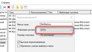
4. Screen recorder. The de facto standard is TechSmith Camtasia, but if funds permit, invest in TechSmith Morae, which is specifically designed for usability testing (it records not only the contents of the screen, but also logs user actions, which can greatly speed up subsequent analysis - On the other hand, Morae in four times more expensive than Camtasia, which is already expensive).
Before the first test, get to know your equipment as best as possible. Explore how best to position your camera and microphone for the best results. Learn the hot keys of the screen recording program, learn how to quickly launch it in any mode. Nothing undermines a respondent's confidence in testing more than the sight of a bustling experimenter trying to get the recording right at the last moment before a test.
5. If you are going to record the duration of tasks, it is useful to have sports stopwatch with the recording of circles (Laps), which allows you to remember a series of intervals. Otherwise, you will have to watch the videos again to calculate the duration of the tasks, which is very tedious.
6. Test tasks to present to the respondents. As a rule, the best option is to print out each task on a separate sheet so that the respondent cannot run ahead and read the tasks that he has not yet completed. On the first sheet you need to display introductory form. An example of such a form (in square brackets - variable data):
Dear [Respondent's name],
We invite you to complete a series of tasks designed to evaluate the simplicity and ease of use of [Name of the system]. Feel free to complete tasks. The purpose of the study is to evaluate the qualities of the studied interface, and not you personally. If you do something wrong, it will mean that the interface and only the interface needs improvement.
When performing tasks, you must act as you see fit. For example, if you choose to use Help, you can do so without asking the experimenter's permission.
Please note that your actions and words are recorded for further study, but all collected data will remain strictly confidential and will be available only to researchers.
Read the assignment carefully and follow the instructions in it exactly.
Try to complete each task to the end, but if during the task you realize that you cannot or do not want to complete it, inform the experimenter about this and move on to the next task.
Please turn the page with the task only when you complete the task on the open page.
If you do not understand any task, feel free to ask the tester again.
On the other hand, in some cases it is much more efficient to issue assignments to respondents not on paper, but in a way that is closer to reality. For example, when testing a POS interface, it's best to pretend to be a customer, and customers rarely state their needs in writing.
7. If you are going to survey users, you will need printed forms.
8. If you are going to be near the respondent and immediately fix any parameter, you will need tablet with paper and pen. It is convenient to pre-print several sheets with the name of the respondent and page numbers - if you are doing several tests in a row, this is guaranteed to avoid the torment of mixed up papers.
As you can see, not much is needed. The cost of the necessary equipment and software (not including a laptop, in the 21st century it is not a luxury) is no more than $450 in an economical version. The advantages of such a solution are reliability and ease of operation; in addition, mobility allows testing with the respondents themselves, which significantly increases their number (many potential respondents will not go to the office of a usability specialist under any circumstances).
Recording the facial expressions of the respondents
If you are going to analyze the results after the test (rather than during it), it will be extremely useful to make a video recording of the facial expressions and gestures of the respondents. Without a video with the respondent, you will have to analyze the movements of the cursor (accompanied, since the sound is also recorded, with hissing and screaming). With the recording, it will be possible to analyze the interaction of a person with the interface, since the prerequisites for gestalt will appear. An objectively insignificant difference in the method will come back to haunt an objectively significant improvement in the results.
The problem is that recording a video with the respondent himself is fraught with a certain difficulty - you need to automatically synchronize the face of the respondent and the recording of his actions.
Do not place the microphone near test printouts. Go deaf while watching the video.
In a stationary usability laboratory, this is achieved by hardware mixing the video from the camera with the video stream from the computer's video card. The major drawbacks of this solution are the high cost and low quality of the recorded screen image (the number of pixels on the screen is several times greater than what can be recorded on a tape recorder). In addition, such records are inconvenient to work with.
You can also synchronize the recording manually by recording streams from the camera and from the screen on the computer at the same time. But in this case, after each test, you will have to spend some time on the boring job of mixing two different video files.
Previously, only a dumb, albeit workable, solution was available (the new, better way is described below). Before testing:
- Turn off graphics acceleration in Windows (in Control panels select Screen, on the tab Parameters press the button Additionally, in the opened window on the tab Diagnostics move the slider Hardware acceleration to the left side). After the test, acceleration can be enabled again.
- Run any program that can display video coming from the camera. Such programs are attached to webcams, in addition, video chat programs are suitable.
- Set the window with the picture coming from the camera to the lower right edge of the screen (there it distracts the respondent least of all), and position the window of the system under test so that it does not obscure the pictures. The window with the video should be sealed with a piece of paper (thanks to Dmitry Satin for the idea).
- Ask the respondent not to resize the window of the system under test.
- Turn on all screen recording.
Due to this, during the test, the entire screen content is recorded, including both the actions of the respondent and his image from the camera.
Screen view when recording facial expressions in this way.
Addition: In the third version of TechSmith Camtasia Studio, a picture-in-picture mode (a stream from a video camera is inserted into the corner of the video with screen content) is introduced, so now everything has become much simpler.
The only problem with recording the respondent's facial expressions is that if you go to the responders yourself, no one can guarantee that there won't be some nasty stuff in the background of the video - respondents often like to meet usability specialists just in bedbugs.
Tested test
Finally, we need to validate the test itself. You need to make sure that:
- equipment is operational
- you know how to treat her like a young demigod
- all default settings are correct
- you have enough blank tapes or disk space
- all the necessary papers are printed and checked for relevance and errors
- test tasks contain all the necessary information and do not require additional explanations
- there are no hidden clues in test tasks
- you can quickly bring the system under test to its original state so that the next respondents do not see the changes made by the previous participants
- your idea of what constitutes proper task performance is true
- the test on one respondent can be conducted in a reasonable time (no more than one and a half hours).
As you can see, there are so many points in which blunders can be made that checking them in itself will become a source of errors (difficult tasks are difficult to complete without errors at all). Accordingly, a reliable verification method is needed. This method is testing the test itself, i.e. running the test on someone you don't feel sorry for and who is easy to catch (for example, a colleague). If the test run showed at least one error in test preparation, correct it and repeat the run again.
Note, however, that a test run does not replace the need to test the test yourself, as some aspects cannot be tested by a test run.
Testing
So, the test is ready and you can proceed. The procedure is simple. Turning on the recording and seating the respondent at the computer:
- enter the respondent in the task
- find out from him his expectations from the system
- test the interface
- find out how the respondent's expectations were met
- complete the test.
These steps are described in detail below.
Introduction to the problem
The introduction of the respondent into the task consists in the fact that you consistently explain the rules of testing to him. All these explanations are extremely important, if you miss even one point, the results will be distorted.
- Explain to the respondent what usability testing is and why it is needed.
- Explain to the respondent (here it is permissible to lie) that it is he and only he who is needed for testing - feeling his need, the respondent will cheer up.
- Mention that you did not develop the interface (you can and should lie), so you will not be offended if the respondent scolds the interface.
- Before testing, do not forget to turn off your cell phone and ask the respondent to do the same.
- Explain to the respondent that you are not testing him, but the system. Warn him that all his problems are really problems of the system, and that if he makes a mistake, no one will blame him, on the contrary, you will know that the problem is not in him, but in the system.
- Sorry for having to record his actions. Reassure the respondent that the collected data will remain with you and you will transfer the test results to the customer, having anonymized them before that. If you are recording screen content, additionally ask the respondent not to enter their last name in screen forms (so that your client to whom you will give the video recording does not see it).
- Explain to the respondent that they can refuse to continue the test at any time and that in this case they will still be paid a reward. Explain that the respondent can ask to stop the test at any time to rest.
- Finally, explain to the respondent that it is useless for you to ask questions about the interface, but you can and should be asked if any task is not clear to the respondent.
Memorize a list of things to say before testing. This also affects the results.
Identification of expectations from the system
Regardless of the type and purpose of the test, when testing a new interface, it is useful to determine how well it meets user expectations. If expectations are met, implementation and initial support will be greatly facilitated; if the expectations were deceived, the system will immediately cause rejection.
Expectation elicitation should generally be done before interface design, but unfortunately it is extremely difficult in the early stages of development and requires, in addition, an extraordinary talent for listening and asking the right questions. However, at stages where there is already something to test, such as testing prototypes, it is easier to identify user expectations, so it is foolish not to take advantage of this opportunity.
The procedure for identifying expectations consists of two steps:
- Before conducting the test, the respondent should be asked what he expects from the system. You need to listen to the respondent with an attentive look, and everything that he says can be safely forgotten, since all his words are nothing more than fantasies. You need to ask not in order to find out something, but in order to prepare the respondent for the second stage.
- After the test, the respondent should be asked how the shown interface meets his expectations. Here the respondent can already be trusted: firstly, he is prepared by his previous answers, and secondly, the interface shown to him may prompt him to formulate requirements that he was not aware of before.
Testing
When testing, the following six "never" should be followed:
- Never apologize for the imperfection of the system under test.
- Never say "We'll fix it later."
- Don't blame anyone that the interface is bad ("The developers, of course, are idiots, and created something awkward, but we'll fix it right now").
- Never call the testing process "user testing" - the respondent will think that they are testing it and will be afraid. It's ideal if you always refer to the procedure as "interface usability testing" or simply "interface testing".
- Never interrupt a respondent. Even if he says something irrelevant, let him talk fully and only then ask your questions.
- Never shape the respondent's behavior. Some people adjust to the experimenter's expectations, for example, if they feel that you want to find more errors in the interface, they will constantly err themselves, even if the interface does not have the prerequisites for this. To avoid this result, all your words should be emphatically neutral. There are two simple methods to achieve neutrality. First, do not ask questions with a single answer. Instead of asking the respondent how simple the system seemed to them (this is clearly a leading question, since it can be asked differently with a different attitude to the topic - "how complicated did the system seem to you?"), it is better to ask if the system has a simple or complex interface. Secondly, often respondents ask you questions themselves, trying to avoid having to make a decision yourself. Answering such questions is easy, only the answers, because of their spontaneity, will be suggestive. In such cases, the best answer is a counter-question. Am I doing well? -What do you think? Did I complete the task correctly? -What do you think? And so on, until the respondent settles down. Impolite, but effective.
In addition, there are a few not so categorical rules:
- If you are monitoring an interface property during a test, such as counting respondent errors, you should not monitor more than one metric. For example, if you count errors, it is not worth counting the execution time - the probability of your own error increases too much. In my opinion, during the test, you can only write down your hypotheses about potential improvements to the interface - i.e. what you see immediately. It is better to calculate interface indicators from video recordings.
- Even with active intervention, try not to ask the respondent questions that are not directly related to their current operation. It is better to ask them after the test.
- If possible, sit to the right behind the respondent - so that he can see your face with his head turned slightly. Your presence is burdensome for the respondent, but in this position he will at least be less tense.
- During the test, you often cannot see problems with the interface as a whole. For example, you notice a user error. But what explains it? Is this an anomaly caused by the fact that the user is less prepared than the rest? Are you sure that everyone repeats this mistake? Because of this, you need to record a maximum of observations. Some you will discard later, but that is better than missing the problem.
- Work speed. Between tasks, move the stopwatch to a new circle. If the respondent becomes distracted for any reason, pause the stopwatch.
- Mistakes. On a sheet of paper, put a dash for each human error. It is convenient to put small dashes for small errors and long lines for large errors. After the test, it is enough to count the number of dashes. If you count errors of different types separately (for example, simple errors and separately incorrectly selected menu items), it is better to use different codes, for example, the same dashes for simple errors and the letters M for menu-related errors.
- Problems that you see right away. Briefly write down on a piece of paper the essence of the problem and the current time (time first!). If you know exactly when the problem occurred, it will be easier for you to find the relevant video clip.
- Emotional reactions of the respondent. Put a plus sign for positive reactions and a minus sign - for negative ones. Reactions that occur at the moment of completion of test tasks are not considered.
Completion of the test
After finishing the test:
- Ask the respondent questions.
- Have the respondent complete the questionnaires if you are conducting a survey.
- Ask the respondent if they liked the interface; Regardless of the answer, ask for clarification on what exactly you liked and what you didn’t like.
- Pay the respondent.
- Thank him for taking the test. Reassure the respondent that they did a great job and that you were able to identify many interface problems thanks to them (do this even if the respondent turned out to be a withdrawn, unpleasant type who did not reveal anything new on the test).
- If the respondent is particularly good, ask him if he can be contacted in the future for new testing tasks. A respondent with testing experience is always better than one with no experience.
Prototype testing
Particular attention should be paid to testing on prototypes. When testing on prototypes, you have two options:
- You can limit yourself to an active intervention test, without the possibility of obtaining any quantitative data. To do this, you do not need any special prototype, since you always have the opportunity to explain to the respondent the meaning of service information and the reasons for gaps in the prototype.
- In addition to the usual, you can create a test prototype and get some quantitative data, losing a lot of resources spent on a test prototype.
A test prototype is a type of prototype in which the respondent can perform test tasks. For example, if the prototype consists of a sequence of screen images:
- In a typical prototype, each screen image will represent all possible interface fragments under different circumstances; instead of real data, generalized data will be displayed with notes about their possible maximum and minimum volume.
- In the test prototype, the same interface will be presented as it is displayed at any time during the execution of test tasks: if data is edited on any screen according to the test task, in the prototype you will have to draw both versions of this screen, and possibly more (state before, during and after editing).
Creating a test prototype is always labor intensive. It's good that the screens in such a prototype have to be drawn several times. Worse than that, you won't be able to limit yourself to creating only a test prototype, so you will have to make both a regular and a test prototype. And if you are iteratively testing, you will still have to make corrections to both prototypes at once.
In fairness, it must be said that sometimes you still have to create test prototypes. For example, if the interaction on some screen is too complex and variable, the customer will not be able to understand it (it will be difficult for you to do it yourself). The only way out in such a situation would be to draw this screen in all possible states with all possible interaction options, i.e. create the same test prototype.
Thus, the use of non-functional test prototypes is a manageable, but still a nightmare (in fact, this is the main argument in favor of creating functional prototypes that are initially test ones). Do you need this nightmare - decide for yourself.
Analysis of results
Finally, it's time to analyze the test results. Three things are important here:
- when to start analysis
- how to analyze the respondent's actions
- what can be gleaned from quantitative data.
Of particular note is the question of when to start optimizing the interface.
When to start analysis
You can analyze the results both during and after the test. Analysis during testing has advantages and disadvantages. The advantages include that it:
- Allows you to save time at the analysis stage, because part of the analysis is done during an earlier step.
- Gives the most direct impression of the test (gestalt), which allows you to see problems that are not noticed in any other way.
There are also disadvantages:
- It does not allow recording more than one ergonomic indicator at a time, and even then in practice it is possible to measure only the speed of the user's work and the number of human errors (although these are the most popular indicators).
- It is possible only with significant experience of a usability specialist.
- It is impossible if the test is conducted by one specialist, and the analysis is done by another (on the other hand, the observations of the one who conducted the test will definitely come in handy for this other person).
Analysis after testing is devoid of these disadvantages and advantages. It allows you to carefully and thoughtfully analyze the material, regardless of the number and nature of the measured indicators. In addition, it is easily scalable to any number of performers.
Thus, the optimal strategy seems to be to start the analysis during the test. In some cases, this analysis can be limited. If this turns out to be impossible, you can always analyze the video test protocols as well.
Analysis of respondents' actions
Almost all usability testing is aimed at finding and identifying problems. But how to see the problem in the actions of the respondents?
Mistakes
Not every mistake of the respondent is explained by interface problems, for example, the respondent could show elementary inattention. However, any error requires consideration:
- If the error is critical, i.e. the respondent made a mistake due to a misunderstanding of the interface structure and the error led to other errors (for example, a site visitor went to a section he did not need and got lost there), the corresponding fragment should be redone: steps should be taken to resolve the ambiguity, add hints, etc.
- If the error is non-critical, i.e. the respondent immediately noticed it himself and corrected it himself, you need to decide whether to correct it or leave it unattended. Correcting a problem is worth it if you feel you understand why the error occurred (only experience will help you here). If you don't feel it, leave the interface as it is. Of course, if the problem reoccurs, the error needs to be fixed - but then you will have more information about it, so it will be easier to fix.
- Perhaps the error is due to the imperfection of the test task. Be sure to make sure that this is not so - ask the respondent to retell the task in his own words and if he made a mistake, then he understood the task incorrectly and the task needs to be urgently redone, the error can be ignored.
Job slowdowns
If the respondent paused for no apparent reason, this means that he is trying to figure out what he needs to do next. The interface is probably not self-explanatory or unambiguous enough. The problem needs to be corrected.
You can see the slowdown not only by the slowdown itself, it is just not always clearly noticeable, but by the random movements of the mouse cursor accompanying it (many people, having lost the thread of the action, automatically move the cursor).
) there is a stage of design evaluation, it is in it that high-quality usability testing can be carried out.
I was forced to write this article by the problems that arose during my usability testing. I hope I can help someone more accurately determine when to use usability testing and how to avoid some of the questions when doing it.
Website redesign
When should you conduct usability testing and what precedes it?
 In the case of an already developed site, the question of conducting usability testing arises when you feel or discover that something is wrong with the site. In any case, it is necessary to install Google analytics (book: Google Analytics. Professional analysis of website traffic) or another service for website visit analytics. I won’t talk about why such a service should be installed, since the topic has long been exhausted and only lazy people do not recommend installing such services. After installing Google analytics, you already have specific data on visit statistics, entry and exit points for site visitors, and other information.
 The next step should be to define KPIs (Wikipedia: Key Performance Indicators). It is necessary to analyze what is important for the business, to determine the goals that the sites must achieve.
Example: for someone it can be orders of goods, for someone it can be an appeal through the feedback form with any questions, etc.
If up to this point the recommendations were mandatory, that is, in any case, these steps will help in the development and promotion of the site, then further there are recommendations if you really understand that the site is not effective.
The third step is to directly identify problematic pages and functions. Just doing usability testing is not effective, you need to understand where the problems occur, on which page, with which function, and then test to determine what exactly is wrong on the page and how to solve it. Again, Google analytics will help, here you can determine which pages users leave, which pages are ignored, and which functions are not used.
Preparing for Usability Testing
 So, at the moment it has already been determined that the site needs redesigning, we have found pages and functions that users have problems with. The only thing left to do is to understand why users have problems and how to fix them.
 The fourth step should be to form hypotheses about what is wrong with the page, and based on this, it is necessary to determine the metrics (Wikipedia: ISO 9126 - Software Product Evaluation) against which the features will be tested (there is a peer review method in which the expert puts forward hypotheses to improve the interface of the site and, based on them, the site is redesigned, however, it is possible to check whether this hypothesis is really true only by the results of the implementation of changes, which entails a large error price).
Example: Using Google analytics, we determined that users enter the registration page, but they do not pass it. Perhaps users cannot understand what information to enter in the fields or do not know what to do next after filling in the fields. So, we need to test this page in terms of comprehensibility of system messages and operational sequence.
After determining the metrics by which we will test problem areas on the site, it is necessary to determine the character and scenario of work (book: Alan Cooper on the interface. Fundamentals of interaction design), according to which usability testing will be carried out. This step is necessary to attract the right respondents and select a task for usability testing. If this point is missed, then the respondent who is not the target user can successfully pass the problem area, and the user who actually uses this page will have really big problems. The result will be a redesign of the interface without taking data into account, but the problem will remain. Defining the scenario accurately will help give the respondent the right task. That is, if the task is to buy a mobile phone, and the respondent does not register at all (and we are testing registration), then usability testing is useless.
Note: choose a scenario so that as many problem areas as possible are tested.
Next comes the selection of respondents based on the selected character. The more the respondent matches the portrait of the character, the better. A sufficient number of respondents is 5-8 people. In choosing the quantity, I am based on the recommendation of Jakob Nielsen and my own experience.
 Immediately before the usability testing itself, let the respondent fill out a questionnaire to check whether the selected character and the respondent match the required characteristics. Conduct an introductory briefing during which describe the context of using the site and the task (books: Web Design: A Book by Steve Krug, or Don't Make Me Think!).
 Task example: in search of a new mobile phone, you came to this site through a search engine. Find the phone you are looking for (also ask the respondent to describe the phone they are looking for).
Conducting usability testing itself (program: Usability Studio) is not as difficult as it seems. You need a laptop with a camera and some software to capture user movement and screen capture. Ask the respondent to comment on all his actions and emotions. As practice shows, he will do it anyway (and this is not surprising, because even at home, users often love to scold or, on the contrary, groom various forms and other elements on sites).
After completing the test, ask the respondent about their experience, what difficulties they encountered and what they found uncomfortable. I do not recommend using the poll data as a law to change everything that he does not like. You need to listen to users, but be very distrustful of his subjective opinion. It’s better if, based on the results of the survey, a hypothesis about the need to change interfaces appears, add one more item to the list of problem areas and test it in the next iteration.
Handling Usability Testing Data
 Next, you need to view the collected video materials, analyze the results of usability testing and determine the requirements for the interface for redesign (book: Web Design. Usability of Web Sites). Changes that will be made based on certain requirements should be checked at the next usability test. The number of such iterations should largely depend on the goals and budget allocated for redesigning the site.
 Examples: add tips to the registration form, highlight the purchase button, add the “platform” field to the form for selecting a phone by parameters, etc.
Website design
If the design was carried out according to the ISO 9241-210 standard, then usability testing should not be a costly and time-consuming process in connection with the prepared analytical base. The main stages of usability testing when designing a site from scratch remain the same as described above, with the exception of some aspects:- Formation of hypotheses
- Defining Metrics for Testing
- Defining characters and scenarios
- Selection of respondents
- Filling out the questionnaire
- Induction training
- Conducting usability testing
- Poll of respondents
- Analysis of results
- Determining requirements for site design
I do not consider the option of quantitative usability testing, since it allows you to determine the overall ergonomics of the interface, but does not allow you to determine what problems arise, why and how to fix them.
P.S. I am waiting for constructive criticism regarding the proposed solution of high-quality usability testing of the design, since I have not seen such a solution anywhere. If there are suggestions on how to conduct a full-fledged high-quality usability testing cheaply and cheerfully, then I will be glad to read it.
It is carried out to find problem areas on the site or in the product. Its main goal is to subsequently make changes to the site and put forward new hypotheses for A/B testing.
Do you need to increase the conversion rate on your website? Launching a new website or product and need feedback from potential customers? Then this article is for you. Today we will talk about what stages the testing process consists of and how to conduct it correctly.
6 steps of usability testing
Step 1. Determine the key objectives of the study
The quality and final result of usability testing will depend on how correctly and accurately you formulate the goals of the study. You should not explore everything at once in one test. We recommend that you choose one goal for each test, this will help you correctly compose tasks for users and get more data for analysis.
Bad example:
- The purpose of the study is to identify all the problems of the site.
Good example:
- The purpose of the study is to find out how easy it is for the user to find the right product and place an order.
Step 2. Select the target audience
You need to conduct usability testing on real people, as close as possible to your target audience. Moreover, they must use your site for the first time (or test a new update for the first time). If a person has already learned how to use the site, he will experience much less difficulties than a new buyer, and will find fewer errors and problems.
Where to look for testers?
If you have a b2c company and you sell goods or services to a wide audience (shoes, household goods, etc.), we recommend using our online usability testing service userpoint. en, where there is a large base of testers, among which you can choose your target audience by age, gender and any other parameters:
Of course, if you have a very narrow audience (for example, if you have an online store for Chukotka lumberjacks), then you need to conduct a focus group in the old fashioned way, organize the testing process yourself, in a convenient room, or use the services of agencies. Of course, traditional testing is much more expensive and will take ten times more time.
How many users need to attract for testing?
In scientific circles, this is an old topic of debate. According to research by Jakob Nielsen and Thomas Landauer, 5 users find 85% of problems in usability, 15 users find 100% of problems. The figure shows a mathematical model for finding usability problems presented by Nielsen.

More recent and solid research shows the need to involve more participants. Dr. Gitte Lindgaart from Carleton University has shown that the percentage of problems found is more dependent on the quality of the problems for testing than on the sample. Groups of 5-6 users in her research find 30-50% of usability problems across different approaches to problem formulation. You can get acquainted with the chronology of research and disputes at the link - The history of the magic number 5 in usability testing.
We recommend conducting usability testing involving both minimum 10 people, and it must be remembered that an equally important indicator in addition to the sample is the quality of the tasks and questions.
If you plan to run multiple iterations during the site development process, you will need to recruit a new group for each test. This is important when calculating the budget.
Step 3: Create a script and tasks
Scenario - the path that the user takes from beginning to end to achieve the goal of the study. At each step of the script, you need to create tasks that will allow people to think out loud as they interact with your site or product.
As we have already said, you should not explore everything at once in one test. The ideal option is to conduct your own research for each goal, creating a specific scenario for it with a set of tasks. Remember that for quality testing, 15-20 minutes is the optimal time for a user to complete one scenario. Also, we do not recommend doing more than 4-5 tasks in one scenario.

Use different task types in scripts
Wide tasks are useful in examining the usability and content of a site, to observe natural user behavior.
Examples of broad tasks:
- Find a bag you like.
- Find the right hotel for your holiday in Sochi next month. Please share your thoughts.
Specific Tasks can help identify which tools users are having problems with and have difficulty with.
Examples of specific tasks:
- Find a red bag for up to 10 thousand rubles.
- When placing an order for a gift, indicate that you want to pick it up at the pickup point closest to you. Check out the results page. Sort items by best reviews.
Don't do complex compound tasks
Bad example:
- Add item to cart. Now select another item and add it too. Then increase the quantity of the first item in the cart. Now place an order and select delivery.
Better do 4 different tasks:
- Add item to cart.
- Find another item and add to cart.
- Increase the quantity of the first item in the cart.
- Place an order for delivery.
Set goals for comparison with competitors
Of course, the price and terms of delivery are the most important factors in choosing a store. But are you sure that the client bought the product from a competitor because it costs 1% less? Maybe your site just inspires less confidence? Or maybe there is not enough online chat? Or is it a shipping issue? If there is a suspicion that the reason is in the terms of delivery, you can make the task “compare the terms of delivery and payment with competitor X” or even “with competitors from the top 3 Yandex issuance”. There can be many reasons for choosing a company, and usability testing is a great opportunity to find out why customers choose to buy products from your competitors' sites.
Ask the right questions for tasks
Tasks in usability testing are needed to see the actions taken by testers, and questions for tasks are needed to collect feedback. Depending on the type of question (simple question, multiple choice question, rating scale, feedback) you can get different results. For each task, you need to ask the right questions in order to collect data as fully as possible for subsequent qualitative analysis and hypotheses.
Task example:
- Choose a gift for a friend in the price range from 5 to 10 thousand rubles on the websites xxx.ru and yyy.ru.
Question example:
- On which site is it more convenient to use product filters?
Very soon we will publish a new article on how to correctly compose a scenario, tasks and questions for them. Subscribe to blog updates and do not miss useful information.
Step 4: Test Your Test
Of course, it's almost impossible to come up with a perfect script the first time, so run a pilot test for 1-2 users. This will detect and eliminate most of the shortcomings in the formulation of tasks and questions.
The main goal is to make sure that testers correctly understand your tasks and questions, that they do not cause them to think and additional questions.
You can do the following:
- Ask someone you know to take the test (who is not very familiar with your project).
- See how the person works with each task and issue, note any difficulties they have.
- Make changes to the tasks and test on another user.
Using usability testing makes it easy and quick to run a test on 1-2 users from your target audience. Within 1-2 days you will receive videos, you will be able to edit tasks and launch a new test for more users.
Pilot testing improves research quality and saves you a lot of time in the long run.
Step 5: Test
If you work with UserPoint, then the whole process (providing testers with the necessary software, recording videos recording all the reasoning of a person in the process of completing tasks) is done automatically without your participation. Therefore, we will not dwell on this step in detail.
If you decide to conduct traditional testing, we recommend that you familiarize yourself with the materials of one of the pioneers of traditional testing Nielsen Norman Group.
Step 6. Analyze the results and put forward hypotheses forA/ B— testing
After testing, it is necessary to write out and structure quantitative (the number of successfully completed tasks, testing time, the number of errors and problems found) and qualitative data (what problems and difficulties the testers had, comments and recommendations from users, answers to your questions about the tasks). Remember that the ultimate goal of usability testing is to identify obvious problems in order to make changes to the site or product and prepare hypotheses for new A / B testing.
Fix all problems
Accurately and concisely write down all the problems and difficulties that testers had in the process of completing tasks.
Bad examples:
- Confused about navigation.
- Clicked on the wrong link.
Good example:
- At the stage of purchase, I clicked on the "Login" link, instead of the "Checkout" link.
Mark the importance of problems.
- critical– if it is not corrected, users will not be able to complete the task.
- serious- most users will be disappointed if we don't fix the problem.
- Minor- people are annoyed, but this does not prevent them from completing the task without much difficulty.
Formulate conclusions, make changes, put forward hypotheses for the followingA/ B-testing
Each conclusion should be based on the data received and contain recommendations on what to do next. If the problem is critical, you must immediately make changes to the site or product. Based on most problems, you will need to put forward hypotheses to run A/B tests.
Do not forget that you will not be able to follow all the recommendations of the testers and make the site or product as convenient as possible for everyone without exception. Focus on the biggest issues that directly affect conversions on your site first.
Sometimes we come across obscure, illogical applications, many of whose functions and uses are often not obvious. After such work, there is rarely a desire to use the application again, and we are looking for more convenient analogues. In order for an application to be popular, it is not enough for it to be functional - it must also be convenient. When you think about it, intuitive apps save users frustration and employer training costs. This means they are more competitive! Therefore, usability testing, which will be discussed below, is an integral part of testing any mass products.
Usability testing- this is a testing method aimed at establishing the degree of usability, learnability, understandability and attractiveness for users of the developed product in the context of given conditions. [ ISO 9126]
Usability testing evaluates the usability level of an application in terms of:
- productivity, efficiency (efficiency) - how much time and steps will the user need to complete the main tasks of the application, for example, posting news, registering, purchasing, etc.? ( less is better)
- right (accuracy) - how many mistakes did the user make while working with the application? ( less is better)
- activation in memory (recall) - how much does the user remember about the application after pausing to work with it for a long period of time? ( re-execution of operations after a break should be faster than for a new user)
- emotional reaction (emotional response) - how does the user feel after completing the task - confused, stressed? Will the user recommend the system to their friends? ( a positive response is better)
Conduct levels
Usability testing can be carried out both in relation to the finished product, through black box testing, and to the application interfaces (API) used in development - white box testing. In this case, the convenience of using internal objects, classes, methods and variables is checked, and the convenience of changing, expanding the system and integrating it with other modules or systems is also considered. The use of convenient interfaces (APIs) can improve the quality, increase the speed of writing and maintaining the developed code, and as a result, improve the quality of the product as a whole.
From this it becomes obvious that usability testing can be carried out at different levels of software development: modular, integration, system and acceptance. At the same time, it will entirely depend on who will use the application at a specific level - a developer, a business user of the system, etc.
For the design of user-friendly applications, it is useful to follow the principles of “bye-yoke” or fail-safe . In our country, this is better known as "fool-proof". A simple example, if the field requires a numeric value, it is logical to limit the user's input range to only digits - there will be less random errors.
To improve the usability of existing applications, you can use the Demming Plan-Do-Check-Act cycle by collecting feedback on the operation and design of the application from existing users, and, in accordance with their comments, plan and implement improvements.
Misconceptions about usability testing
1. User Interface Testing = Usability Testing
Usability testing has nothing to do with user interface functionality testing, it is only done on the user interface as well as on many other possible product components. At the same time, the type of testing and test cases will be completely different, since we can talk about the convenience of using non-visual components (if any) or the administration process, for example, a distributed client-server product, etc.
2. Usability testing can be done without an expert
Not always a person who is not versed in the subject area is able to carry it out on his own. Imagine that a tester needs to test the usability of a strategic bomber. He will have to test the basic functions: the convenience of combat, navigation, piloting, maintenance, ground transportation, etc. Obviously, without the involvement of an expert, this will be very problematic, and one might even say that it is impossible.
Usability testing is a method for evaluating the usability and effectiveness of an interface. For evaluation, representatives of the target audience of the product are involved, who work with the interface, performing specially selected tasks. Based on the behavior of the respondents, the usability specialist draws conclusions about the presence of usability problems in the interface and their nature.
Why do you need usability testing?
Like other usability audit methods, testing is about understanding what is preventing your product from being effective. Usability testing will help you find out the reasons why:
- your online store has a low conversion rate;
- your users call the call center with questions that are already on the site;
- your mobile application receives negative reviews in the App Store and Google Play;
- employees working with your EDMS hate it and complain that it is too difficult to work with it;
- etc.
You will also need testing if you want:
- compare two interfaces, for example, old and new, yours and a competitor, to find out which one is better;
- compare the convenience of the interface for two groups of users, for example, for beginners and experienced;
- identify potential usability problems of a new product before it is released to the market;
- evaluate the compliance of the product with certain KPIs (for example, “the checkout process takes no more than 5 minutes”).
How is usability testing different from focus groups?
Focus groups always involve several respondents at the same time discussing a topic. Therefore, they allow you to effectively collect the opinions of respondents about a product, service, brand, and any other issue. Focus groups are generally not used to assess usability, as this method provides little information about what difficulties users experience when using the interface.
In usability testing, respondents participate one at a time, very rarely two, but never as a group. Each respondent performs certain tasks in the interface of your service. The expert observes the behavior of the respondent and draws conclusions on how the product can be improved. The result of such a study is a description of usability problems and recommendations for their elimination, based on the behavior, and not on the opinions of the respondents.
What are the types of usability testing?
Using different classification criteria, we can name several types of testing. We use all of them in our practice.
Depending on the degree of participation of the moderator (UX-analytics):
- moderated - the moderator gives tasks, monitors the progress of their implementation, asks clarifying questions;
- unmoderated - a specialized service gives tasks, collects metrics and feedback automatically, without the participation of a moderator.
One of the options for remote unmoderated testing
Depending on the location of the respondent:
- face-to-face - the respondent and the moderator are in the same room, usually in the laboratory, and communicate directly;
- remote - the respondent participates in testing from home or from his workplace. As a rule, this is unmoderated testing. If a moderator is required, the analyst communicates with the respondent via video link.
Depending on the goals:
- exploratory - carried out at the stage of developing an interface concept to check how the concept is understood by users in general, meets their needs and expectations;
- verification - conducted to find and fix usability problems or evaluate the performance of the finished product or its layout (time spent on tasks, user satisfaction, etc.);
- comparative - conducted to compare the effectiveness of the new and old versions or two competing products; requires the participation of a large number of respondents in order to draw statistically significant conclusions.
Face-to-face lab testing is appropriate for most projects. It allows you to identify key interface problems and collect detailed feedback from respondents. In order to compare the performance of two versions of the interface, remote unmoderated testing is well suited because it allows you to collect a large amount of data in a short time, but it does not provide insight into the problems that respondents face.
Our managers at the project planning stage find out from the customer what information he would like to receive as a result of the project, and, based on his needs, select the most appropriate method.
How is usability testing done?
As a rule, we conduct face-to-face moderated usability testing. This means that the respondent comes to our laboratory and performs tasks under the supervision of a usability specialist.
Before the start of the project, we communicate with the customer to learn more about the product to be tested, its audience, testing goals and hypotheses that we would like to test.
After collecting the requirements for the project, the UX analyst writes a test script. This is a document that contains instructions for the respondent, a list of tasks to be tested, and questions that the moderator must ask after completing each task and after testing is completed. The scenario is agreed with the customer.

Scenario excerpt. The wording, success criteria, hypotheses to be tested, and questions that the moderator will ask after the respondent completes the task are indicated.
In parallel with writing the script, there is a search for respondents. As a rule, it is 8-12 people. Some companies help us to attract respondents from among their clients. If this is not possible or it does not meet the objectives of the study, then we are looking for respondents through specialized agencies, for example, RusOpros. We pass them the requirements for respondents, and they provide lists of potential test participants. At the same time, we carefully control the quality of recruiting: we conduct additional phone calls to respondents, ask them questions about the experience of participating in such studies, and if the respondent seems unsuitable to us, we weed it out.
After the scenario is agreed and the respondents are found, the testing process begins. The respondent comes to our laboratory. We meet him, talk about the testing procedure, then read him the tasks prescribed in the script and observe the progress of their implementation. At the same time, we record various usability metrics: the time and success of the task, the satisfaction of the respondent, and some operational psychological metrics developed by our company together with the Institute of Psychology of the Russian Academy of Sciences. We discuss a set of metrics with the customer before starting the project.

Our usability lab. View from the moderator's room. The image from the respondent's screen is duplicated on the screen
During testing, we record a video that shows everything that happens on the screen of the respondent, his face and his comments are heard. If necessary, we can use the technology of registration of eye movements (eye-tracking) - this provides additional information about the nature of the difficulties faced by the respondents.
After all testing sessions have been completed, the UX analyst writes a report, which he sends to the customer.
How long does usability testing take?
One testing session, from the moment of meeting the respondent to the moment of parting with him, takes about an hour and a half. Of these, the testing procedure itself takes about an hour, the rest of the time is spent on the introductory and final conversation. It makes no sense to make testing sessions longer. Respondents get tired and either make mistakes due to inattention, or begin to perform tasks formally, which has a bad effect on the quality of the results.
A typical usability testing project, including preparing and writing a report, takes about three weeks. However, depending on the nature of the product, the goals and complexity of testing, business processes in the customer's company, the timing may vary. For example, for companies working according to the Agile methodology, we can conduct very short tests that take 1-3 days to meet the sprint. And a large project involving cross-cultural research can last three to four months.
Is eye-tracking included in usability testing?
Our laboratory has equipment for recording eye movements. But not all projects need eye-tracking. Typically, it is used to test hypotheses about how users view a page. For example, if you assume that users don't click on a button because they don't notice it, eye-tracking can help you test that hypothesis.

The heat map shows how the attention of users is distributed on the main page of our site. For different tasks, the heat map obtained for the same screen will look different.
By default, we conduct tests without recording eye movements. But you can always discuss with our manager the possibility of adding this option to your project.
What is included in a usability report?
Typically, the report includes:
- information about product features, goals and objectives of the project, respondents and testing methodology;
- usability metrics for each task (if they were measured);
- a detailed illustrated description of the found usability problems with an indication of their criticality and occurrence;
- recommendations for solving the problems found;
- heat maps if we recorded eye movements during testing.
The structure of the report may vary depending on the specifics of a particular project. For example, if there are many problems, then we add to the end of the report a list of all problems, sorted by criticality. This will make it easier for you to decide what needs to be fixed first. We can also add a description of the successful solutions of competitors to the report.
How to use test results?
We are interested in the testing results being useful for you, and our recommendations being implemented. Therefore, in the report, we rank issues and recommendations by severity, so that you can plan improvements and set tasks for developers. In addition, we have a designer's supervision service: we can advise developers and control the implementation of our recommendations.
Would you like us to conduct usability testing for you?
If you want us to conduct usability testing of your interface, leave a request on our website. Our manager will contact you to discuss the details and choose the best method.