I have always wondered how such a phrase as "a picture replaces a thousand words" appeared. It can easily be attributed to managers, since it is they who, after viewing a long list of numbers, can find a graph at the end of the page that combines all the numbers, thereby demonstrating the above phrase. Diagrams and graphs provide short review a large number information. With the help of a chart, a person can quickly notice any trend, compare different results, or notice a pattern.
There are many ways to create charts in an ASP.NET web page. You can use the classes in the System.Drawing namespace in order to create diagrams programmatically. You can also use Microsoft office Web Components (OWC). There are also free software in the form of chart drawing tools, as well as an abundance third party components. Microsoft also came into play and provided Microsoft Chart Controls for the . NET Framework 3.5 SP1 (Chart Controls for .NET Framework 3.5 SP1) .
This article looks at how to use the Google Chart API to create charts. Google Chart API is free service from Google, which allows web application developers to create chart images on the go by creating an element with the src attribute pointing to a URL link that includes chart data, labels, and other information for the query string. For example, the chart shown on the right is available at http://chart.apis.google.com/chart?cht=p&chs=225x150&chd=t:100,30,70,25&chl=Q1|Q2|Q3|Q4&chtt=2008 %20Sales%20By%20Quarter. Read on to learn how to use the Google Chart API in your ASP.NET website!
Google Chart API Overview
The Google Chart API allows developers to create various types of charts on the fly. The Google Chart API is stored under a resource link (URL) on Google's web servers, and upon receipt of a properly formatted link (URL), returns a chart as an image. Chart characteristics (colors, titles, axes, plot points, etc.) are specified via a link query string (URL). The resulting image can be displayed using the element , or can be stored in file system your web server or database. The best part is that the Google Chart API is free and does not require any account and go through the registration process!
The main link to the Google Chart API is http://chart.apis.google.com/chart?. The parameters that determine the display of the chart follow after the ? symbol. There are many options that you can specify via the query string. the only mandatory parameters are chart size (chs), chart data (chd), and chart type (cht). The following table describes some of the parameters used:
| Features of the Google Chart API | |
|---|---|
| Parameter | Description |
| cht | Chart type. Google offers about a dozen various types charts, including line, column, segment and others. |
| chs | Chart size. Given value expressed as chs= WIDTH x HEIGHT, where WIDTH And HEIGHT- the number of pixels in relation to the width and height of the chart - that is, chs=250x100. Max Height and the chart width can be 1,000 pixels and as a result the chart area should not exceed 300,000 pixels. |
| chtt | Chart title. |
| chd | Chart information. Using given parameter you must specify the data format. The Google Chart API allows you to use different data encodings. The simplest way would be to use the text encoding, which is denoted by the letter t. This is followed by a colon (:), followed by a comma-separated list of plot point values. The standard text encoding requires the numeric values displayed on the chart as floating point numbers between zero (0.0) and one hundred (100.0). In order to correctly scale the data, convert each value to a percentage of the value itself. great importance. That is, the largest value can be 100.0, and the remaining points will be expressed as a percentage of that value - 50.0 is half of the largest value, 25.0 for 25% of the largest, and so on. To process a chart with values 10, 20 and 8 you would send: chd=t:50,100,40. Notice the t: which indicates that the data formatting uses text encoding. Alternatively, you can use the text-encoding method with data scaling, which allows floating point values, but both positive and negative. With this approach, you need to specify a scaling parameter (chds). The examples in this article use the standard text encoding, limiting all chart point values between 0 and 100. |
Note that the plot points sent in the chd parameter are not what we want to be on the plot - 43, 23, 12, 62, 34 and 39. Instead, percentages of the largest value of these points were sent. In other words, the graph point x converted to a percentage using the expression ( x / maxDataPoint) * 100. For example, the real value of 43 becomes 43/62 * 100 = 69.3.

And you will get the following result:

Looks good, doesn't it? This chart very simple and it took us 1.5 seconds to create it. If you spend more time researching Google features Chart API , you will find options you can use to specify colors, add axes, labels, and more standard features. For example, we can include numeric values on the y-axis to show the number of visits and days on the x-axis by simply updating the link to use next line query: ?cht=lc&chs=300x200&chd=t:69.3,37.1,19.4,100.0,54.8,62.9&chds=0.62&chtt=Monthly%20Traffic &chxt=x,y&chxl=0:|1st|7th|14th|21st|31st&chxr=1,0,62
Here's what the chart will look like:

Creating a Google Chart for an ASP.NET Page Using Data from a Database
With more work, you will be able to create a chart based on the values from the database with Google help chart API. We just need to create the appropriate query string based on the data we need to create it on, the chart type, and the x and y axis labels (if any). Later in the article, we'll look at building a query string in an ASP.NET page for a database query that returns the sales volume by month for Northwind Traders. You can download the working code at the end of the article.
The first step is to create a query that returns the required data. My example uses the Northwind database, which stores information on products (products), customers (customers), orders (orders), etc. For this example I decided to create a chart of gross sales by month of a given year. The following query returns this information for a given year:
SELECT MONTH(o.OrderDate) AS MonthVal, SUM(od.UnitPrice * od.Quantity) AS Total
FROM Orders AS o
INNER JOIN AS od ON
od.OrderID = o.OrderID
WHERE(YEAR(o.OrderDate) = @Year)
GROUP BY MONTH(o.OrderDate)
ORDER BY MonthVal
The Northwind database has sales for 1996, 1997 and 1998. If you pass one of these values as the @Year parameter, you will get the following results:
| MonthVal | Total |
|---|---|
| 1 | 66692.8000 |
| 2 | 41207.5500 |
| 3 | 39979.9000 |
| ... | |
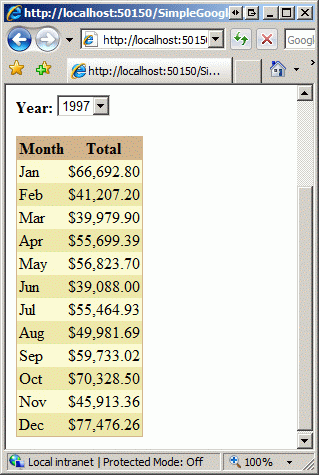
The example specifies the above query in a SqlDataSource control and displays the results on the page in a GridView control. The GridView has been customized to display the results of the Total column in currency format, and format the MonthVal column so that each row contains only the first three letters of each month. This formatting MonthVal is processed helper function in the code behind, namely DisplayMonthName which takes the month as numerical value(1, 2, ..., 12) and returns the formatted value ("Jan", "Feb", ..., "Dec"). I also added a DropDownList control to the page so that the user can specify a value for the @Year parameter - DropDownList is hard-coded to 1996, 1997, and 1998.
In addition to the SqlDataSource, GridView, and DropDownList controls for the year, the page includes an Image control for displaying the chart. The ImageUrl property of the Image element is programmatically set to the appropriate URL in the code-behind class. This is handled in the DisplayChart method. This method starts by creating the main body of the link (URL) - chart type (cht), chart size (chs) and chart title. The chart type and size are dictated by the values selected by the user using the DropDownList controls.
Protected Sub DisplayChart()
"Constructing a chart link
Dim chartUrl As New StringBuilder("http://chart.apis.google.com/chart?")
"Adding a Chart Type
chartUrl.AppendFormat("cht=(0)", Server.UrlEncode(ddlChartType.SelectedValue))
"Adding a Chart Size
chartUrl.AppendFormat("&chs=(0)", Server.UrlEncode(ddlChartSize.SelectedValue))
"Adding a title
chartUrl.AppendFormat("&chtt=(0)", Server.UrlEncode("Sales for " & ddlYear.SelectedValue))
Next, the Select method of the SqlDataSource element is called. These results are enumerated and their values are collected in a list of decimal values (Decimal) (literalDataPointsList) and the labels for each data point, that is, the abbreviations of each month, are written in a list of string values (xAxisLabels). Once plot point values are written, they will be expressed as a percentage of the largest value and stored in a list of string values called relativeDataPointValues. Values in this list are then concatenated (separated by commas) and assigned to the chart data parameter (chd).
..."Adding chart data points. First you need to get the data from the SqlDataSource control
Dim dataPointsView As DataView = CType(dsChartData.Select(DataSourceSelectArguments.Empty), DataView)
Dim xAxisLabels As New List(Of String)
Dim literalDataPointsList As New List(Of Decimal)
Dim maxValue As Decimal = 0
"Reading data points and saving maximum value
For Each point As DataRowView In dataPointsView
"Removing cents from any amount
literalDataPointsList.Add(Convert.ToDecimal(point("Total")))
"Checking for a new high
If literalDataPointsList(literalDataPointsList.Count - 1) > maxValue Then
maxValue = literalDataPointsList(literalDataPointsList.Count - 1)
End If
If ddlChartSize.SelectedIndex<>0 OrElse literalDataPointsList.Count Mod 2 = 1 Then
xAxisLabels.Add(DisplayMonthName(Convert.ToInt32(point("MonthVal"))))
Else
xAxisLabels.Add(String.Empty)
End If
Next
"Calculation of relative values of data points
Dim relativeDataPointValues As New List(Of String)
For Each Point As Decimal In literalDataPointsList
Dim relativeValue As Decimal = (point / maxValue * 100)
relativeDataPointValues.Add(relativeValue.ToString("0.00"))
Next
Next, the labels for the x and y axes are specified. The y axis extends from 0 to the maximum value returned by the query, while the x axis data points are loaded from the xAxisLabels list. Finally, the ImageUrl property of the Image element is set to the value of the constructed link (URL).
..."Adding Two Axes
chartUrl.Append("&chxt=x,y")
"Adding Values for the Y-Axis
chartUrl.AppendFormat("&chxr=1,0,(0)", maxValue.ToString("0"))
"Adding Labels for the X-Axis
chartUrl.AppendFormat("&chxl=0:|(0)", String.Join("|", xAxisLabels.ToArray()))
"Loading chartUrl "image" into the imgChart property of the Image element
imgChart.ImageUrl = chartUrl.ToString()
end sub
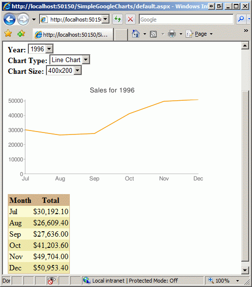
Eventually you should see the chart below. The first figure shows 1996 sales as a line chart, and the second shows 1997 sales as a bar chart.

Output
The Google Chart API offers fast and easy way creating a multitude various kinds diagrams for your website. In order to create a chart, you need to make a URL request to the Google Chart API , passing the chart's characteristics (sizes, data points, colors, labels, etc.) using a query string. Chart API returns an image that you can display in an element . With a little work, you can create such a chart link directly from an ASP.NET web page, and you can also create charts based on information from a database. In this article we looked at how to create a link manually, and in the next one we will look at a specialized control that supports declarative data binding and others. useful features.
Happy programming!
I have always wondered how such a phrase as "a picture replaces a thousand words" appeared. It can easily be attributed to managers, since it is they who, after looking at a long list of numbers, can find a graph at the end of the page that combines all the numbers, thereby demonstrating the above phrase. Charts and graphs provide an overview of a large amount of information. With the help of a chart, a person can quickly notice any trend, compare different results, or notice a pattern.
There are many ways to create charts in an ASP.NET web page. You can use the classes in the System.Drawing namespace to programmatically create charts. You can also use Microsoft office web Components (OWC). There is also free software in the form of diagramming tools, as well as a plethora of third-party components. Microsoft also stepped in and provided Microsoft Chart Controls for the .NET Framework 3.5 SP1.
This article looks at how to use the Google Chart API to create charts. The Google Chart API is a free service from Google that allows web application developers to create chart images on the go by creating an element with the src attribute pointing to a URL link that includes chart data, labels, and other information for the query string. For example, the chart shown on the right is available at http://chart.apis.google.com/chart?cht=p&chs=225x150&chd=t:100,30,70,25&chl=Q1/Q2/Q3/Q4&chtt=2008 %20Sales%20By%20Quarter. Read on to learn how to use the Google Chart API in your ASP.NET website!
Google Chart API Overview
The Google Chart API allows developers to create various types of charts on the fly. The Google Chart API is stored under a resource link (URL) on Google's web servers, and upon receipt of a properly formatted link (URL), returns a chart as an image. Chart characteristics (colors, titles, axes, plot points, etc.) are specified via a link query string (URL). The resulting image can be displayed using the element , or may be stored on your web server's file system or database. The best part is that the Google Chart API is free and doesn't require any account or registration process!
The main link to the Google Chart API is http://chart.apis.google.com/chart?. The parameters that determine the display of the chart follow after the ? symbol. There are many options that you can specify via the query string. The only required parameters are chart size (chs), chart data (chd), and chart type (cht). The following table describes some of the parameters used:
| Features of the Google Chart API | |
|---|---|
| Parameter | Description |
| cht | Chart type. Google offers about a dozen different chart types, including line charts, column charts, segment charts, and more. |
| chs | Chart size. This value is expressed as chs= WIDTH x HEIGHT , where WIDTH and HEIGHT are the number of pixels in relation to the chart's width and height - that is, chs=250x100. The maximum height and width of a chart can be 1,000 pixels, and as a result, the area of the chart cannot exceed 300,000 pixels. |
| chtt | Chart title. |
| chd | Chart information. When using this option, you must specify the data format. The Google Chart API allows you to use different data encodings. The simplest way would be to use the text encoding, which is denoted by the letter t. This is followed by a colon (:), followed by a comma-separated list of plot point values. The standard text encoding requires the numeric values displayed on the chart as floating point numbers between zero (0.0) and one hundred (100.0). To properly scale the data, convert each value to a percentage of the largest value. That is, the largest value can be 100.0, and the remaining points will be expressed as a percentage of that value - 50.0 is half of the largest value, 25.0 for 25% of the largest, and so on. To process a chart with values 10, 20 and 8 you would send: chd=t:50,100,40. Notice the t: which indicates that the data formatting uses text encoding. Alternatively, you can use the text-encoding method with data scaling, which allows floating point values, but both positive and negative. With this approach, you need to specify a scaling parameter (chds). The examples in this article use the standard text encoding, limiting all chart point values between 0 and 100. |
Using the information above, you can test creating your own graphs and charts using the Google Chart API. For example, the following link will generate line chart with dimensions 300x200 and values 43, 23, 12, 62, 34 and 39, and the title "Monthly Traffic": http://chart.apis.google.com/chart?cht=lc&chs=300x200&chd=t:69.3,37.1 ,19.4,100.0,54.8,62.9&chtt=Monthly%20Traffic
Note that the plot points sent in the chd parameter are not what we want to be on the plot - 43, 23, 12, 62, 34 and 39. Instead, percentages of the largest value of these points were sent. In other words, the graph point x is converted to a percentage using the expression (x / maxDataPoint) * 100. For example, the real value of 43 becomes 43/62 * 100 = 69.3.
And you will get the following result:

Looks good, doesn't it? This diagram is very simple and it took us 1.5 seconds to create it. If you spend more time exploring the Google Chart API, you'll find options you can use to specify colors, add axes, labels, and other standard features. For example, we can include numeric values on the y-axis to show visits and days on the x-axis by simply updating the link to use the following query string: ?cht=lc&chs=300x200&chd=t:69.3,37.1,19.4 ,100.0,54.8,62.9&chds=0.62&chtt=Monthly%20Traffic &chxt=x,y&chxl=0:/1st/7th/14th/21st/31st&chxr=1,0,62
Here's what the chart will look like:

Creating a Google Chart for an ASP.NET Page Using Data from a Database
With more work, you can create a chart based on values from a database using the Google Chart API. We just need to create the appropriate query string based on the data we need to create it on, the chart type, and the x and y axis labels (if any). Later in the article, we'll look at building a query string in an ASP.NET page for a database query that returns the sales volume by month for Northwind Traders. You can download the working code at the end of the article.
The first step is to create a query that returns the required data. My example uses the Northwind database, which stores information on products (products), customers (customers), orders (orders), etc. For this example, I decided to create a chart of gross sales by month of a given year. The following query returns the given information for the given year:
SELECT MONTH(o.OrderDate) AS MonthVal, SUM(od.UnitPrice * od.Quantity) AS Total
FROM Orders AS o
INNER JOIN AS od ON
od.OrderID = o.OrderID
WHERE(YEAR(o.OrderDate) = @Year)
GROUP BY MONTH(o.OrderDate)
ORDER BY MonthVal
The Northwind database has sales for 1996, 1997 and 1998. If you pass one of these values as the @Year parameter, you will get the following results:
| MonthVal | Total |
|---|---|
| 1 | 66692.8000 |
| 2 | 41207.5500 |
| 3 | 39979.9000 |
| ... | |
The example specifies the above query in a SqlDataSource control and displays the results on the page in a GridView control. The GridView has been customized to display the results of the Total column in currency format, and format the MonthVal column so that each row contains only the first three letters of each month. This MonthVal formatting is handled by a helper function in the background code, namely DisplayMonthName, which takes the month as a numeric value (1, 2, ..., 12) and returns the formatted value ("Jan", "Feb", ..., " Dec"). I also added a DropDownList control to the page so that the user can specify a value for the @Year parameter - DropDownList is hard-coded to 1996, 1997, and 1998.

In addition to the SqlDataSource, GridView, and DropDownList controls for the year, the page includes an Image control for displaying the chart. The ImageUrl property of the Image element is programmatically set to the appropriate URL in the code-behind class. This is handled in the DisplayChart method. This method starts by creating the main part of the link (URL) - chart type (cht), chart size (chs) and chart title. The chart type and size are dictated by the values selected by the user using the DropDownList controls.
Protected Sub DisplayChart()
"Constructing a chart link
Dim chartUrl As New StringBuilder("http://chart.apis.google.com/chart?")
"Adding a Chart Type
chartUrl.AppendFormat("cht=(0)", Server.UrlEncode(ddlChartType.SelectedValue))
"Adding a Chart Size
chartUrl.AppendFormat("&chs=(0)", Server.UrlEncode(ddlChartSize.SelectedValue))
"Adding a title
chartUrl.AppendFormat("&chtt=(0)", Server.UrlEncode("Sales for " & ddlYear.SelectedValue))
Next, the Select method of the SqlDataSource element is called. These results are enumerated and their values are collected in a list of decimal values (Decimal) (literalDataPointsList) and the labels for each data point, that is, the abbreviations of each month, are written in a list of string values (xAxisLabels). Once plot point values are written, they will be expressed as a percentage of the largest value and stored in a list of string values called relativeDataPointValues. The values in this list are then concatenated (separated by commas) and assigned to the chart data parameter (chd).
..."Adding chart data points. First you need to get the data from the SqlDataSource control
Dim dataPointsView As DataView = CType(dsChartData.Select(DataSourceSelectArguments.Empty), DataView)
Dim xAxisLabels As New List(Of String)
Dim literalDataPointsList As New List(Of Decimal)
Dim maxValue As Decimal = 0
"Reading data points and storing the maximum value
For Each point As DataRowView In dataPointsView
"Removing cents from any amount
literalDataPointsList.Add(Convert.ToDecimal(point("Total")))
"Checking for a new high
If literalDataPointsList(literalDataPointsList.Count - 1) > maxValue Then
maxValue = literalDataPointsList(literalDataPointsList.Count - 1)
End If
If ddlChartSize.SelectedIndex<>0 OrElse literalDataPointsList.Count Mod 2 = 1 Then
xAxisLabels.Add(DisplayMonthName(Convert.ToInt32(point("MonthVal"))))
Else
xAxisLabels.Add(String.Empty)
End If
Next
"Calculation of relative values of data points
Dim relativeDataPointValues As New List(Of String)
For Each Point As Decimal In literalDataPointsList
Dim relativeValue As Decimal = (point / maxValue * 100)
relativeDataPointValues.Add(relativeValue.ToString("0.00"))
Next
Next, the labels for the x and y axes are specified. The y axis extends from 0 to the maximum value returned by the query, while the x axis data points are loaded from the xAxisLabels list. Finally, the ImageUrl property of the Image element is set to the value of the constructed link (URL).
..."Adding Two Axes
chartUrl.Append("&chxt=x,y")
"Adding Values for the Y-Axis
chartUrl.AppendFormat("&chxr=1,0,(0)", maxValue.ToString("0"))
"Adding Labels for the X-Axis
chartUrl.AppendFormat("&chxl=0:/(0)", String.Join("/", xAxisLabels.ToArray()))
Eventually you should see the chart below. The first figure shows 1996 sales as a line chart, and the second shows 1997 sales as a bar chart.


Output
The Google Chart API offers a quick and easy way to create many different kinds of charts for your website. In order to create a chart, you need to make a URL request to the Google Chart API , passing the chart's characteristics (sizes, data points, colors, labels, etc.) using a query string. Chart API returns an image that you can display in an element . With a little work, you can create such a chart link directly from an ASP.NET web page, and you can also create charts based on information from a database. In this article, we looked at how to create a link manually, and in the next one, we'll look at a specialized control that supports declarative data binding and other useful features.
Saving information in the database, in this article it is time to display data from the same database in graphical form. Yes, friends, for starters, we will take a superficial look at the available technologies. And having opted for one, we integrate it into our website.
Let me remind you a little, who forgot that this is a component of the project. An overview article planning can be viewed.
So let's get started. Various graphs and charts are used to display different data. Consider some JavaScript libraries for creating fast and efficient data visualization.
List of some of them:
- D3.js - JavaScript library with open source, for data processing and visualization. Graphs are generated using HTML, SVG and CSS;
-ChartJS- open source project. Uses HTML5 canvas for rendering. Comes with a set of "ready-made" basic charts;
- Chartlist.js - used by SVG to render graphs / charts, and also managed and configured using CSS3 media queries and Sass;
- n3-charts - built on top of D3.js and AngularJS. It provides many standard plots as custom AngularJS directives;
- EmberCharts is open source, built on D3.js and Ember.js. Uses SVG to render graphs;
- Smoothie Charts - for working with real-time data flow. The HTML5 canvas element is used here to render the graph. A pure JavaScript library that provides such optional features for real-time charts;
-Chartkick - JavaScript library for plotting/diagramming in Ruby applications. Charts are generated via SVG;
-MeteorCharts - For rendering charts, you can choose any of these technologies: HTML5 canvas, WebGL, SVG and even DOM;
-Flot is a JavaScript library for jQuery that allows you to create graphs/charts.
And also many others. I will focus on - JavaScript library, for simple creation graphs. Provides many pre-built charts. There are many configuration settings(Google Chart Tools API is a powerful set of data visualization tools.) that help you change appearance graphics. Graphs are generated using HTML5/SVG to ensure cross-browser compatibility and cross-platform portability to iPhone, iPad and Android. Also contains VML to support older IE versions.
Now let's move on to practice. Google Charts provides information and tools for developers to integrate this technology into their resource https://developers.google.com/chart/
 We will work with a line chart
(fig. from the left). Let's move on to the example provided on this service following link. https://developers.google.com/chart/interactive/docs/gallery/linechart. When A line chart that is rendered within the browser using SVG or VML . Displays tooltips when hovering over points. Well, we met with SVG back in , when building an interactive image of the data collection controller. And the tooltips are great too.Let's take the script template above the graph shown and paste it on our page. Let's just draw one graph. Let's make some changes Let's analyze where what and where. So the code in studio.
We will work with a line chart
(fig. from the left). Let's move on to the example provided on this service following link. https://developers.google.com/chart/interactive/docs/gallery/linechart. When A line chart that is rendered within the browser using SVG or VML . Displays tooltips when hovering over points. Well, we met with SVG back in , when building an interactive image of the data collection controller. And the tooltips are great too.Let's take the script template above the graph shown and paste it on our page. Let's just draw one graph. Let's make some changes Let's analyze where what and where. So the code in studio.
Below in fig. result of using this script:
 Let's follow the link http://ap-impulse.ru/interface.php to an interactive web interface. On the left is a graph based on static data.
Above, we examined the use of the Google Charts library on our resource, work with documentation, and disassembled the code. This resource has a wide selection of graphs and charts, as well as an example of their use and Full description. As mentioned above, we used static data. For our project, we need to read from the database, into which we learned how to enter data from GET parameters in the last article. In the next one, we will look at connecting to the database, plotting, as well as errors that occur. This is where we will stop for today. All for now.