As you know, among the users of GNU/Linux there are quite a lot of people from the academic environment, that is, those people who observe, measure, calculate, compare, and eventually write scientific articles. This work is usually associated with a graphical presentation of information or visualization. In the common people - by plotting graphs. It is about the programs intended for this that will be discussed.
I compared 9 free programs for visualizing 2D and 1D data. All of these programs are available on GNU/Linux, and many are available to users of other operating systems. All 9 programs allow you to build such graphics that you are not ashamed to show or print. This is what is called "publication quality".
The choice of programs is limited to those designed to visualize one-dimensional or two-dimensional data. By one-dimensional (1D) data, I mean a mapping from one one-dimensional set to another, such as functional dependency. By two-dimensional (2D) data, I mean a mapping of a two-dimensional set to a one- or two-dimensional one, for example, a functional dependence or a vector-valued function given on a plane. In my opinion, it is the visualization of one- and two-dimensional data that is the most common task.
Programs focused primarily on the visualization of multidimensional data are excluded from the comparison. However, all these programs deserve a mention: OpenDX, VTK, MayaVi,. All this is interesting, but it's a completely different story. Also, programs for constructing graphs and for other, exotic, visualization methods did not participate in the comparison. Of these, graphviz and prefuse are worth mentioning.
So, in comparison participated:
- gnuplot- an industry veteran, so almost everyone who needs graphics is familiar with him and knows how to work; I myself use it with pleasure, because with just one or two short commands, you can display the data tolerably;
- Gri- a lesser known project, actually a programming language for drawing scientific graphs; was originally actively used to represent geographic information, so there is complete order with isolines and color maps;
- matplotlib- a relatively young, but rich in features and actively developing project, is a library for the Python language; a feature of matplotlib is a syntax close to MATLAB; hence the second name of the project: pylab;
- PyX- another package for visualization with Python; the choice between matplotlib and PyX is largely a matter of taste, but it should be noted that some things are more natural to do in one, and others in the other (see table);
- Tioga- a library for the Ruby language that uses PDFLaTeX to draw graphs; as a result, a qualitative result pleasing to the eye, but a rather steep learning curve (in addition to mastering Ruby, you will need to deal with thioga itself);
- Ctioga— the same Tioga for those who want now and immediately; chart parameters are set from the command line, and Tioga is already used to draw it; unfortunately, Ctioga is suitable only for one-dimensional data, but for them it may well replace gnuplot;
- GNU plotutils- they are the graph utility; I personally find its interface less intuitive and easy to use, and more limited options than other programs; however, the libplot library included in the same package may be of interest from the point of view of writing your own programs for plotting;
- plotmtv- far from a new project, and, as it seems to me, is in stagnation; copes well with two-dimensional scalar and vector data; main disadvantage: commands for plotting must be embedded in data files; on the other hand, if files in the plotmtv format are already available, it is easy to build graphs, the quality is very decent, and the main parameters of the graph can also be changed using the graphical interface;
- grace- the only program among those considered, in which you can fully control the construction of graphs using a graphical interface; unfortunately, that is why I still have not managed to make friends with her; its capabilities are very decent, but it is suitable for visualizing only one-dimensional data;
I personally used and use gnuplot, Gri, matplotlib, Tioga and Ctioga - and am satisfied with each of them. If you need to draw something quickly (for yourself) - usually gnuplot, Gri or Ctioga is my choice. I also use Gnuplot if I need to draw a level surface. If you need to draw contour lines or color maps from 2D data, Gri and Tioga are the best. Matplotlib can also do this, but I met it relatively recently and have so far only used it for different charts.
In comparison, probably, one could also add programs
Almost any mathematical function can be visualized as a graph. In order to help users who have encountered certain difficulties in building them, a huge number of a wide variety of programs have been developed. The most common and useful of them will be discussed below.
3D Grapher is one of the programs for plotting function graphs. Unfortunately, among its capabilities there is no creation of two-dimensional graphs, it is sharpened only for the visualization of mathematical functions in the form of volumetric images.

In general, this software provides a very high-quality result, and also provides the ability to track the changes in the function over time.
Ace IT Grapher
Another program in this category that cannot be ignored is AceIT Grapher. As in 3D Grapher, it provides for the creation of three-dimensional graphs, however, in addition, it is not without the ability to display the appearance of functions on a plane.

It is very nice to have a tool for automated function research, which allows you to avoid long calculations on paper.
advanced grapher
If you are looking for really high quality feature graphing software, then you should look into Advanced Grapher. This tool, in general, has a set of features similar to AceIT Grapher, but there are some differences. It is also important to have a translation into Russian.
It is worth paying attention to extremely useful tools for calculating derivatives and antiderivatives, as well as displaying them on a graph.
Dplot
This representative of the category in question is a little more difficult to handle. With this program, you will be able to perform all the same actions with functions as in the case of the previous two, however, this may require some preparation.

The main disadvantage of this tool can definitely be called an extremely high price for the full version, which makes it not the best option, because there are other solutions to the problems that arise when plotting mathematical functions, for example, Advanced Grapher.
Efofex FX Draw
Efofex FX Draw is another program for plotting functions. Pleasant visual design, coupled with a wide range of features that are not inferior to the main competitors, allow this product to take its rightful place in its segment.

A pleasant difference from competitors is the ability to plot statistical and probability functions.
Falco Graph Builder
One of the tools for building function graphs is the Falco Graph Builder. In terms of its capabilities, it is inferior to most similar programs, if only because it provides the ability to build only two-dimensional graphs of mathematical functions.

Despite this, if you do not need to create volumetric charts, then this representative can be an excellent choice, at least due to the fact that it is completely free.
FBK Grapher
The program created by Russian developers from FBKStudio Software, FBK Grapher is also a worthy representative of this category of software. Possessing all the necessary tools for visualizing mathematical expressions, this software, in general, is not inferior to foreign analogues.

The only thing you can blame FBK Grapher for is not the most pleasant and understandable design of 3D charts.
Functor
Here, as in 3D Grapher, it is possible to create only volumetric graphs, but the results of this program are very specific and not very rich in details, because they do not have any symbols.

Given this fact, we can say that Functor is suitable only when you only need to get a superficial idea of \u200b\u200bthe appearance of a mathematical function.
GeoGebra
Creating graphs of mathematical functions is not the main task of the program, because it is designed to perform mathematical operations in a broader sense. Among these are the construction of various geometric shapes and interaction with them. Despite this, this software copes with the creation of function graphs, in general, no worse than specialized programs.

Another plus in favor of GeoGebra is that it is completely free and is constantly supported by developers.
Gnuplot
This software is the most unlike its competitors in this category. The main difference between this program and analogues is that all actions with functions in it are performed using the command line.

If you still decide to pay attention to Gnuplot, then you need to know that it is quite difficult to understand how it works and is recommended for users who are familiar with programming at least at a basic level.
The programs presented above will help you deal with the construction of a graph of a particular mathematical function of almost any complexity. Almost all of them work on a similar principle, but some stand out with a wider range of features, which makes them the best options to choose from.
Any freelancer has faced a situation when he needed to quickly solve a problem, but he did not have the necessary tools. Today, having access to the Internet, many of the tasks can be solved directly in the browser - there are many services on the network for adjusting images, working with audio and video files, text, tables, and so on. In addition, it often becomes necessary to illustrate the created content with graphs and diagrams. Graphs are very informative and allow you to show the relationship between different types of data, they are difficult to do without when creating presentations or reviews, and they must be used if possible. FreelanceToday brings you 10 graphing and charting tools.
Most of the presented tools are quite simple, so it will be very easy to master them.
Chart Maker is a simple and intuitive tool for creating charts. Working with Chart Maker, the user can create five types of charts: line charts, pie charts, histograms, Venn charts, and scatter charts. At the end of the work, you can specify the exact size of the chart in pixels and either save it on your computer's hard drive or publish it on the Internet - the service generates a link to the image.
The ChartGo tool allows you to create colorful and informative charts. You can work with a variety of chart types, including column charts, line charts, pie charts, and area charts. Using the settings, you can adjust the color and size of the image, change the font style (italic and bold), and mention the source of information. Using the service, you can create your own investment and stock charts, Forex charts, as well as illustrate any data related to finance.
One of the features of ChartGo is the ability to edit a saved graph or chart. The image is stored on the ChartGo server and can be modified. The server generates a link to the chart, so when the original image changes, the chart published on the website or blog page also changes.
A chart is a great way to present information visually. Using the free Online Charts tool, you can create a variety of graphs and charts: line, pie, radar, pyramid, area charts and many others. It is possible to work with color and font type. You can also choose the appearance of the chart: 2D or 3D. The finished chart can be saved in PNG, JPG, PDF and CSV formats. A link to the chart is also provided. The diagram can be posted on a website or blog, or shared on social networks Facebook, Twitter and Google+.
A very easy to use chart generator created by John Winstanley. The mention of Google in the name of the tool is explained simply - the generator uses the Google API. With the help of the service, you can create accurate, bright and informative graphs and charts. The finished result can be saved on your computer or published on the Internet. The service also generates an HTML image tag. There are relatively few tools at the user's disposal, but there are all the necessary types of charts and graphs. You can create charts with multiple data sets, grouped histograms (vertical and horizontal) and choose the appearance - 2D or 3D.
Line charts are indispensable when you need to display certain types of data or demonstrate current trends. Line Graph Maker is a very easy to use tool for creating line graphs. Also, using the service, you can create simple pie charts and histograms.
The RAW tool is a powerful platform for creating colorful graphs and charts. The tool allows you to display information in 16 different ways. The creators of the service did a good job on the functionality, the platform can be used in serious research, since Raw is an intermediate option between professional spreadsheet editors and vector graphics editors. Anyone working with sensitive information will be happy to know that Raw only processes data through the browser and does not store it on its servers. The platform does not allow you to create simple line graphs and histograms, the creators of the service suggest using other available tools for this. But if you need to create an alluvial diagram, a circular dendrogram, or something else complex and unusual, then you can use Raw.
The amCharts service is designed to create modern and stylish chart templates that can be used in presentations, at conferences, as well as for illustrating content. There are several initial diagrams, the platform interface is fully configured in a couple of minutes. The main advantage of the service is the ability to create interactive graphs and charts, but this will require the user to have at least basic knowledge of HTML, since they will have to work with the generated HTML code that interacts with JavaScript libraries.
If you're looking for an easy-to-use plotting tool, Plotvar is an online service worth checking out. The tool is ideal for illustrating financial analysis, presentations, forum posts or social media posts. You can create line graphs, bar charts, and pie charts. It is also possible to create dynamic graphs. A "live" graph will allow you to present information in dynamics, which will be appreciated by those users who work with constantly changing data.
Infogram is known as one of the leading infographic creation apps. But it also has tools for creating charts and graphs, and in more than 30 variations. Infogram is a premium tool, it is paid, so you should create diagrams in it in case of emergency. As a last resort, you can sign up for a 30-day trial period. The service has a very wide functionality, the platform capabilities allow Infogram to compete even with such professional graphic editors as Photoshop.
Google Charts online service allows you to create almost any graph or chart. The tool also supports interactive dynamic charts. All charts are created using the HTML5/SVG bundle, so no additional plugins are required to display the information correctly. There is no easier and more convenient tool if you want to create an interactive and scalable chart.
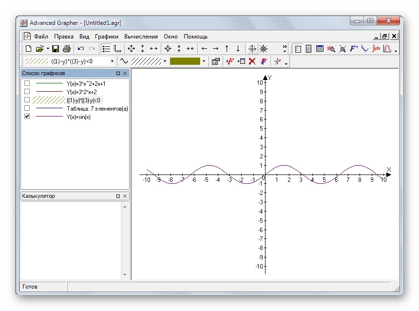
Graph is an application for constructing mathematical graphs based on a function. The program is open source. Any existing functions are supported here, while for convenience, they are divided into categories. You can create any graph, be it sine, cosine, algorithm, etc. The graph itself is also customizable, you can set the thickness of its lines and their color, or specify the indent with which the data will be displayed. Graph allows you to display function conditions, such as equality or vice versa.

You can save the graph in any graphic format. Moreover, you will be able to export the coordinate system and the graph itself to a file, which other programs can then work with, for example, . The graph builder can also display their values by recalculating the data, insert comments, make custom functions, set animations, and much more.

Advantages of Graph:
- simplicity - you can deal with the program in a matter of minutes;
- simple functions, parametric and polar are supported;
- the ability to build any auxiliary lines;
- you can add any inscription near the chart;
- it is possible to copy the result as a picture;
- the ability to plot a graph by points, or by tabular data;
- there is a print to file function.

Finishing
The first impression of the program for plotting graphs is deceptive, and contrary to the opinion that it is difficult to perceive, it will be quick to figure it out. After two minutes of deliberations, we managed to build a simple line chart. Moreover, all possible methods of data output are supported here. This is both an elementary printout and the transfer of the result to third-party programs. The coordinate system itself is also very flexible.

The application is useful not only for students who learn all the tricks of mathematics, but also for their teachers. In addition, you do not need to register for the program. By clicking the button below, you can download the latest version of the program for free using a direct link.
Instruction
First you need to launch the Microsoft Office program, if you have it. If not, then you can install from the Internet or a disk in any specialized store. You can download this program from the official website of Microsoft Corporation ( http://www.microsoft.com/rus/).
After you have launched the program, go to the "Insert" tab, which is located on the toolbar in the left corner of the window.
Then find the "Illustrations" section. It will offer you a rather large list of additional modules (for example, shapes, a clip, and so on) that you can use when working on a document. In our case, you need to click on the "Diagram" button.
As a result, a new window should open in front of you, in which a large list of chart types will be presented: , pie, histogram, bar, scatter, surface, stock, bubble, donut, radar. All these you can use Microsoft Word 2007. To, you need to select the appropriate button.
Next, a small Microsoft Excel window will appear in which you need to specify certain values that your graph will be based on. Don't forget to enter in the graph so that later you will be more comfortable working with the values. After confirming the creation, you will see it on the current page of the document. You can edit this chart at any time.
If after working with the chart its appearance does not suit you, then it can be changed to a more suitable one at any time. To do this, right-click on the graph and select Change Chart Type. In the new window, click on the appropriate chart type and click OK. Your graph will automatically change its appearance.
Sources:
- how to draw in word
- How to Draw in Word 2013
Nowadays, almost all documents are created using text and graphic editors. Graphs and diagrams that were previously drawn with a pencil and ruler can now be drawn using a variety of programs.
You will need
- Microsoft Office suite
Instruction
After making changes to the work schedule and their approval, it is necessary to draw up an order for the introduction of a new work schedule. The text of the order indicates the established parameters of the working day, and a reference to the regulatory document itself is given as a basis.
Sources:
- how to change chart in word 2019
Imagine that you are faced with the task of conducting a sociological study. It includes the processing of a large amount of data. But besides this, they need to be visualized so that a person who is not familiar with the topic under discussion can understand what is at stake. How to build histogram?

Instruction
Construct a 2D coordinate plane. On the x-axis place the answers and scores, on the y-axis - the frequency of their occurrence. Mark the results on the graph in such a way that in the end you get columns whose number matches the number of marked features. Their height should match the frequency of their occurrence. To make the information easier to perceive, color the columns in different colors. Choose colors in such a way that they do not “cut” the eyes.
Open the Microsoft Word application. On the toolbar, find the "Insert" item, left-click on it and find the "Illustrations" item. Look for "Diagrams" in the illustrations. You will see a window with all sorts of options. In it, select histograms.
Click OK. Often, a charting icon is placed on the toolbar. Click on it and do the same. A window with a data table will appear. To draw histogram, fill in these columns with all the necessary information. Click OK. A histogram will appear on the sheet. To adjust it, double-click on it with the left mouse button. This way you can rename columns and axes.
Open the Microsoft Excel application. It is much easier and more convenient to build a histogram in it than in Word, because it is easier to adjust the range of covered values. In enter the data corresponding to the coordinates of the points. Then do the same as you did in the Microsoft Word application. In the "range" line, enter it manually or select the filled cells.