Continuing the topic adaptive layout... Today we will talk about one of the three whales of adaptive layout - grid based layout(flexible gridbased layout). The other two are flexible images.
In the middle of the 20th century, graphic designers popularized the concept typographic, or modular, mesh- a rational system of columns and rows in which modules with content could be placed. It looked fresh and very harmonious.
However, graphic design and web design are, as they say in Odessa, two big differences. The key point here is page size. In typography, it is fixed, and a web page can stretch and shrink depending on what it is being viewed on.
To apply a modular grid to a web page, use a simple proportionality formula:
target / context = result
The easiest way to understand this formula is with an illustrative example. Let's say we have a drawn site layout in two columns - the content part and the sidebar:

We make it "rubber". But here's the problem: how to set the width of both blocks? After all, if you write it in pixels, then they will no longer be rubber. This means you need to use percentages, not pixels. But excuse me, what meanings should I write? All the same, after all, you need to make a start from something.
You can, of course, figure it out by eye: the content takes up about 70% of the total page width, and the sidebar - 30%. But the correct layout designer never estimates anything by eye. We need the exact size.
This is what the formula of proportionality is for. We just take the width of the inner blocks and divide it by the total width of the page. Here the whole page is context, and each of the indoor units, respectively, target from the above formula.
660 / 960 = 0,6875
300 / 960 = 0,3125
It remains only to translate this data into percentages. Without bothering too much, just move the comma two characters to the right. We get:
68,75%
31,25%
It's as simple as that. However, let's complicate the task. Suppose we have the content part divided into two more unequal parts. For example, on the left there is a narrow column with the date of the article and social buttons arranged vertically, and the right column is wide, and we have the text of the article in it.

We know from the design layout that the width of this narrow column is 120 pixels, and the wide one is 520. How do you translate these numbers into%? Again, apply the proportion formula. But this time we do not use the entire width of the page as a context, but the width of the block that contains these two columns, that is, the width of the content part, which we have is 660 pixels. We divide:
120 / 660 = 0,1818
520 / 660 = 0,7878
As a percentage, we get, respectively, 18.18% and 78.78%
By the way, in modern style files that use responsive layout, correct layout designers add similar calculations as comments. For better clarity. This is how it usually looks:
Content (
width: 68.75%; / * 660px / 960px * /
}
I hope this was not a problem. Let's go further!
Grid based layout
The above examples are, of course, not a mesh yet. Well, what's the two-column grid? A real modular grid is designed to help both designers and layout designers create complex websites with many columns and individual blocks.
Therefore, a lot of convenient services and tools have appeared that implement this method easily and simply. For example 960.gs. Here you can not only visually study the principle of layout based on a modular grid, but also download templates and use them.

In fact, such services are now a dime a dozen! They are also called frameworks. Choose which one you like best. Here's a great selection of 30 CSS Frameworks for Responsive Web Design.
What are these modular grids for?
First of all, modular grids are needed in order to visually organize content on a website page. It is not only beautiful from an aesthetic point of view and pleasing to the user's eye, but also convenient for the developers themselves. Especially if the site is really complex in structure and content.

In addition, such modular grids are much easier to make adaptive than randomly scattered blocks of different sizes.
And, of course, the speed of development of such sites is much higher. You don't need to fool around and reinvent the wheel from scratch. It is enough to choose a suitable framework and build a website using it.
I hope you now know what a grid-based responsive layout is.
Next time, let's talk about flexible images in a responsive layout. A very important and controversial topic. I recommend that you study it well too, so as not to get into a mess. Stay in touch! Better yet, subscribe to the Web Council newsletter.
Any layout designer faced with the next task of coding an adaptive layout needs grids. In most cases, the good old bootstrap is taken, and divs with classes like col-xs-6 col-sm-4 col-md-3 begin to appear in html-ke. And everything seems to be good and fast, but in this approach many pitfalls often arise. In this article we will look at these pitfalls, and throw rotten tomatoes, consider my craft for trouble-free nets.
Problems
Custom meshes
So, our layout designer has very little time, the layout is on fire, everything needs to be done yesterday. Therefore, he takes the popular bootstrap css framework as a basis, and starts his work. And then, in the middle of work, he suddenly stumbles upon a block of "5 in a row" banners. Anyone who has worked with bootstrap knows that its default grid is 12x, so 5 columns in a row with a standard bootstrap grid, well, you can't do it. Yes, of course, you can assemble an arbitrary grid in bootstrap, but this is time to waste, download dependencies, collect less-ki (and we, for example, write in sass).
Can I include some library for custom grids? In general, this is a good way out, the only drawback of this approach is that almost all of them are designed either for a long and tedious writing @media (min-width:) (), or generate their own set of classes, with a bunch of probably unnecessary col15-xs- offset-3, which will be included in the final css.
Therefore, with a high probability, the layout designer will simply write all the styles by hand (in principle, there is not much to write there).
Very often the standard bootstrap grid lacks additional breakpoints, i.e. there are xs, sm, md, lg - all of them up to 1200px wide. But what about large monitors? Any breakpoint xl at 1600px just asks for a standard set. But again, it does not exist, and the same solutions arise as in the previous paragraph. But there can be a lot of control points - 320, 360, 640, 768, 992, 1200, 1600, 1900 ..
Redundancy and verbosity
And here we smoothly come to the next problem. Imagine that you need to write your own block sizes for each grid, then you get something like this:
Is it too much? Add the possible pull / push and visible / hidden here and then you can safely start going crazy. But all these classes are written in css, imagine how many classes you need to write in css for all combinations of a 60-fold grid!
Separating styles from markup
Any typesetter knows that inline styles are bad. So why do we write styling in our markup classes? col-xs-6, visible-sm and God forbid text-right - these are all styles, and if you need to make edits to an already stretched layout, there will certainly be a problem that the layout designer will have to ask the backend to change col-sm- 6 on col-sm-4.
Overlapping unnecessary styles
Often, the css framework is connected just for the sake of grids and a couple of small functions, which subsequently results in an excessive reset of styles and a double size of the final css. For example, the entire bootstrap.min.css is connected, and then the shadows and rounded corners of .btn, .form-control and the like are cheerfully and perkly removed, including: hover,: focus,: first-child. As a result, instead of helping, the framework gets in the way. Not to mention the often unnecessary features like the.glyphicon. Of course, again, you can collect bootstrap from what you need, but this is time again.
Foreign standards and code-style
Let's say a layout designer has studied BEM and started using it. But the need to use bootstrap dictates its own exceptions - in it all classes are written with a hyphen, not following the principles of BEM. And then the problem of choice arises - either put up with the mess in the names of the classes (btn-block disabled component__btn component__btn_disabled), or still throw out bootstrap.
Deprecated Methods
As you know, grids in bootstrap 3 are float-based. What often causes problems, one of the most common is the different heights of the blocks, as a result of which the beautiful mesh "breaks". Stop using floats for other purposes, all browsers that don't know how to flexbox are almost extinct!
Susy! is this a way out?

Looking for a solution to all of the above problems, I'm on the wonderful Susy grid framework! , overall very good. But I lacked the speed, because susy! suggested describing the columns for each breakpoint separately:
.col (@media (min-width: 768px) (@include gallery (4 of 12);) @media (min-width: 1200px) (@include gallery (3 of 12);))
That is, susy! assumes that you will do the breakpoints yourself. Also, susy! does not write display: flex for, lines for you, you need to remember to write them yourself. The indents between the columns in it are set only relative (it will not work to make fixed in pixels). Also, he recently learned flex, and before that he built grids with floats and: nth-child (). In general, susy! this is good, but I would like the speed and ease of describing grids for all breakpoints, as it was with bootstrap.
The search for other grid systems also did not give much result - everyone either follows the susy! Path, forgetting about breakpoints, or follows the bootstrap path, providing a set of generated classes for taxiing grids in html.
Bicycle building
So, it was decided to write something of their own, as a result fast-grid was born. It is also built with sass like susy. What are the main advantages of it in comparison with other solutions, in particular, with susy !? First of all, speed due to less code, let's take a standard bootstrap example:
With fast-grid, such a grid is very easy to describe:
@import "~ fast-grid / fast-grid"; .row (@include grid-row ();) .col (@include grid-col (6 4 3 2);)
Let's now walk through our shortcomings and see how fast-grid solves all of these problems.
Custom meshes
@import "~ fast-grid / fast-grid"; .cols ($ grid: (gap: 5px); @include grid-row ($ grid); & __ item (@include grid-col (12 6 null (1 of 5), $ grid);))
The need for your own set of breakpoints
@import "~ fast-grid / fast-grid"; .cols ($ grid: (breakpoints: (xxs: 0px, xs: 360px, sm: 640px, md: 960px, lg: 1200px, xl: 1600px), columns: 60); @include grid-row ($ grid); & __ item (@include grid-col ((xxs: 60, xs: 30, sm: 20, md: 15, lg: 12), $ grid);))Redundancy and Verbosity / Separating Styles from Markup
fast-grid is a grid framework for use in css, not html based on generated classsets. This separates the markup from the styles, which is beneficial for future support. It also eliminates the need to generate a bunch of helper classes (.col-xs-push-4, etc.) that are mostly unused.
Overlapping unnecessary styles
Since fast-grid is a bunch of mixins, it doesn't generate any rules in css by itself. Therefore, here you will not come across the fact that the framework is styling the elements as you do not need. Anyway, these are only grids, and nothing else.
Foreign standards and code-style
fast-grid are mixins that you must use internally your classes with the names you prefer. Love BEM? No problem!
Deprecated Methods
The default is flexbox, which opens up a lot of possibilities and solves the problems of classic floats. For example, you can easily change the order of the columns.
In the example below, we render the sidebar below the main content for the mobile version, and make it the first block on large screens.
It would be possible to achieve this of course using pull / push for float, but this is very crutch.
Conclusion
In general, the task set for me was completed - now the grids no longer cause any problems for me, and the layout is quick and easy. You can read more about fast-grid capabilities in the repository and see examples:
Are you still using bootstrap? Then we go to you!
Tags:
- css
- sass
- grid
A modular grid is a special template that is used to build a website design. In fact, it is a system for presenting visual information to the visitor based on separate blocks, called modules. A website developed using such a template is much easier to read and navigate.
How the mesh is applied
The modular grid is used in the development of designs for books, business cards, trademarks, logos, etc. It is obligatory to use it when creating sites. A correctly made grid harmoniously composes the environment for all elements of the resource - graphic and text. It makes it much easier to place them all on the page and create clear boundaries between them. By arranging the elements in a certain way, you can make each of them noticeable and at the same time tie together all the information about the site itself.
Types of modular grids
The most common modular grid in page design is the three base cell columns. In this case, the header and footer have a width equal to their size. This standard option is usually used by amateurs when creating sites. Sometimes the width of one cell increases due to the width of the other.
The creation of the second version of modular grids - non-standard - is only possible for people who are professionally engaged in web design. In this case, only the width of the columns and the distance between the individual elements are precisely defined. A modular grid in the design of various kinds of news resources and online magazines is usually developed as follows:
- A header and footer is created. The site name, navigation menu, various kinds of video materials should be located here.
- The page is split into three columns. Moreover, two of them have the same dimensions. The third column is divided in two by a vertical line. Thus, four sections are obtained (news, photo gallery, advertising space, latest informational changes on the site).
The modular grid for online stores of different specializations is created in a slightly different way. In this case, it is very important to provide an easy navigation for the visitors. At the same time, the elements are grouped in a standard and uniform way. For each of the objects in the grid, important information is highlighted that characterizes it.
Ruler in Photoshop editor
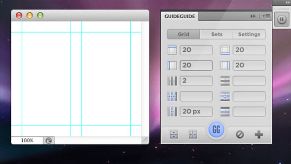
Websites are created using raster or vector. Meshes in them are very convenient to create. Let's take a look at how this is done in the popular Photoshop editor. It is very simple to create a modular grid in Photoshop.
In order for the rulers to appear along the perimeter of the working image window, go to the main menu item “View” and click on the line “Rulers”. You can use a wide variety of elements in this editor - with divisions in centimeters, millimeters, inches or pixels. In order to make the necessary settings, go to the main menu item "Edit". Then select the line "Preferences" - "Units & Rulers". After that, a window will be highlighted, in which you can change the appearance of the ruler. In the top drop-down menu, select centimeters, millimeters, pixels, etc.

However, usually when working in the editor "Photoshop" they use a slightly different, simpler method. To change the units of measurement, simply click on the ruler itself in the image window with the right mouse button. After that, in the menu that appears, you can perform the desired action. Usually, when creating a website, a grid in pixels is used.

Photoshop grid
The very modular grid of the Photoshop program will become visible after you go to the main menu item "View" - "Show" - "Grid". The spacing between the grid lines is configurable. To do this, execute the command "Edit" - "Settings" - "Guides, Grid and Slices" (Guides, Grid, Slices). Here you can change not only the step between the lines, but also their color. Using this grid, it will be quite easy to quickly and accurately place all objects of the future site on the working field.

Working with the cursor
The modular grid of the site is very easy to create in this way. The cursor sticks to lines when working. This can be convenient if you need to make blocks of precise, defined sizes. If, for some reason, this function turns out to be unnecessary, you can disable it. By default, the origin of the grid in Photoshop is located in the upper left corner of the window. If desired, you can move it to any other place on the canvas. To do this, place the cursor on the square of the origin and simply drag it while holding the mouse button. To return the starting point to its place, double-click on the same square in the corner.
Among other things, there are all sorts of plugins for the editor "Photoshop", allowing you to make the creation of a site using a modular grid even more convenient. Download them online. Using these plugins, you can create meshes with specified parameters.
Grid in CorelDraw
Now let's see how to create a modular grid in the vector editor CorelDraw. Here it is created in much the same way as in Photoshop. Its icon is located on the top panel (eye in the grid). After clicking on it, you can make all the necessary settings. You can select the distance between the lines, change the unit of measurement, etc. Delineate the working area in the image window in CorelDraw and using guides. They can be made visible or invisible if necessary.

A modular grid in website design is a fundamental element, the development of which should be approached with the utmost responsibility. After all, the convenience of its visitors, and hence the time they spend on its pages, depends on how correctly the resource will be structured.
"The grid is a help system, but it is not a guarantee, it only has a number of possible uses, and each designer can find a solution that suits his individual style. But you have to learn how to use the grid. It is an art that takes practice."
— Joseph Müller-Brockmann
In fact, the very use of the grid is associated with one of the oldest and most basic design principles - alignment. Our brain wants to simplify everything and make it more understandable. This is why we try to bring order to things that seem chaotic.
Naturally, the faster we organize everything correctly, the faster our brain can identify the model and move on. The grids are so orderly that they require almost no interpretation on our part. .
Consider two page layouts presented in the image below:
Although both of these images are just a few rectangles, the set at the top seems to be fundamentally better than the bottom. We can instantly recognize the pattern, accept it, and move on. The image below, on the other hand, causes visual discomfort, since it does not have a clear picture, order, or purpose and looks like a random set of shapes.
It should be noted that disorganization can also be beautiful. . In nature, for example, there are no clear lines. Meshes look cold and stiff, but remember that they are a very effective and efficient method to keep your imagination from getting bogged down in structures.
Take a look at some of the most popular websites with top-notch designs. Most likely they used a grid. Grids help stabilize the structure of a web page and provide the designer with a logical template for building a website.
Using a grid doesn't mean your design will have a boring design. A good designer should know and be able to apply the basic rules for using a grid, but this does not mean that he cannot break the rules.
In simple terms, a grid is the division of a layout with vertical and / or horizontal guides including margins, space, and some columns to lay the foundation for organizing your content.
Grids are traditionally used in the printing industry, but they are also commonly used in web design. The mesh is simply a tool that helps with the design.
When starting to learn new skills in a particular area, you must first follow the guidelines. Learning the basics ensures that you can apply the principles effectively. That is, first - theory, and then - practice.
It's worth noting that there are two ways to create a template grid:
Method # 1: Create your own mesh
There are many different ways to create your own mesh, but at the end of the day, you are free to choose which one works best.
You can divide a blank document mathematically, creating an even or odd number of columns to work with. Your network can be complex or simple, you can use the rules of thirds or the golden ratio as you like.
Perhaps the following articles will help you with this:
- How You Make A Grid (book in English in .pdf format)
Here are some examples of meshes created in Photoshop using guides ( View> New Guide):

Plugins for creating meshes in Photoshop


5. Grid System Generator -generator of such popular grids as 960.gs, Golden Grid, 1Kb Grid, Simple Grid / set the necessary parameters and press "GENERATE".


Grids for gummy / responsive sites
Responsive web design is hugely popular today. The main of its principles is the use of a rubber mesh. You can read more about them, but I would like to supplement this collection a little and add a few more resources.
1. - adaptive grid generator

2. Fluid grid calculator - a service that allows you to create a rubber grid. Enter the parameters and get a ready-made code.
Everything is somehow not enough time, so I decided to write an article on the topic of modular grids in web design, maybe for whom the information will be useful and interesting. The modular grid is a very useful tool for a web designer, and many beginners neglect it for some reason, and in vain.
In today's article I will try to tell you about what a modular grid is, what tasks it performs, how you can build it yourself, and also show you an example of creating a site design layout using its example.
As an example, I've created a simple blog design layout. Of course, I will not consider all the details of creating a design within the framework of this article, I will only show a general principle of how you can use a grid to create a website design.
What is a modular grid?
Modular grid Is a system of modular layout, which is a grid with vertical and horizontal rhythms, the intersections of rhythms form modules. Thus, the entire grid consists of such modules, hence its name appeared.
A unit can be called a unit of measurement created to give proportionality and proportionality.
Probably, he wrote too abstrusely. I'll try to explain in simple terms, in our world there are quite a few examples of modular grids, for example, a brick wall in a half-brick, it will just be a modular grid, and a brick will be a module.
The tile in the bathroom, too, the entire wall is a modular grid (provided that all tiles are of the same size), and one tile is a module or unit of measurement, as in our case.
What is a mesh for, and what tasks does it perform?
The grid is essential for the rapid development of a layout, prototype, website or application design. It significantly saves time on development, structuring, template templating. Eliminates the routine work of positioning and aligning design blocks. Simplifies the work of both the designer, the layout designer and the development team as a whole.
- Speeds up the development process. It takes us much less time to find space for blocks in the layout.
- Helps in positioning. All elements are aligned relative to each other on the grid, and positioning takes a minimum of time.
- Allows templating. Having developed a modular grid, we create a template basis for the entire project, both during development and for future solutions. We also provide opportunities for quick modification.
- Eliminates errors. The grid avoids some of the most common mistakes with positioning, structuring, sizing, and spacing between blocks.
- It is a single system of proportions. Thanks to the modules, all elements in the layout are proportional and commensurate with each other.
- Structures and organizes. Thanks to the modular grid, the layout becomes more structured and ordered, the design is perceived more comfortable.
- Leads to a more aesthetic appearance. A clear and logical structure of the resulting site gives a more aesthetic look.
- Assists in further development of other project participants. A design built using a modular layout system is much easier to typeset than a layout built without a grid. The grid gives the layout designer standardization of solutions, speeds up the layout process. Makes it easier for a large team to work on large-scale projects. It also allows new developers and project participants to understand the layout much faster. Which in turn leads to a more holistic work result.
Building a modular grid
First of all, before starting to create a modular grid, we need to decide on the size of the layout of the future site. We decide under what minimum resolution we create a layout.
The minimum resolution is most often taken as a monitor resolution of 1024x768 and 1280x720 pixels. Of course, other resolutions can also be chosen, as always, it depends on the task you are facing. Based on these parameters, we will have to create. Of these, the width is most important to us, since it is often fixed for sites, while the height, on the contrary, varies due to the content of the site.
In this case, I will create a canvas with a width of 1000 pixels for a minimum resolution of 1024x768 pixels. I will make the content part in 960 pixels, padding at the edges by 20 pixels (the width of our margins).

Create a font grid
The first thing we do is create the font grid. Choosing one line height for the entire site layout. We line it up like a notebook into a copy, on which we will have all the texts, lists, illustrations, headings, paragraphs and other plates. I usually create a line height of 18 pixels, but there may be a different size, it all depends on the selected size and font.
Line spacing(in css line-height) can be calculated in two ways:
- Main font size for content (16pt.) / 2 + main font size for content (16pt.) = 24pt.
- Main font size for content (16pt) x 1.5 = 24pt.

Building a vertical articulation or columnar grid
Now for the fun part, we need to create a columnar grid. The column width determines the width of our module. So, we need to determine this very width, how it can be done.
- If the site plans to have a block with a constant size (banner, video, illustrations, etc.). These blocks are of fixed size and often include several modules. Thus, knowing their size, we can easily determine the width of the module, it is enough to understand that the block must be within the width of the modules.
- The second way is when you have specific tasks that you can rely on. For example, according to the task, it is worth placing a certain number of blocks in a line across the entire width of the site's body, say 6. Then, knowing this parameter, we can estimate that one such block includes two modules in width. Accordingly, a 12 column grid is suitable for us.
Additionally, we need to determine the distance between modules or columns. I mostly use the font grid line size, in this case 18px.
Thus, we get a module width of 63.5, rounded to 63 pixels. We have 0.5 pixels left for each module, we have 12 total of 6 pixels, we spread them into fields of 3 pixels, thereby our fields will increase and become equal to 23 pixels, and not 20, respectively, and the content part will become equal to 954 pixels ...
Note: the number of columns depends on the needs and tasks and may differ. However, it is worth considering the fact that it is more convenient to work with medium-sized modules than large or small ones. Large modules turn out to be cumbersome and less flexible to use, and small ones are very scattered and lost, which also becomes inconvenient to work with.

Making horizontal division
Here we just take several lines and combine them into one line, then we skip one line and again combine several lines. In our case, I will combine three. All lines are created in a semitransparent form, thus, in the places of their intersection, squares are formed, which will be our modules. In principle, all the modular grid has been created.

Creating a prototype layout
Now, with a small example, I'll show you how this mesh can be used. Very often, first of all, I draw a sketch on paper, it is so easy to quickly sketch out the options based on the task at hand, and when there is already a certain structure, I transfer it to the grid and do it. When creating a prototype, where necessary, I combine several modules into regions and cover all blocks with dies.

We design, detail, work out
Having a prototype, you can easily imagine the structure of the design, the blocks of the site. You can estimate the convenience, usability, and if necessary, quickly tweak. Further, after the prototype suits us completely, we can proceed to drawing the design itself, drawing the details.

And this is how the layout looks without a modular grid, in the end, after all the work done.

The layout was made exclusively for this article. To show with an example how to use a modular grid in web design. I would like to note that the grid can be used in conjunction with guides, this method is even more effective.
And in conclusion, I want to say whether or not it is your business to use grids in your work, I just wanted to tell you a little about this web designer tool, which helps me a lot in my work.
Below you can familiarize yourself with the step-by-step process of creating a design from a prototype to a finished site layout from this article.
Video process for creating a website design using a modular grid:
- Lesson 1:
- Lesson 2:
- Lesson 3: