The beautiful design of the VKontakte community is not a whim, but an important element that forms user confidence in you and your company. If a public page or group is not professionally designed, your potential clients may quite logically conclude that you are just as negligent about your work. To prevent this from happening, make sure that your VKontakte page is beautiful, neat and easy to use. How to do it? Read below.
Actual sizes of images "VKontakte"
Some time ago, the developers of the VKontakte social network launched a new design. This led to the fact that the dimensions and principles of displaying images have changed. The memo, which will be given below, corresponds to all the innovations and contains the dimensions that are relevant at the moment.
Now let's take a closer look at each item.
VK avatar size
The minimum avatar size is 200 x 200 pixels. If you try to upload an image less than 200 pixels wide or in length, you will see an error like this:

The maximum avatar size is 200 x 500 pixels. But, in principle, you can upload images and larger sizes - up to 7000 pixels on each side. The main thing is that the ratio of their sides does not exceed 2 to 5.
Let me show you with an example.
I have an image. Its size is 200 by 800 pixels (2 to 8 ratio). No error occurs while loading. However, I still cannot use this image, since "Contact" does not allow me to select it completely.

Cover
The size of the cover for the full version of the site is 1590 x 400 pixels.

Please note: in the mobile version and applications, not the full version of the cover is displayed, but only a part of it with the size of 1196 by 400 pixels. See how it gets cropped in the mobile app:

To prevent this from happening, place the main elements of your cover within 1196 by 400 pixels.

Attached Images
In the updated design of "Contact", the width of the news feed has become fixed. This means that images attached to a post no longer stretch, but remain as they are. Therefore, if you want your image to completely fill its allotted space in the news feed, its width must be at least 510 pixels. It is best if it is a square or rectangle in landscape orientation.
It sounds a little confusing :) So I'll show you with an example.
Let's say we have a square image with sides of 510 pixels. If we attach it to our post, it will look very good in the news feed on all devices:

And this is how a horizontal image looks in landscape orientation (width 510 pixels):

As you can see, the narrower the image (in height), the smaller it looks in the feed of smartphones. To verify this, look at the picture below:

It is clear that the difference is not particularly critical here, and smartphone users will still consider your image, just in the second case they will be a little more comfortable.
Images for posts with a link

All this data is taken from the Open Graph markup code:

If the Open Graph is not specified, the title is taken from the Title meta tag, and the image is taken from the article. At the same time, it can be easily changed - or you can choose another image from the article using special arrows:

Or upload your own:

The minimum image size that you can use as a preview for your article is 537 by 240 pixels. However, you can upload larger images as long as the aspect ratio is correct.

Picture for an article created in the editor
The size of the image for the cover of the article, created in the editor, is 510 by 286 pixels. It is better if it is dark and more or less monochromatic, since the title of the article and the community is lost on a light background.
Good example:

Not a good example:

Photo and video size for stories
The size for photos is 1080 by 1920 pixels. The size for the video is 720 by 1280 pixels.
Specifications for video recordings:
- up to 15 seconds;
- no more than 5 MB;
- h.264 codec;
- AAC sound.
Stories should use vertical format photos and videos.
Please note: stories on behalf of communities at the moment can only be added by large communities for which the VKontakte developers have opened this function. And this is done using the official application. This cannot be done from a computer.
Photo album cover size
Image size for video
1280 by 720 pixels.

Wiki page
The content area of the wiki page is 607 pixels wide. If you upload a larger image, it will automatically upload 400 pixels wide. Example: I have a 1366 by 768 image. If I add it to a wiki page, it looks like this:

To change the size of the picture, you need to click on it and set the desired values:

I will describe in detail how to work with wiki pages below. Therefore, we will not dwell on this point here.
How to make sure that VKontakte images do not shrink? Effect of background and size on picture quality.
If you've ever tried to upload VKontakte images (it doesn't matter if it was an avatar picture or just a photo from your trip), then you probably already know that they tend to shrink. This is especially noticeable on a dark (and especially, on a red) background and when the picture is not too large. Example:

How to make sure that the quality of the pictures does not deteriorate?
To prevent the image from shrinking (more precisely, shrinking, but to a much lesser extent), it is necessary to make it 2-3 times larger than the required size. For example, if we need to make an avatar with a size of 200 by 500 pixels, we take a picture of 400 by 1000 pixels. If you need to make a menu with a size of 510 by 400 pixels, take - 1020 by 800.
The image on the dark blue background, which I brought a little above, has a size of 510 by 350. I made it twice as large (1020 by 700) and saved. That's what came out of it:

How to fix it? The answer is very simple - you need to choose a different background. The fact is that pixels are more visible on a dark background than on a light one. Therefore, if you want to achieve perfect quality (although the picture above already looks quite normal), then you need to slightly change the color scheme. For example, make the background white and the text blue:

How to style the page header
The header of your public page or group is the first thing that users see when they visit you. In most cases, this place is used to place a navigation menu based on public materials, some interesting posts or important announcements. Let's take a look at examples of how different companies use this space.
Cover
Not so long ago, VKontakte introduced an update - now you can upload large and beautiful covers on the pages (1590 x 400 pixels). To do this, go to Settings and click the Download button.

You can place anything you want on the cover: from the name and motto of your company to all kinds of promotions, offers and even contests.
I recommend paying special attention to the possibilities of a dynamic cover. How it works, for what purposes it can be used and with what services to install it, read our article.
Examples of dynamic skins:
Cover + community description + website link
Some companies do not specifically fix any posts in the header so that users can read the basic information about the page and go straight to the site.
Description with hashtags
Some companies add hashtags to the standard description of the page that characterize it. This is done so that the page has a clearer relevance, and due to this, it is higher in the search for relevant queries. To be honest, I don't know if this method works or not. I have not met any cases on this topic, so if anyone knows, I will be grateful if you share a link.
Pinned post telling what the page is about
If you want to tell about your page in more detail (with photos, links and a beautiful layout), then you can attach a wiki post or an article, typeset in the editor, with a bright picture on the announcement to the header, which will encourage users to click on it. An example of such a post:
And here is what the user sees after he clicks on the link:

Group menu open
An open menu I call such a menu, which immediately shows what items it consists of. That is, the wiki post's preview picture completely duplicates its content. Thus, users immediately see what awaits them inside. Let me show you with an example.
Here's what the pinned post looks like in the Flatro page header:

Group menu closed
A closed menu is the same wiki post as in the previous paragraph, only the announcement has a picture on which there are no menu items. Usually they write on it: "Menu", "Navigation menu" or "Navigation through public materials".
And here's what we see when we click on it:

By the way, it should be noted that these are far from the only options. Basically, you can write whatever you want in this picture. The main thing is that the user wants to click on it, and he understands what awaits him after that. Example:
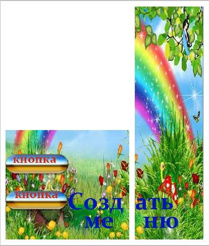
Fusion menu for the group
A merged menu is when the picture on the announcement of your menu is one image with the avatar. Below I will tell you in detail how to make such a menu, but for now, just see how beautiful it looks.
GIF and avatar in one image
But this option for the design of the cap really impressed me a lot. The automatically played GIF merges with the avatar into a single composition and attracts the attention of users, even though there is no information on it at all.
By the way, I saw this example in the group of SMM marketer Sergey Shmakov. So, for the find I express my gratitude to him :)
Hidden Menu
The hidden menu is available only for groups (pages do not have this functionality). To see it, you need to click on the corresponding link. The advantage of this design method is that users can see the basic information of the community, and if they want to use the menu, they just need to make one click. However, there is a small drawback here - not all users are aware of the existence of this function, so your menu may receive less attention than if it were pinned to the top of the page.
Automatically playing video
At the end of November 2015, an interesting innovation appeared on the VKontakte social network - as soon as the user visits your page, the video attached to the header starts playing automatically. With the help of this technique, you can attract even more attention of users (especially those who first visited your page), and at the same time, do not annoy those who do not like when their content is imposed on them, because the video is played without sound and practically does not interfere ...
How to add such a video to the header of your page?
To do this, three conditions must be met:
- Attach a video to a post and pin this post to the top of the community.
- Apart from the video, nothing else should be attached to the recording. Video and text only optional.
- The video must be uploaded by VKontakte - third-party players are not supported.
A post that gets a lot of shares
Another way to productively use the space in the header of your page is to pin one of your most successful posts to it - the one that has already gained and continues to gain a large number of likes and shares. Why do this, I think, is clear to everyone - the more reposts, the more coverage, the more subscriptions the page gets.
Announcements of new clips, albums, events
Presentation of new products / services
Discounts and promotions
Cases, customer reviews
Application Advertising
Practical jokes
Community rules
Links to other social networks
I have listed far from all the options for the design of the header. Basically, you can post any kind of information on the cover and pinned post: jobs, ads, links to top-selling products, etc. So don't limit yourself to the examples above. Get creative and use your community design to achieve your goals.
What should be an avatar
An avatar is not only a beautiful image with the logo of your company, but a working tool for a marketer, with the help of which he achieves his goals. Let's take a closer look at what it should be in order to attract the attention of users and encourage them to perform the targeted action. Let's start with a miniature.
Avatar thumbnail
- The text on the avatar thumbnail must be large enough to be readable.
- The text should not go beyond the thumbnail.
- Users should understand what is shown on the avatar.
- If possible, it is best not to use stock images, as they often diminish the credibility of the company.
- It is undesirable for the avatar thumbnail to be too dull and boring, otherwise it will get lost against the background of the brighter avatars of competitors.
- If you want your avatar to look modern, make it in a minimalist style: less text, shadows, gradients and elements that do not carry any semantic load. Your avatar should be as simple and neat as possible. This style is trending now.
- If your goal is to attract the attention of users and stand out from the background of other avatars in the feed, you will have to turn on imagination. Think about what you yourself look for when looking for interesting communities? Here I, for example, have repeatedly been attracted by avatars with a burning light, which usually indicates that a new message has come. This is a very old technique, but for some reason it still affects me - when I see such a light, I will definitely keep my eyes on it.


I am not suggesting that this trick will work with your page as well. The point I want to convey is that there are very, very many ways to stand out, you just need to ask this question and show a little creativity. For example, here is another interesting idea that I myself would hardly have thought of:

The avatar is a black circle: big and small. It would seem, why do this at all? But when you scroll through the list of communities, these avatars attract attention, because they are very different from everyone else.
What information can be placed on the avatar thumbnail
Although the avatar thumbnail is very small, it can (and should) be used to attract followers to your community. How to do it? Let's look at a few options:
New product / service / event announcement

Company / service / page advantages

Company phone number

Favorable prices

Free shipping

By the way, very often the information that the company provides free shipping is added to the name of the group itself, so that users will definitely pay attention to it.

Stock

Contests

Vacancies

What should be the avatar itself?
I considered what the thumbnail of an avatar should be and what text can be placed on it. Now let's move on to the avatar itself. The full version of the avatar will only be displayed in the community that does not have a cover image installed. It is for such cases that I wrote this section. So, what should be the avatar of your community so that users immediately understand that your company has approached the creation of the page responsibly and professionally.
- The avatar must be of high quality. How to achieve this, I wrote a little higher. For those who missed this part, I will say in a nutshell - the size of the avatar should be 2-3 times larger than what you planned.
- It is desirable that the avatar is combined with the menu: it has the same color scheme, has the same fonts, elements, etc. Thanks to this, the header of your page will look more neat and professional. Example:
- The avatar itself and the avatar thumbnail can be different. For example, you can draw a circle on your avatar, style it however you like, select that area as a thumbnail, and style the rest of the avatar in a different style.
- In order to encourage users to subscribe to your page or write a message to a company representative, you can place a corresponding call to action at the very bottom of the avatar and accompany it with an arrow pointing to the button.
- Try not to post too much information on your avatar, otherwise it will look overwhelmed and untidy. Add only the most important points to it and make sure there is "air" between them.

Another option is to split the avatar into two parts. One for the thumbnail and one for the rest of the avatar.


What information can be placed on the avatar?
Basically, you can place anything on your avatar. Unlike miniatures, here really is where to roam. Most importantly, don't overuse it :)
Site domain

Phone / address / opening hours

Contests / promotions

Most bought products / new items

information about delivery

Mobile app advertising

The main advantages of the company / page / product, etc.

Range renewal / new creativity, etc.

Information that your community is official

Information about upcoming events

Account addresses in other social networks

Extended page description

Brags

In general, absolutely any information can be placed on an avatar. I have provided just a few ideas so you can see what others are doing and be inspired by their examples. Well, keep in mind the basic recommendations: the avatar should be of high quality, the font should be large, and there should be more "air" between the elements.
How to create a fused avatar and menu
In order to make a merged avatar and menu, you need Adobe Photoshop or its equivalent. I will explain the whole process using the example of Photoshop. So let's go.
- Download the Photoshop template that I have specially prepared for this article. Regular size (menu - 510 pixels wide, avatar - 200) or zoomed (menu - 1020 pixels wide, avatar - 400).
- Open the image you want to base on.
- Copy it, paste it into the template and position it the way you would like to cut it.

- Add effects, text, graphics, and more.

- If you don't want part of the image to be lost (in that space, which is 50 pixels), move it to the right as shown in the following gif:

- Select the "Cutting" tool and click on the "Slices by guides" button.

- Delete unnecessary fragments (right-click - "Delete fragment") and edit the existing ones (right-click - click in an empty space - take the required area and stretch it to the required size).

- Go to the "File" section and select the "Save for Web" command.

- Navigate to the location where you saved the pictures (desktop or some specific directory) and find a folder called "Images" there. This is where your images will be. Now all that remains is to fill them in the page.

P.S. The height of the avatar can be changed at your discretion. I took the maximum size - 500 pixels, but your value may be less. For example, as on the Wiki Markup page:
How to use widgets
Widgets are also part of the design of the VK community. With the help of them, the user can: place an order, subscribe to your mailing list, take part in a competition, read and leave reviews, open a search in the community, receive a gift, a discount coupon, etc.
Here are some examples of what widgets look like on a VKontakte page:


How to style images for posts
If you are a web designer or have an artistic taste and a sense of beauty, then it should not be difficult for you to come up with a corporate identity for your images. However, it seems to me that such people in this article will be a minority (I, by the way, do not belong to them either). Therefore, let's take a closer look at how this is done, based on examples of successful companies.
By the way, please note that almost all well-known VKontakte companies brand their images, that is, they add a small logo, their page address, or a watermark. This increases brand awareness and protects your images from being copied. Whether it is worth doing, everyone decides for himself. The only thing I would like to advise: if you do decide to do this, try to make sure that your logo is not too bright and does not take up too much space, otherwise all the emphasis will go to it, and the image will lose its attractiveness.
Where can I get good images?
We have a good blog article on this topic - "". They are all free, but some require registration. If you don't find anything suitable for yourself, try searching for the keyword + wallpaper (or, if in English, wallpaper). Usually, high-quality images are released for such a request. But here you need to be careful and check the type of license, otherwise, if you have a serious business, you can run into trouble.
And what about those who cannot work in Photoshop?
If you have never worked in Photoshop (or any other graphic editors) and are not yet ready to take the time to master it, you can use the services that already have ready-made picture templates for different social networks:
1. Fotor.com


After that, on the left side of the screen, select the template that interests us. Please note that only templates that do not have a diamond icon are provided for free.


Paste it into the template, select it with the left mouse button, select the Layer command (sandwich icon) and click on Move to bottom. Thus, our picture will go in the background, and all the inscriptions will be superimposed on top of it.

After that, we change the text, font, font size, position of the inscription, etc.

Then click on the floppy disk icon, select the name, image format, quality and click on the Sign in to download button.

2. Canva.com
Another service that will help you decorate your image beautifully. It works on the same principle as the previous one. We register in the service (you can use your Google+ account or email).

Choosing our field of activity. We skip the step where you are asked to invite friends. We get to the main menu, where we select a Facebook post if we need a rectangular photo, or an Instagram post if we need a square one.

Select a template (if the template is marked "FREE", then it is free), change the text.

If necessary, upload your image, adjust the dimensions, change the text, font and position of the inscription. After that, press the "Download" button, select the image format and save it to your computer or any other device.

How to format articles in the editor
Recently, VKontakte has been able to typeset articles in a special editor. To create an article, you must click on the letter "T":

How to use wiki markup
Well, here we come to the most interesting and at the same time difficult section. Perhaps among the readers there are people who do not know what wiki markup is, and generally hear this term for the first time. Therefore, especially for you, I will give a definition that is given by "Contact" itself.
Wiki markup is a markup language that is used to format text on websites (usually belonging to the class of wiki projects) and makes it easier to access the capabilities of the HTML language. On our site, wiki pages are a good alternative to regular posts and text navigation. If you need to create a large article with different text formatting (bold, underline, headings, etc.) or add graphics to it, or just create a colorful navigation menu around your community - the wiki is indispensable.
Just like Wordpress (or any other CMS) has an HTML editor with which you create articles, so Contact has its own editor for creating and editing wiki pages. It looks like this:

With the help of this editor, navigation menus are created, as well as articles with pictures, videos and audio recordings. Below I will analyze in detail how to work in this editor, but first I ask you to add two links to your bookmarks. They will help you a lot in learning wiki markup.
The purpose of the creator of the group in social. networks attract more visitors. It is important that the guest wants to join, sign, read information, leave a comment or order a product. The need for the end result differs from the direction of activity.
The first seconds of the stay shape the further actions of the guest. That is why the interface plays a big role.
Guest leaving factors:
- avatar;
- description;
- title;
- beautiful and practical menu;
- colorfulness;
- content.
Creating a practical menu that encourages more than just action is easy. But first you need to figure out what it should be.
What should be the menu
Using a well-designed menu, the visitor can easily navigate through it and quickly get answers to their questions. Also, navigation allows you to create the right impression about the project.
The three main goals of the groups are:
- sales;
- increased traffic;
- an increase in active visitors.
For sales, group navigation replaces the storefront.

The most important buttons should be here:
- catalog;
- price;
- delivery;
- promotional offers;
- reviews.
To increase traffic, the emphasis is on the content and flavor of the site or blog.
An approximate version of a set of buttons:
- interesting articles;
- helpful information;
- subscribe;
- reviews.
To increase the activity of participants, you should stimulate them with promotions, polls and interesting and unusual content.
We offer the following buttons:
- subscribe to news;
- ask an interesting thematic question;
- stock;
- questionnaire;
- vote.
Consider how to create a menu for a group in contact, all the technical points that require minimal knowledge of a graphic editor and the basics of working with VKontakte.
We create in stages
Navigation creation is an interesting, complex and lengthy process. But the result is worth it.
The whole process is conventionally divided into 2 stages:
- work with photoshop;
- technical addition.
video: menu for the public
We work with photoshop
Before you start, you need to visually represent the design or general view, as well as its components. No special knowledge is required, just follow the steps in the instructions.
Algorithm of actions:
- install and run the "Photoshop" program;

- in the item "File" select "New";
- in the window that appears, set:

This is done using the Rectangular Marquee tool:

Working with graphics:

It should look like this:
Save the rectangle on the right as a separate picture, setting the size to 200x500 px. This is a ready-made avatar, loaded through the "Upload a photo" button in the VK group.

The second picture still needs to be divided by the number of points. This is done in order to assign a link to each button.
First, you need to make the markup:

Create fragments:

Saving images:

How to clean your computer of unnecessary programs? The instruction is here.
Technical part
The finished images must be transferred to the group. By following the steps below, this task can be easily dealt with.
Important! Filling the menu is different from the usual loading of photos or pictures.
Everything in order:

Now the most important thing is, in fact, for what all this was done. Add menu functionality. A separate picture must be assigned "your" link.
- find the required entry;
- click on it with the left mouse button;
- copy the url in the address bar.
- go to the source where you want to send the visitor;
- copy the required address.

Save the changes with the appropriate button at the bottom of the window.
Attention! Changes may not appear immediately. It is recommended that you log out to your main profile and then log back into the group.
How to create a menu in the Vkontakte group wiki markup
Wiki markup is a special language used to design web pages in social networking groups.

This tool allows you to create:
- effects;
- unusual menus;
- plates;
- navigation elements;
- format text.
In a word, this markup allows you to create a mini VKontakte site. This is great especially for sales and recruiting subscribers.
This design intuitively makes the visitor stay, click on the button. That is, it delays and stimulates to action - and this is exactly what is needed.
Visually, such a system is very similar to HTML layout. But it does not require long training and a special mindset.
Video: menu with search by category
Nuances of creation
Actually, what was done above (splitting and loading an image) is already markup elements. This is the advantage of this tool. Automatic conversion to tags when simply uploading images.
However, it is important to know the individual tags to help make it even more functional and beautiful. For example, when we fill individual parts of the image, white stripes may form between them. You can remove them simply by adding the noborder tag.
Like this: []
The main tags are presented in the table below:

Working with pictures
[] .
Where options is replaced with:
- noborder- removing the frame around the image;
- nopadding- removal of spaces between images;
- plain- insert a link to a picture. Drawn up in the form of text, without graphics;
- nolink- removal of the link to the picture;
- box- opening an image in a window;
- NNNxYYYpx or NNNpx- sets the size of the photo in pixels.
Creating a table
Regardless of which menu (textual or graphical) you create, you can hardly do without inserting a table. Otherwise, you can just paste the text into the news field and not format it, wasting so much time.
The table is created using a special set of characters, where each of them is responsible for a specific part of the table:

Today I will continue my "Dive into VK groups". In the third part of the "series", I told and showed,. Today, let's talk about the design of the VKontakte group menu!
In the first article on creating menus, there were many questions in the comments, so before starting a new topic, I will answer frequently asked questions.
Question 1: The first and most common: "Where is the code in the menu?" or "If there is no bookmark when editing" Source code "how to add an internal page?" or "I still don't understand what to do if the code does not appear!"
Answer 1: VK changed the editor, now to switch between the visual editor and the code just one click (upper right corner of the editor):

To check which editor you are in: move the mouse over this button, write some text and highlight it in bold - if not ordinary characters appear, then this is a code
Question 2: The second, really problematic: “ but how to remove spaces between pictures ??»
Answer 2: I admit, I was scared myself when for the first time the client's menu "went". Now I fix it quickly, and then it was not fun. See:

Add nopadding tag; and everything will fall into place!
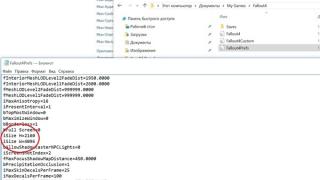
Space creeps in between the pictures and the menu looks broken. For the uninitiated, maybe this is not normal, but for, it is at least not professional. So what's the deal? Ah, everything is very simple! Some updates are constantly taking place in VK, new algorithms are being introduced ... and even the editor is crooked ... it happens for no reason, no reason, important tags drop out of the code and then we see such a picture. To fix this, you need to look into the code and make the necessary adjustments. The code format should be like this:
Template: [] Example: []
Usually, the menu pictures move apart because the code drops out nopadding; - we insert it into place and everything is aligned. Before saving the result, click on the "Preview" button to make sure that everything is smooth.
Question 3: News. In October 2012, forcibly, Vkontakte cut off the autos of groups and publics. Now their size has a common standard of 200x500 pixels. So, if you had more avatar in your group, then make an update (update your avatar).
By the way, along with cropping, VK introduced another innovation regarding group photos: now, by clicking on the avatar, we, just like in the account, will be able to see all the albums of the community. It's comfortable! And from this a new functionality is drawn in the group's communications.
So-a-ak, we have finished with the questions ... now we turn to the very creation of the menu!
Step 1. How to create a menu in a contact and make nested pages:
First of all, let's make sure that you know how to create a group menu in contact and go over a short instruction:

How do you like my cheat sheet?
Here's a cheat sheet I got! For the sake of clarity, I will write down each number:
Do this with all the nested pages and your menu will be ready.
There is! We created the menu, made the inner pages, filled them in, now let's move on to creating a beautiful graphical menu.
Step 2. How to create a beautiful graphical menu in contact and put it:
I will not give you the whole theory of how wiki markup works in contact, we now have other goals. To create a visual menu in the VK group, you do not need to know the entire wiki markup. Let's move on to creating a visual menu!
First, I'll show you the code and the result of my menu:

I admit, I made it on purpose to write this article. All "hands did not reach", you know, as "a shoemaker without boots." But now I am with a visual menu in the VK group!
I will not tell you how to draw a picture for the menu, this is the business of designers, I draw myself, but not so professionally. , at the end of the article, I gave a video on how to draw a simple menu in Photoshop, check it out, maybe you can do it on your own. If not, order a picture of the menu from.
I will show you an average menu setup option. The difference is in the number of items. The menu, which is simply cut into strips, is the simplest execution of it. The more clickable buttons in a row, the more difficult it is to execute. Although, knowing the feature, everything is simple! It's only a matter of time. So, the width of the image should be:
370 px - if you have two or more objects in a line, like I have buttons for social networks
And max 388 px - if we cut the picture in a simple way, only into lines, without dividing into small objects. This is the feature that you need to know when cutting a menu into buttons. My image size of the entire menu is 370x456 px.
After the picture has been cut into the required number of objects and saved into a separate album, upload this album to VK. Upload to your account profile, not to a group! Since there is no longer an option to hide albums in the group's albums. A technical album in a corporate (for example) group is not needed at all, so we hide the menu items in the account album:

VK technical album
After you have set up the "Only Me" privacy. We proceed to the installation of the menu itself. I will give you an example of code that would be a template for you and we will analyze what it consists of:
[]
where, photo7632142_296911699- this is the address of the picture! We look at it in the address bar of the picture:

From the first picture, we will start to insert the menu into the VKontakte group
You need a short address of the picture, for this go to the album itself:

Go to the album itself to get the desired image address!
... and starting from the first picture, drag them to the group menu.

Add the size of the picture to the menu code!
So, the address of the picture was added, the size was indicated, now we put the tag nopadding;- it is needed so that our pictures fit snugly together. And the last step is to put a link to the page where the visitor will go after he clicks on the picture.
Here's a little clarification! We write external links, links to VK albums and discussions in full, and links to internal pages in the format page-32734125_44298120... At the beginning and end of the line, do not forget to put two square quotes and no spaces.
Clarification 2: When we link to internal pages without images, we use single square quotes for discussions, albums, and external links.
Lines containing two or more elements are inserted into the code without spaces. Insert each line of the picture one after another. Because if you press Enter after the line with the picture, the picture will jump to a new line and the menu will move. We need the menu to be displayed in one piece, so we don't need any extra spaces and "irters"!
After you have transferred all the pictures to the menu and designed them (size, link), save the result and admire our work! Everything! Ready!
If you are actively promoting your group and want to make it more, then you probably know that a beautifully designed group is a very important aspect of the development of your brand, but before you think about the design of your Vkontakte public, you should think about the purpose of your VK group!
As a rule, an SMM specialist, after completing the creation of a VK group, begins to fill it. It is the content that can hold people back in the group. But you just need to do it efficiently and competently! After the group contains: descriptions, recordings on the wall, albums with photos and videos, audio recordings, you should start implementing the functional menu. And let the menu at the beginning of the journey be not superbly beautiful, as we used to observe at the beginning of work, but rather unpretentious. First of all, the usefulness of the existing content is important!
In this article you will find information on how to create a VK group menu yourself! Therefore, if you are puzzled by the question: how to make a VKontakte group menu, this review is for you!
Quick navigation:
What is group menu
The menu can be considered a list of all available public functions. Through the menu, you can put all the important elements in one neat and beautiful list, set an individual icon or image for a specific link, send notifications to visitors about the planned changes quickly and easily. You can display the following elements in the menu: all kinds of links to third-party sites, callouts for discussions, music, albums and other subsections within the VK site, images and the usual structure of your public. Based on the instructions below, you can, by your own efforts, make a menu for your Vkontakte community.
Creating a Vkontakte group menu online
If earlier, to create a menu, you had to bother entering various codes, which is quite difficult for people who do not have programming skills, now you can create a high-quality and beautiful menu for a group in online contact using specialized seris.
So, now let's take a closer look at how such constructors work. It is worth noting that they all have identical functionality, so having figured out one thing, you can freely work in any of them.
The principle of creating a menu can be divided into several steps:
Step 1. Decide on a template for the design.
On sites that allow you to create a group by templates, professional designers work, who draw dozens of templates of different styles and colors with high quality. You can choose the one that is right for your group. Subsequently, you will have the opportunity to change the template at any time.
Step 2. Determine the number of buttons.
Decide how many button links to different pages will appear in your menu.
Step 3. Specify links and labels.
Step 4. Verification and export.
Make sure the rendered menu works the way you want it to and then upload it to your community. The services will independently produce all the necessary pictures, generate a code, and, with your permission, upload everything to your public.
Step 5. Making changes.
If you need to make changes, for example, add new buttons, fix links and labels, change the design, just go to your account, make changes and export the menu again.
As you have already seen for yourself, creating a high-quality, affordable and beautiful menu using special servers is the best option for VK administrators. It is worth noting that such servers offer free services only for one time - trial. Subsequent use of such resources must be paid for. But, despite this, the result of using the functionality will undoubtedly justify your investment.
Banner for the Vkontakte group, create for free!
There are specialized sites where, without much effort and software, you can make yourself a beautiful banner for the Vkontakte group. For example https://bannermakers.ru/banners-vk/.
In addition to creating a menu in this way, there are also ways to make a menu in the VK group and in another way. Read about it below.
VK menu wiki markup
Wiki markup is a great helper in building a beautiful and effective community! This is a very convenient and effective way to design a public in the popular VKontakte network. This markup is very similar to html code in terms of its action. But for those who are not related to programming,
it will be more understandable due to the ease of implementation. This markup got its name thanks to "Wikipedia", where numerous users for the first time got the opportunity to familiarize themselves with the main features of its functions. Wiki markup allows people without programming skills to easily and quickly design a group:
· Create spoilers and tables graphically.
· Format images and text.
So, let's move on to analyzing how to make a menu for the VK community?
Of course, in the process of designing the group menu, additional recommendations may be required, but in general, you can figure out the principle of creation using this guide. If we consider html, then for its research and work with it you need to spend several days or about a week. Working with Wiki markup with good memory will only take some time. How should you create it? What approaches should be taken?
Let's dwell a little on its history, and then we'll talk about technology. Ward Cunningham first introduced people to the concept of "wiki", which means "fast" in Hawaiian. Thus, he expressed simplicity and speed in using markup.
Fast registration
Now we will consider the questions: "How to make a menu in a group in VK", and clarify how to effectively implement it. In the process, you can go in several ways, each of which has its own direction and leads to the final goal - the presence of a high-quality group menu.
We will sort it out in order. If the group carries a sense of social direction, then you can implement a text menu. Its advantages lie in its serious appearance. For commercial and entertainment communities, it is desirable to determine the rate on the menu - graphics. Do not forget that there are ready-made templates for the VK group menu. The use of images will draw the attention of visitors to what should be visible. Taking this approach will give you the opportunity to make the group more fun and relaxing. Wiki - markup allows you to create a group menu with pictures and photos, create tables, embed and open links, and much more. Of course, this is far from the entire list of functions, but it is also easy to design the menu of your community and on a rather impressive scale.
Basics of Wiki markup in creating a menu for a VK group
 Themed pictures and photos will allow you to create a menu of the VK group, beautiful and interesting. It is important to know that on VKontakte it is possible to insert the necessary photo or picture using wiki markup only when they have already been uploaded to the site's albums. So, go to the album, decide on the desired photo and copy its address. Let's say, let it be like this: photo14523_90678. Now you need to enclose it in double square brackets. There should be such a result: []. But what if you need to attach a link or text to a picture or photo? Or maybe there is a need to edit the external image? Then the following action will help here: you need the file to look like this - [[photo14523_90678 | options | text / link]], and instead of the last three words, you need to substitute what you need. Text - enter what you need. Additional explanations will probably be inappropriate here. Link is translated from English as "link". It is indicated so that the visitor's car understands where it needs to go. Options - these values are set here:
Noborder - removes the frame around the photo. Box - the image is located in the window.
Nopadding - spaces between pictures are not displayed.
NNNxYYYpx or NNNpx - indicate the size of the picture (in pixels).
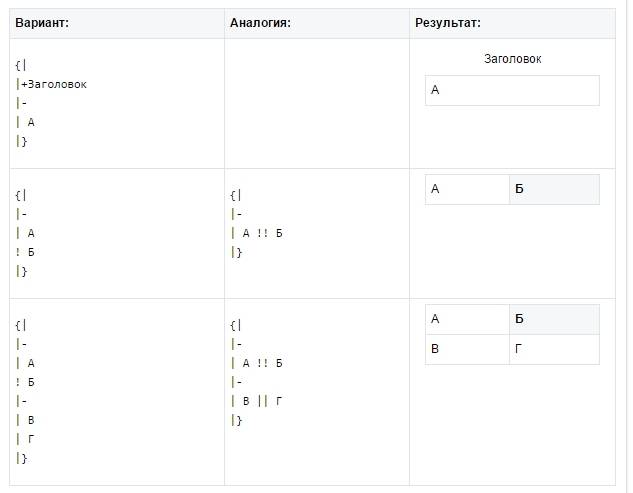
As a rule, it is necessary to embed an element to the text and graphical menu of the VK group that allows you to present information in a form convenient for the visitor, namely a table. Few community on VKontakte can do without it. To create a table using wiki markup, you need to apply a certain list of symbols. Next, you will find out what functionality this or that symbol is responsible for:
(| - designation of the beginning of a table. It is impossible to do without this symbol when creating a table, it is a required attribute.
| - used to give the cells a transparency effect.
| + - using this set of characters, the table name is centered. This is not a required attribute at all, but it should be placed immediately after the signs that characterize the beginning.
| - - this is how new lines are denoted (also for cells).
Renders a dark color. In the absence of this symbol, it is necessary to use the sign from point 2.
|) - a set of characters denoting the end of the table. This is an optional attribute. But it is still recommended to use it to prevent an error from occurring.
Now let's look at how cell filling is done. All information that must be entered in them is placed after the | signs. If it is necessary to separate cells from one another, you just need to duplicate this way: ||.
Now you have studied the information step by step on how to make a menu in the VK group using wiki markup. The example of compiling a menu for your public will become even clearer to you.
How to make a menu in a VK group with a new design 2018
The new design of VK not only brought convenience to the site's functionality, but also some confusion for public administrators. In this section, we will go through step by step how to create a menu for a group in a new design.
So, the guide on how to make a menu in the new version of VK quickly and most importantly without errors in the code is in front of you. By following the instructions exactly, you will be able to create the menu yourself, correctly and quickly! Let's start!
1. Open the menu image in Photoshop or another graphics editor.
2. Examine the size of the picture and if it exceeds 600 pixels in width - change the size to 600, the height of the picture changes proportionally, we do not set it manually!
3. We use the tool "cutting" and cut our image on the buttons.
4. Save the picture in the "for WEB" parameter. Now the Photoshop job is finished. Let's go to the community.
5. Go to the community settings in "Materials", select "Restricted" and click "Save".
6. Go to the main page, in the subsection "latest news" click "edit".
7. So we ended up in the Wiki editor, now the most basic activity will begin. Change the column "fresh news" to "menu" or any other and click the camera icon, insert all the sliced pieces from the saved folder.
If instead of the code, pictures appear immediately after entering the wiki markup editor, you must switch the wiki markup mode!
Now we have the code for our menu, but it needs to be slightly modified to remove the spaces between the images. Our code now looks like this: [] [-] [-] [-] [-]
Moving on to the preview, we will notice that the images are not where they should, and, in addition, there are gaps between them.
8. Correct the code: By default, VK has a built-in resolution for the maximum image size in width of 400 pixels, the first button turns out to be 600, change the parameters of the first button 400x89px to 600px, you don't need to specify the height. We also enter the following tag into each line: nopadding must be separated by a semicolon.
Important! Do not click on ENTER after lines of code if you want two buttons to be side by side, on the same menu line. The editor will automatically transfer to a new line those parameters that do not fit! This code should be after editing:
[][-][-][-][-]
Now, by going to the "preview", we see that everything is in its place. Add the necessary links to each of the buttons in the code; for an illustrative example, the link to the first button is unclickable here! Don't forget to remove the extra space between | and ].
[][-][-][-][-]
After making sure that everything is done as planned, click "save" and return to the page. Please note that in the new version of 2018 there is no "return to page" button, so you just need to click on the page name at the top.
9. Now we need to pin our menu. To do this, copy the link to the page from our menu and return to the main page of the group.
10. In the new message field, you need to paste the copied link. After a piece of the menu is displayed, the link must be deleted! And through the camera icon, you need to add a pre-prepared image for the banner. We put "on behalf of the community" by clicking on the circle to the left of the "send" button, and click on "send"
11. Now let's fix the menu, refresh the page and evaluate our result. The whole work, slowly, takes about 15-20 minutes.
How to make a menu in a VK group with transitions
Now let's look at how you can make a VK group menu with transitions.
So how do you make one wiki menu inside another? First of all, the first menu should be ready. Let's start from the picture already cut into buttons. Add the cut pieces of the image through the camera stash in the wiki editor. If pictures appear instead of the code, then the wiki markup mode is not enabled, before adding the image, click<>
Don't forget to click on "Save" at the bottom of the page! If necessary, you can change the size of the image and add the nopadding tag to the code, it is absent by default, and the size of the image should be a maximum of 400 pixels in width, if the image needs to be corrected to the desired size!
1. After editing the code, save and click "return".
2. Check the correctness of the display of the first menu.
3. If everything is as it should be, click "edit" again.
Now we need to create a new wiki page where the second menu will be located. At the very end of the code, we write the menu value for the VK 2 public, well, or any text you need. We save and go back. An active link with a new name should appear at the bottom. For the greatest convenience, open it in another browser tab.
While your newly generated page is still empty, click "edit" or "fill with content"
Just as we did at the very beginning, we add sections of the second menu, save and see how the new menu looks like.
If everything is as it should be, copy the link to the new menu page in the address bar of your browser.
Let's say a new menu should open when you click on the "Reviews" button of the first menu. You need to go to the tab where we formed the first menu and find the third line and paste the link from the clipboard, save and return.
Thus, when you click on the "Reviews" button, our second menu will open.
How to make a VK group menu from a phone
 If you are "lucky" to work as an administrator of VK groups or create your own group with only a phone, then if you adapt, it is quite possible to make a group menu from a phone without experiencing much effort.
Everyone and everyone knows that the creators of VK offer their user a fairly convenient mobile version, and earlier you already learned about different ways to create a menu. But, manually entering codes using wiki markup is possible, but not very convenient. But downloading a template from the sites of specialized services and inserting it into the necessary columns is quite simpler and more convenient, and it will not take you very much time. Thus, you can administer Vkontakte groups simply and conveniently.
Vkontakte group menu templates
All of the above methods to create a VK group menu are quite simple, and if you apply them in practice, you can make sure that there is absolutely nothing complicated in this. Getting used to embedding pictures and tables using wiki markup is quick and easy. But it is even faster and more convenient to use ready-made templates for the group menu, which can be found either on the resources mentioned above, or downloaded from blogs and sites of the same users.
It is worth noting that templates imply the presence of pictures and images of various topics. They also have a versatile design. If you don’t have time to search for images, or you don’t have enough imagination to create a bright menu, you’d better use ready-made menus.
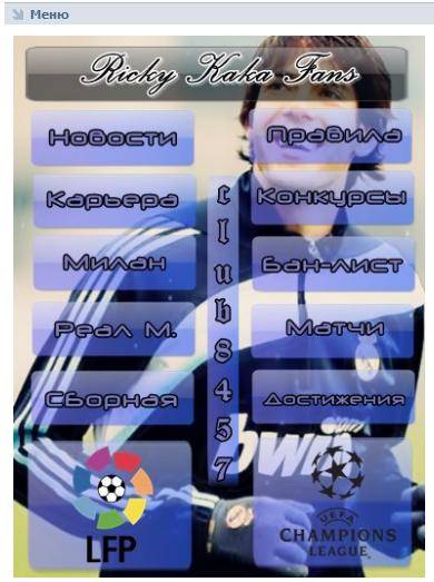
I think everyone who actively uses the social network Vkontakte has already met beautifully designed groups and publics. Many of them, in addition to the menu, also have a lot of stylized nested pages, directories, etc., which in fact creates a small site right inside the social network.
Here are some examples so that everyone understands what this is about.


Such groups allow you to stand out from your competitors and attract more users. Especially if the content is interesting too :)
Within the framework of this article, we will talk about how this is all done. To disassemble everything in more detail and delve into all the subtleties, let's take a specific example. There will be a small master class on group design.
The very first stage of our work is an idea. We need to understand what we want to tell and to whom. There are several formats of communities in the contact and it is worth choosing based on the tasks set. Although in the future, the group can be converted to a public format and vice versa.
I explain it on my fingers. Public- this is something to compare to a blog. Newsline. In other words, we tell our subscribers about some things and they will not be able to write on the wall of our community. The maximum is to comment.
Group allows you to create a more open community for conversation and discussion, where people can post on their own behalf in the feed. You can also add friends from your list to it. There is no such possibility in public. In addition, the group has a little more options for integrating wiki markup (there is a "News" section in which you can integrate the menu).
Globally, you can reason like this: if we need to create a community for the store, then I would take the "public" format. If we are talking, for example, about fishing enthusiasts, then it is better to take a "group". Although, everyone is free to do as they see fit. After all, the format can be changed at any time. However, keep in mind that Vkontakte introduces a restriction on re-changing the community format and after the first time you will need to wait several days before you can return everything back if necessary. Therefore, it is better to test the functionality before the group begins to be filled with content.
As part of this master class, I will take the Mad Max game based on the movie of the same name, which was released just a couple of weeks ago, as a starting point and will create a community for players with various materials on this game. The main goal is to drain traffic to your gaming site.
The format will be "Group", since you need to create a natural flow of audience and maximize communication within the community. I will clarify right away that I will use a universal technique that can be applied both in a group format and in a public one. It works everywhere.
There is a lot of content, we are starting to bring the idea to life!
Group creation
To create a group, go to "My groups" in the right menu of your Vkontakte account and click on the blue button at the top "Create community".

This window should appear, where we enter the name for our group and select the format.

After entering the necessary information, a control panel for our community opens in front of us. In my case, it looks like this.

As you can see, I added a few parameters: I included video, audio recordings, discussions and a number of other features that will be useful to me in future work when collecting content. All this can be further changed without any restrictions. I also registered the address of my site. If you do not have a site, or its subject matter does not correspond to the community format (they are about different things and are not related to each other in any way), then this line can be left empty.
In this case, I set the age limits from 18, by analogy with those that the developers put up for the game. Although I have almost no doubt that children are also playing.
Everything. The group has been created!

Now you can start to design it.
Vkontakte group design
This stage can be divided into 2 components: graphic and technical. To work, we need a template for creating a group avatar and a menu, as well as a little imagination and basic knowledge of Photoshop (aka Adobe Photoshop).
Markup template
What is a template and what is it in general? A template is a kind of blank. In this case, in * .psd format, we have marked areas for the picture under the menu and the group's avatars.

As you can see in the second example at the beginning of this article, we can make the design in the same style for the avatar and menu picture. At the same time, it visually cuts it into 2 parts. So the template allows you to form an image in such a way as to eliminate the displacement of the graphics and fit the pictures to one level as much as possible.
To make it clearer, here's an example.

We can see that there is a stripe on both sides of the picture overlooking the residential area. It is almost impossible to do exactly the first time without using a template. You will need to adjust the images, measuring out the discrepancies down to 1px. Whereas when using a template, we simply add graphics to it within the markup and immediately get the desired result.
I want to note that this template is designed for 1 line in the explanation. In the screenshot of the example, there are phones. If the second line appears, then you will need to use a different template, or fix the design manually.
In the meantime, we proceed directly to the graphic design of our new group. Here I take the path of least resistance and go to Google Images to find design pieces. You can also use Yandex. Who likes what more.
I do not have a design education, so we will not dwell in detail on the selection of fonts and other trifles. After some magic in Photoshop, I got the following result.

On the left fragment (where the inscription "Menu"), you can also add several triggers. In this case, I decided to do without them. Everything. The avatar design is ready. Press Shift + Ctrl + Alt + S hotkeys in Photoshop and save our fragments to a folder on your hard drive.
The first stage of working with graphics has been completed. We return to contact.
Setting the avatar and menu for the group
We click on two types in the place of our group's ava and load our image there. These guys, underneath them also says "Upload a photo".

Add a picture. Specify the fields and select the thumbnail. Everything is simple here and there should be no problems.

As we can see, you need to know the community id. It's very easy to find out. We find the menu in our group (right below the avatar) and open the "Community statistics". In this case, something similar will appear in the address bar of the browser (the numbers will be different).
These numbers after "? Gid =" are the desired group id. We insert the resulting value into the script form and write the name for the page that we want to create. In this case, I drive in "Menu".

It should be noted that the page will be created only if the window with the group is open in the adjacent tab. Simply put, you must be logged in to VK in the same browser. Indeed, only the group administrator and the people assigned to them have access to such manipulations. A casual passer-by cannot easily take and change the settings of a group, in the admin panel of which he does not have access.
If everything is done correctly, this page will open.

This is the very window where we will later make the wiki markup and create an internal menu for our group. For now, it is enough for us to write something here. After that we press the blue button "Save page" and at the top we press the link Return to the page.
I wrote a "Menu" for myself and my page after saving began to look like this.

There is no design yet, but now we only need a link to this page. We pick it up in the address bar of the browser and return to the main page of our group. Into the tape.
Here we create a post with the following content: insert there a picture and a link to the menu page for the group.

Click send. After that we click on the time of sending the message and select the "Pin" item among all the options. We update the page (F5 key on the keyboard) and, if everything is done correctly, we get the first result: the group has acquired an avatar and a link to go to the menu section.

Wiki markup of the Vkontakte group menu
Now let's start designing the menus itself. Go back to Photoshop and create a design for our menu. When designing the interface, you need to remember about those people who will enter VK through the application from mobile phones. In other words, we should not have small elements and besides, we should try to make everything as clear as possible. In order not to have to guess how everything is arranged here and where we should click ... but simply poke at the desired point and study the required information.
Now I will not dwell in detail on how exactly I assembled the menu. That's what I did.

Minimum of fields. Vertical layout. Ideal format for responsive menus. That is, nothing will go anywhere on mobiles. Everything will be exactly like on the screens of computers and tablets. I take the width of 500 px, so that later nothing will shrink and not lose the quality of the image twice. Height is not important.
Cut the image into fragments and save them.
Everything. It's time for the final chord - we collect the menu already in the group itself.
To do this, we return to the group's main page (where the feed and our link-picture leading to the menu are). We click the mouse on the image of the menu and get to the very page that we created earlier for the menu.
If you are the administrator or the creator of the group (in our case, this is the case), then at the top of the page there will be a link "Edit". We click on it.
Then we go into the wiki-markup mode (under the close button in the upper right corner of the page, such a frame is drawn with<>inside). When the desired mode is activated, this button is outlined in gray.
Then we poke at the camera icon and add all the fragments of our menu at once. In wiki mode, we will not see the pictures themselves, only the code of these images with sizes and parameters.
I want to position the menu in the center so that there are no gaps between the fragments. Therefore, we wrap each of the elements in a tag
The first and last menu items should not be buttons - in my picture it is just a graphic element without a link to an internal page, so we add the "nolink" parameter to them. This will remove the ability to click on this element to open a piece of the picture in a separate window. Now nothing will happen from a mouse click. This is a normal page background. Inactive.
In my case, the menu code looks like this.

Separately, I would like to note the fact that after importing pictures into VK, the embedded system sometimes incorrectly indicates the size of the images. Therefore, you need to closely monitor this and exhibit exactly those that we planned at the design stage of the design. Otherwise, everything can go wrong and the puzzle will not work out in the end.
When we have written the code and aligned all the elements, we save the page and see the same thing as in Photoshop.

The final touch remains - you need to create the very pages where our menu will send people. To do this, we will again turn to the script for generating wiki pages and this time we order three pages at once. In this case, you also need to write something on each and do not forget to save their addresses somewhere from the address bar of the browser.
Then we insert links to new pages into the wiki code of the menu in the form of page-102302049_51013384, where the first number is the group id, and the second is the page number. Although, this is generally not important. After all, we just need to copy this piece of URL and paste it into the markup.
As a result, the menu code takes the following form.

Outwardly, nothing has changed. But when we click on the menu items, we can see that now it works!
As for the markup itself and the rules by which the code is written, I advise you to read the Vkontakte group specially dedicated to this matter. The guys described all the key points and in their catalog you can easily find the necessary element and figure out how to add it to your wiki page.