Today I will show you how to make a smooth transition between two photos.
I made a picture in advance and this is the result I got:
In order to get such a picture, I will take two photos, which I will combine.
I took a beautiful background with the sea and a photo of a girl who was photographed against a background of gloomy trees without leaves.


So let's get started - I will do smooth transition of colors and for this I will follow the steps below:
Step 1
Opening my photos in Photoshop and using the tool Moving drag the girl's photo onto the marine background photo.

I want to reduce the photo of the girl a little and for this I call Free transformation by pressing the keyboard shortcut CTRL+ T.
The frame that appeared around the photo with the girl has nodules for which you can pull and reduce the size of the photo, while holding the key Shift, so that the proportions of the image are not distorted.

Step 2
Now I go to the palette Layers and being on the layer with the girl, click on the icon called Add vector mask.

As we see in the palette Layers on the layer with the girl, a layer mask is formed, which is highlighted with a frame, which indicates that the mask is active and all the work that I will perform will be carried out, namely, on the layer mask.
On the top panel, where all the tool settings are located Gradient i click on arrow next to the tool icon and in the gradient window that appears, I choose radial gradient, which goes from black to transparent.

Now I draw the gradient lines before reaching the girl's shape as shown in the picture (you may have more directions). As you draw a gradient line, the background fades out.

It took me two or three times to draw a gradient line in each of the directions indicated in the picture to achieve the result that you see in the picture below.

Step 4
However, we can notice that with the disappearance of the background belonging to the girl's photograph, the image of the girl itself has also somewhat changed, since in some places it has become translucent.
But it is very easy to fix it.
While on the layer mask, I take a soft round brush white and paint with this brush on the girl.

The white brush restores all the lost areas of the girl's image.
And we also want to remind you that you can always chat about Photoshop topics on the Photoshop forum and find answers to many of your questions.
Here's the result:
I have merged the two photos together using a blend.
I hope I explained clearly how to make a smooth transition between the two photos - as you can see it's pretty simple.
I also advise you to look at my previous lesson. Valentine in Photoshop, in which there are many interesting things.
I wish you continued success in mastering Photoshop!
Galina Sokolova was with you.
1 voteGood day, dear readers. Today I decided to prove to you that the best way to learn theory is through practice. Even if you are a beginner, in literally an hour you can achieve a good result without understanding anything in Photoshop! Look, this picture was created purely thanks to gradients. They are applied to different elements and in different variations.
If you read this article to the end, you will not only learn how to make a smooth color transition in Photoshop, but also apply this knowledge in practice in relation to text, a shape, create beautiful flickering rhombuses and much more.

I have already made this picture. If you want, then you can create on your own exactly the same, or maybe even better, but I will teach you by a different example. Which one? Find out at the end of the article. I will draw with you and describe the process at the same time, I myself do not yet know what I will get. Thanks to this, I will be able to see what problems you may encounter and help resolve them.
Basic knowledge and one secret of always winning option
So, first we have to open Photoshop. I highly recommend you download this program ( you can buy the licensed version here ). You will never find better than her. If you are afraid that you will not master it and will waste your money, completely forgetting about the program after the first attempt, you can try the online service https://editor.0lik.ru/ ... It is much more convenient to have your own program and very soon you will understand why.
This is what the 2015 version of Photoshop looks like, if you have a different edition, then don't worry. Everything will be about the same. You have slightly fewer options and this is the only difference.
Create a new document.

Choosing a size is one of the most difficult questions for me. As a basis, I took the maximum image size for a post on social networks. 800x500, but, as you can imagine, this is not the point. It all depends on the goals and objectives that you are going to perform with Photoshop.

Look, the panel on the right contains all the main buttons, including the gradient. However, it cannot be found now. How so? I myself faced this problem when I started learning how to work with Photoshop. You read an article, and half of the information you have to look for in third-party sources. Google, Google, Google.
May a very clever reader forgive me, who knows everything very well for small deviations from the topic. I want all blog visitors to be able to work with my lessons. Perhaps someday it will be very useful for you. It will save you a lot of time.

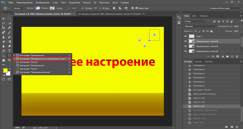
In the lower right corner of almost every button, except for the magnifying glass, there is something like an arrow. This indicates that there are several tools hidden in the button.

Hold the left mouse button on the button for a few seconds to open an additional menu and select a gradient.

Another additional menu opened at the top. It is used exclusively for gradients. Poke at the text - a special text menu will open at the top, a brush and ... well, you get the idea.

Click on the arrow next to the color icon. This is where standard transitions or those you downloaded are stored.

If you do not consider yourself a design genius, then I recommend that you download free templates from the Internet. There are plenty of them. Firstly, it saves time, and secondly, several similar options, as a rule, are combined into a theme created in the same style. this can be easily applied to one picture and it will almost always look good.

Installing new templates is no problem. Download them from the Internet then select the nut in the upper right corner and find the link "Download ...".

Select the folder with the downloaded files on your computer and save.

They will be added to the bottom of the list.

Fill
Now let's learn how to fill. Choose any option you like (we will move on to creation a little later) and click on it. Anywhere on the screen, hold down the left mouse button and move in any direction. The location of the color transition depends on it.

See the difference.

You can twirl anywhere.

To prevent the movement of your line from shifting and the gradient from blurring, hold down the Shift key while setting the direction.
You see, the color transition is now in the center. We'll take a closer look at the settings when creating our own gradient. Now I will only talk about the center offset. We click on this plate.

Grab the color below with the left mouse button and move it to the left or right.

Here's what I ended up with.

How to apply a gradient to text to make letters look modern
Now let's write something. We select the corresponding button.

If you need to change the size or the font itself, pay attention to the panel at the top of the screen. Everything is simple there.

Now press Ctrl and at the same time click on the icon of the new text layer. Be careful, you need to click not on the text, but on the rectangle, as shown in the screenshot below.

Now we create a new layer. There are three options for solving the problem: we simultaneously hold down Shift, ctrl, N; use the panel on top, find there "Layer - new - create"; use the button in the quick menu on the right. In the picture below, I showed it with an arrow.


Now, to remove the highlight around the edges of the letters, you can click on the selection, and then click on any part of the picture. You get the following result.

The work with the text does not end there. Look, we have 2 layers: one with a gradient, and the second with letters. Why did it happen there? I will explain as I can. Write in the comments if it's not clear. You wrote the text. Photoshop realized that these were letters and even suggested that you enlarge them, reduce them, change the font, and so on.
Then you have selected this piece. We created a new layer, if we draw an analogy, cut out a stencil from paper and filled it. At this point, Photoshop got lost. He stopped seeing your letters. For him, it is just a part of some picture, like a rhombus, square or circle in the carved center. If you go to work with the letters on the layer, you will fail, if you want to apply a gradient to the text - the same thing.
If now you decide to move the text somewhere and you climb into the corresponding section, and then begin to move the arrow, then everything will move out for you.

We are removing the text layer to avoid confusion. Click on it with the right mouse button and select the desired option.

Gradient views, shape fills, and asterisks
If you paid attention to the gradient bar on top, you might find that they are different: linear, radial, angular, mirror or diamond-shaped. It is not difficult to see the differences, for this you do not need to read the articles, just open a blank sheet and try to apply one or another option. See what happened.

The only thing worth noting is that if you want to see the perfect result, like in my picture, the arrow needs to be directed from the center.

Now let's get back to our picture. Let me teach you one interesting trick. Color transitions can be used within the shapes that you draw. This is very useful, especially for those who are going to create websites.
So, choose a rectangle or a circle. It does not matter.

Now the fill color.

Go to the gradients section.

We need a rhombus here.

You see, this is an interesting effect, but the white color spoils everything. We need a transparent one. Found inside templates. If you see such a grid inside the template, then this is what we need.

Play around with the settings and you will have your ideal one.

Now let's clone this flash. Choosing a move. Just click on the button.

Now hold down alt and drag the duplicate to the side.

I got the following result.

How to create a new gradient and buttons for websites
And finally, I'll tell you how to create gradients from scratch myself, and at the same time figure out their settings. Let's create a nice button? I will add a rounded rectangle to my picture.
This is how it looks. This time we will not use the inner fill. It is not very convenient to work with a new template through it. Let it be just black for now.

Select the familiar tool and click on the plate.

New gradients are based on old ones. Click on any. The old version will not disappear anywhere. Then just come up with a new name for it and save it.

The upper control points can be used to control the transparency levels.

With the help of the lower ones, work with color is carried out. To expand the gamut, click next to any point and it will be duplicated.

You can create as many as you like.

To make the transition look modern, you need to smooth out the colors. Do not touch this indicator and everything will be ok. It should be 100%. Ready. You can click on "OK" or "Save" - it all depends on your desire.

Now we repeat what we have already done recently with the text. Hold down ctrl, poke the button of the desired style in the center and create a new one based on it.

Now add the transition and voila.

Add text to the button and that's it. It is not clear why the necessary contraption is finished. By the way, you can download my source if you like ( Download gradient.psd source ). You can open it in Photoshop and enhance my picture. I think it won't be difficult.

So that is all. You now know quite a bit about gradients. If you are a designer, layout designer, website builder, or want to become one, and this lesson was really useful for you, subscribe to the newsletter and learn more about what interests you. You can also pay attention to this site: https://photoshop-master.org/disc149/ ... Here you can find tons of both paid and free courses that will teach you real, professional work with Photoshop.
Good luck and see you soon.
Making a collage isn't just about combining multiple photos into one. The correct collage shows the skill of the author, and also demonstrates his ability to beautifully and competently arrange photos so that it looks stylish and attractive. A collage will be successful and noticeable, in which there are no noticeable boundaries between the photographs - instead, the photographs seem to flow into each other. This effect can be achieved with simple steps in Adobe Photoshop.
You will need
- - Adobe Photoshop program
Instructions
Move the second photo to the previously opened one.
You can read more about joining photos in.
Then, using the Move Tool, set the desired location of the photos relative to each other. It is necessary to make sure that one photo overlaps the other, and a smooth transition will be mounted in the place of overlap. For convenience, you can temporarily reduce the opacity of the images in the Layers panel, it is also a good idea to put guides on the boundaries of the overlap.

Now we will determine which photo will be on top, and, if necessary, change the position of the layers in the Layers Panel. I have a Twitter image on top.
Then set the opacity of the image layers back to one hundred percent.
And now, let's move on to creating a smooth transition between photos, in this example we will do it using a layer mask and applying a black and white gradient.
Add a layer mask to the layer with the top photo by clicking on the corresponding icon at the bottom of the palette, while the colors in the color palette automatically changed to black as the main color and white as the background color, a mask icon will appear in the Layers Panel on the corresponding layer. Then open the Gradient Tool in the Tool Palette. In the upper left corner of the Photoshop working window, click on the triangle to open the gradient palette, and select the very first one, which has the name "From the main color to the background". Then we draw a line from one guide to another in the direction shown in the figure.

In order to draw the gradient line strictly horizontally (or, for other cases, strictly vertically), hold down the Shift key.
As a result, we will get a smooth transition to transparency of the right edge of the upper image, which gives the effect of a smooth transition between the two photos.
On the mask icon in the Layers Panel, we will see the following changes, black color shows full transparency, and white, on the contrary, full opacity of the image to which the layer mask is applied.

That, in fact, is all, the task is completed!
Hello dear novice webmasters. Again .
In this article I will tell you how to make it transition from dark to lighter shades, as well as, from one color to another.
This action is called a gradient, and since it is essentially a background image, it is executed by the background property, which takes two values:
1.linear-gradient - color transition from one edge or corner to another.
2. radial-gradient - color transition from the center to the edges.
It is written as follows:
background: -moz-linear-gradient (top, # ff0000, #ffcfcf);
top, # ff0000, #ffcfcf);
Below, using an example, we will analyze in detail each element of this record.
Unfortunately, the gradient still has problems with rendering in browsers, and with the W3C specification, so you still have to use prefixes in the values.
A prefix is put at the beginning of the value, and starts with a dash.
We will have to insert such a list into the element selector, creating a gradient for it, in order for your very beautiful background to be correctly reflected in all browsers. Beauty requires sacrifice.
This is the simplest, two-tone gradient. Let's analyze in detail the values of the background property
The first line sets the background for browsers that do not support linear gradients.
The next 5 lines are for displaying the background in different browsers. First, the value of the gradient is written with a prefix at the beginning.
Then, in parentheses:
top - the direction from which the first color starts (can be bottom, left, right)
# ff0000 - first color separated by commas; 
#ffcfcf - second color separated by commas;
Safari up to version 5 and Chrome up to dozen had their own syntax, which significantly increases the code. This is probably why the gradient for these versions is often not specified, especially when there are a lot of colors.
You can make the color transition not horizontally or vertically, but from corner to corner. For this, there are the following directions:
bottom right - from the bottom right corner to the top left;
bottom left - from bottom left to top right;
top right - from the top right to the bottom left;
top left - from top left to bottom right;
You can make a color transition from the center of the block to the edges. Then in the meaning instead of the word linear (linear), put radial (radial)
#gradient (
background: # ff0000;
background: -moz-radial-gradient ( center, ellipse cover, # ff0000, #ffcfcf);
background: -webkit-radial-gradient ( center, ellipse cover, # ff0000, #ffcfcf);
center, ellipse cover, # ff0000, #ffcfcf);
center, ellipse cover, # ff0000, #ffcfcf);
width: 600px;
height: 400px;
border: 1px solid # 333;
}

Now let's do something like a rainbow, so to speak. To do this, add a couple more colors to the above code, and set the volume of each color as a percentage (the number of colors is not limited)
The volume of color is set from 0% to 100%, (the first - 0%, the last - 100%, the rest between them in the order). Consider this option on a radial gradient. On a linear one, everything is done in the same way.
#gradient (
background: # ff0000;
background: -moz-radial-gradient ();
background: -webkit-radial-gradien t ( center, ellipse cover, # ff0000 0%, # 00b630 30%, # 6ff5f5 70%, #ffcfcf 100%);
background: -o-radial-gradient ( center, ellipse cover, # ff0000 0%, # 00b630 30%, # 6ff5f5 70%, # ffcfcf1005);
background: -ms-radial-gradient ( center, ellipse cover, # ff0000 0%, # 00b630 30%, # 6ff5f5 70%, #ffcfcf 100%);
width: 600px;
height: 400px;
border: 1px solid # 333;
}

The principle, I think, is clear. So the line for Safari up to the fifth version, and Chrome up to the tenth, try to write it yourself.
The gradient can be set for any HTML block (body, div, h1-6, p, ul, ol), both global and inline style (this is for a WordPress site).
Now a few words about how and where to select colors. There are gradient services that offer color, volume percentage, and gradient code, but their options are limited.
Therefore, I use the colorscheme.ru tool, in which you can choose a color in an unlimited range, and optimally selected sequences and combinations.

The number of combined colors is selected in the top row of the panel. After going through the "Angle 30 °" the selection range changes.
In "Adjusting Scheme", the tone is made darker or lighter. In the "List of colors", all the colors present in the scheme are arranged by saturation, and with a code in the signature.
In general, unlimited possibilities for the selection of colors for creating a gradient.
I wish you creative success.
- Rabinovich! Do you have a hundred dollar change?
- No, but thanks for the compliment!
Two women from Odessa:
- Rose, how do you like my new dress?
- Sorry, Sarah, I'm in a hurry, I'm not up to scandals now!