Along with iOS 11 came the new iPhone X, the largest iPhone with virtually no boundaries. The 5.8 "OLED screen is even larger than the 5.5" screen of the iPhone 8 Plus, while the body itself is about the same size as the iPhone 8. For designers, this means more freedom in layouts.
Big screen
An additional 145 pt gives space for another row of content. Or we can place a menu on the screen that did not fit there before. These innovations apply to both the iPhone 8 and 8 Plus, as they have the same aspect ratio, despite the different resolutions.

More space for content
Compared to the very first iPhone, the screen height has increased by 332 pt, which is 7 navigation bars. More space for content, and less need for a hamburger menu.
If you compare the first iPhone and the iPhone X, you will notice that the space for content has almost doubled. In general, this means that modern applications should always include all components: status bar, navigation, tab bar and Home button indicator. By ignoring these elements, you risk damaging the user experience and making the application incompatible with Apple standards.

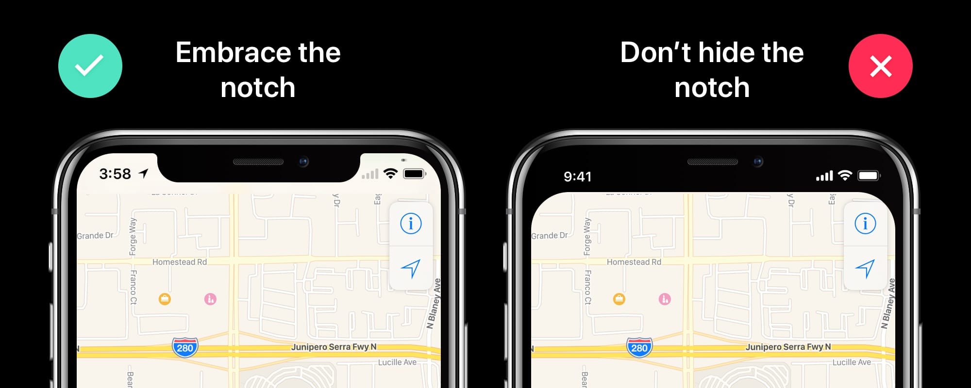
Notch
Perhaps the most controversial aspect of the new design is the top 10% of the screen. The touch sensor, better known as the Notch, is the element that prevents the new screen from taking up the entire area. Technologically, it is now impossible to do without Face ID, the camera and speaker located in it.
In terms of design, this is the biggest compromise Apple has made in years. But looking at how other phone makers are tackling the big screen problem, you can see that they also made some compromises.
Apple advises not to hide the Notch behind the black status bar. They argue that, despite its intrusiveness, the notch provides valuable space for bar status and additional content.
It is a logical continuation of the content and visually makes the screen larger. Background elements such as wallpapers, maps, and colors are not affected when they are slightly obscured by the rounded corners of the screen and the notch. By hiding this space, the screen will appear smaller and the app will not meet Apple standards. Explanation in this video.
Huge headers
In iOS 11, headings are usually 34 pt black in Bold style. Interestingly, when you scroll down the screen, the titles move to the navigation bar and thus give us back this valuable space.
When the screen is in landscape orientation, the title stays small in the bar. From this, designers can conclude that, firstly, you need to use this additional space wisely, and secondly, you need to make the design adaptive, since this space can be in portrait orientation and not in landscape.

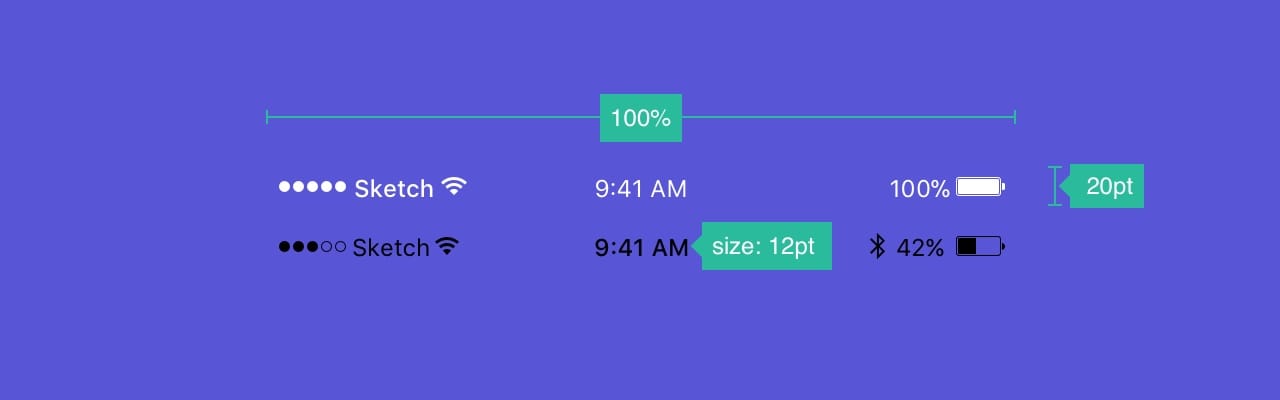
Great status bar
The status bar increased in height by more than 2 times from 20 pt to 44 pt. Notifications can now be simply pulled down from the top left corner. Swipe the screen from the top-right corner of the screen to bring up Control Center. Swiping the screen from the bottom takes you to the home screen, but only if the movement is done quickly.

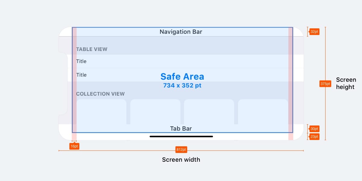
Safe content area
When designing for the iPhone X, keep in mind that the rounded corners of the screen and the notch can crop content. You must always remember this. By using the safe areas of the screen, you can position your elements so that the notch does not cut off the content in any way. In general, all background images can be positioned without relying on this guide, but elements such as text, images and buttons must be positioned taking into account these zones.

iPhone X in landscape mode
In landscape screen orientation, the status bar is hidden to maximize the space for content. The navigation bar is reduced to 32 pt, the Tab bar to 30 pt, and the home button indicator to 23 pt. While most users rarely switch to landscape mode on the iPhone X, there are still many scenarios where this mode is needed.
For example, to view horizontal photos, full-screen videos, or to read articles with large texts. After viewing ends, the user intuitively reverts to portrait screen orientation, especially if the device is conveniently supported in landscape orientation.
If your application is already adapted for the iPad, why not adapt it for the landscape orientation of the iPhone? Huge benefit with minimal effort as most apps are designed with responsive layouts in mind.
Websites in landscape mode
If you are a product designer, chances are you are working with the web. When viewed normally in landscape mode on the iPhone X, your site will have a lot of white space on the left and right sides of the screen. This happens because safe zones appear automatically to avoid clipping content, which makes things even worse. To avoid this, Apple has developed a guide for adapting your website to the iPhone X in landscape orientation. In general, you can expand your background to fill the entire screen while keeping the content within the safe zone.

Rounded screen corners
Content can also be clipped due to the rounded corners of the iPhone X screen. If you do not hide the status bar or Home button indicator, then you will not face this problem. However, for full screen applications such as Camera, it will be important to leave some padding in the corner of the screen. Corner roundings are specified with a radius of 16 pt, the same rounding radius is also recommended for use in buttons.

View your apps on an iOS simulator
The iPhone X hasn't come out yet. Most likely, after the opening of sales, the devices will quickly be sold out, and they will be unavailable for most of us. Not having the right device on hand to test your design on it, all that remains is to use the iOS simulator. You can preview your app or website by installing Xcode.

Hamburger menus are no longer needed
Over the past decade, designers have had to fight for every pixel on the tiny screen of the first iPhone. Many decided to omit the Tab bar entirely because it required too much vertical space. With a bit of creativity, some of them came up with a button that will slide out to the left. This was the birth of the famous Hamburger menu. It was fun and fresh at first, but in terms of usability it was a real nightmare. More clicks to reach the screens hidden under the button. As a result, the use of secondary tabs dropped as people often forgot that there might be more content.
With the advent of large smartphone screens, it has become more difficult for the user to use it with one hand.
Apple even implemented a double-tap on the Home button to bring the Navigation Bar down, making the app's entire UI slide down as well. This was done so that the user can navigate with the thumb. Then this function was transformed into a double tap menu call. The hamburger menu was usually located in the upper left corner of the screen and was extremely difficult to reach. And now that screens have become much larger, there is no longer any need to fight for space for content. Tab bar is the most obvious way to replace the Hamburger menu, as there is enough space for it now. The iPhone X confirms this direction. If your application has several sections, then there is no reason not to use the Tab bar. In iOS 11, Tab bar in landscape orientation takes up even less space.
Hamburger menus are very common on the web, and this may be one of the reasons why the mobile web experience hasn't caught up with the native experience.
Even React Native uses native controls, which is a fantastic trend in web technology. However, on iOS and especially on the iPhone X, you need to use the Tab bar.

Responsive layouts and multitasking
With the ever increasing number of screen resolutions you have to deal with, it is very important to make your layouts responsive. Using tools like Constraints in Sketch and Auto Layout in Xcode, you have to design the screen so that the screen is flexible and can display additional menus if needed.
Stack Views

IPhone Screen Resolutions
There are 5 main resolutions in the iPhone lineup: 320 x 480 pt (iPhone 4), 320 x 568 pt (iPhone 5), 375 x 667 pt (iPhone 8), 414 x 736 pt (iPhone 8 Plus) and 375 x 812 pt ( iPhone X). The layout does not scale, but expands depending on the resolution. For example, the navigation bar adjusts in width but maintains the same height. The elements inside remain unchanged. The iPhone 8 Plus is the only phone that behaves more like an iPad in landscape mode. In other words, navigation may appear on the left, replacing the Tab bar.

Application icons
The application icon is used to style your application. This is the first thing that users see when they start using the application. It appears on the home screen, App Store, Spotlight, and settings.
Icon sizes
@ 1x is no longer supported for iPhone, so you don't need to create an icon for it.
Application icons currently only have two resolutions: @ 2x and @ 3x. There are three types of icons: application icon, spotlight icon, and settings icon. For iPad, @ 1x and @ 2x are used.

Super ellipse
Starting with iOS 7, the round corners of the icons have been replaced with an ellipse shape. If you look closely, you can see that the corners are rounded smoothly. Therefore, do not export masked icons, as this may result in black areas around the edges. Better to export a square shape.

Icon grid
Apple uses the golden ratio in some of its icons. This is a guarantee of good proportions, but it is not a strict rule. Even Apple doesn't always stick to it.

Colors
IOS uses vibrant colors to make icons stand out. These colors work well on both white and black backgrounds. Keep in mind that bright colors should be rarely used, only as a call to action and on a minimally loaded background. Approximately, only 10-20% of all designs may be color, or they will compete too much with the content.
IOS often uses neutral colors to display the background or menu area. Well-contrasting black text against a white background is the best way to read comfortably. Finally, pastel blue is used to highlight the buttons.

System font
The system font is now called SF Pro Text for text with a font size smaller than 20 pt, and SF Pro Display for a font with a font size of 20 pt and above. It is important to note that now when using the system font, you have access to the Dynamic Type, which allows the font to be customized according to the user's preference.

Buttons and font sizes
The general rule of thumb is 44pt for buttons, 12pt for small text, 17pt for content, and 20pt + for headings.

Distance between elements and position
The main rule is to stick to 8pt margins from the edge of the screen and between elements. This creates enough air to make the content on the page easier to read and the text to be more readable. Also, UI elements and text should follow a common baseline.

Status Bar
It is recommended to enable the status bar on those screens where it is possible to do this. Users rely on it to view important information such as battery level, network signal, time. Text and icons can be either white or black, but the background can be any color or even blend in with the navigation bar.
Navigation Bar
The navigation bar is a quick access to information about the screen. The left side of the bar can be used to place the Back, Profile, Menu buttons, while the right side can be used for the action buttons: Add, Modify, Done. It is important that if you are using one of the system icons, then there is no need to create assets for them.
Just like in the status bar, the background can be set to any color, and usually has a subtle blur so that the text is always readable. When a navigation bar is created along with a status bar, both backgrounds are merged.

Search
When you have a lot of content on the page, it is imperative to add content search capabilities.

Toolbar
The toolbar is used as an additional place to place active buttons and show the status of the screen.

Tab bar
The tab bar is the main navigation between screens. Avoid the hamburger menu if you only have a few items. The menu that is visible immediately increases the number of transitions through the items of this menu, since the obvious is always advantageous. In addition, it is better to add text to the menu icons, as most users cannot recognize the characters, especially when they are not standard.

States
When menu items are inactive, icons should be grayed out. For example, as in the picture - they attract less attention.

Table view
The tabular view is the most commonly used view for scrolling through content. Many applications use a tabular display format. This look is standard and also customizable down to the smallest elements.

Basic styles
At a basic level, you can use a set of predefined styles and features.

Sections
Items can be grouped with a title at the top and a description below.

Collection View
When you need to place content in the form of a table in rows and columns, you can use the Collection View. It will help you create your dream layout.

Collection View layouts
If there is more than one collection, you can create a combination of Collection View. The possibilities are endless.

Modal windows
A warning dialog is used to convey important information and requires the user to take immediate action. Dialog boxes of this type should contain concise and succinct information, and actions should be obvious.

Activity modal windows
The activity dialog box allows you to exchange content (text, images, links) via Airdrop, various applications (for example, Mail, Facebook, Twitter), as well as add to favorites, bookmarks, etc. The appearance of the window cannot be customized, but the functions can.

Full screen modals
If there is a lot of information, you can use modal windows in full screen. Such windows are usually opened and closed using animation (they can move out, appear and disappear, turn over, scroll). Like other modals, these should also be as short and capacious as possible, and should be easy to hide.

Keyboards
The keyboard is used to enter information into text fields. It can be easily customized for entering different types of information, for example, links, emails, phone numbers, emoji. It is possible to choose a light or dark theme and an inscription on the confirmation button (by default "enter" or "return" in English).

If there are many choices, you can use Picker. It is especially convenient for dates when you need to enter three fields at once (day, month, year).

Segmented Control
If Tab Bar is used to switch between the main sections, then this control is to switch between subsections.

Sliders
Sliders are interactive controls that are not very precise, but extremely handy for quick adjustments like sound or brightness.

Progress bar
The Progress bar element shows the progress of the action. For example, when loading a web page. The height of the element can be adjusted.
Switch (Switch)
Used to quickly turn functions on and off. Not suitable for any context other than on / off.

Stepper is slower, but more accurate than a slider. Allows users to increase or decrease the value in increments of one. Border and fill are customizable.
IOS icons
Standard platform icons. They are ubiquitous in iOS and well understood by users. Using these icons for other purposes can confuse users, so knowing how they are used on iOS is very important.
It is important to use familiar symbols when creating your icons. In addition, it is recommended to pad them with small text of 10pt or more.

These templates are useful for more than just learning. You can use and customize them to suit your needs.
IOS 11 GUI set by APPLE
If you are designing for iOS, you will want to use things like status bars, navigation bars and tabs.

IOS 11 GUI Bundle by GREAT SIMPLE STUDIO
Translated by UX / UI designers Victoria Shishkina, Ksenia Valyakina and Anastasia Ovsyannikova
Hello. Today we will consider a rare, but no less possible problem associated with zoomed in iPhone screen... This does not depend on the iPhone model, and it does not depend on the iOS version.
If the image on your iPhone suddenly becomes indecent enlarged, and it became impossible to use the phone, most likely you have activated the function Zoom... Read below what to do and how to disable it.
As I already said, " iPhone zoomed in» NOT a breakdown or some unrecoverable problem. Actually, this is another iPhone feature that you just haven't mastered yet.
And this function is called “ Increase"And it is located here: Settings> General> Accessibility> Zoom.
So, here's what you need to do in order to make the iPhone screen look like before:
- STEP 1 - TOUCH TWICE WITH THREE FINGERS to zoom out to 100%. Yes, that's how it (de) activates function "Increase"... It also happens that, leaning the phone to your ear, the increase occurs by itself.
- STEP 2 - Now let's disable this goofy feature. Go to Settings> General> Accessibility> Zoom and turn off the switch opposite the word Increase.

If you have problems disabling Zoom on iPhone, you can also perform this operation using your computer (iTunes). To do this, we do this:
- STEP 1 - Connect your device to any computer with iTunes installed.
- STEP 2 - Click on the device when it appears in the upper left part of the window.
- STEP 3 - In the Parameters field, click on the button Configure Accessibility ...
- STEP 4 - Select the item " Do not use"And confirm OK.

Somehow like this! Wasn't it difficult? If this article turned out to be useful to you, be sure to share with others on social networks (buttons below). And don't forget to subscribe to updates ...
Who knows what other problems may arise in the future with your “apples”, but here I am always smart, kind and beautiful!
iPhone X has received not only an advanced design, but also special features, thanks to which the use of the smartphone is much more convenient. 9to5Mac has compiled a selection of 15 tips and tricks for owners of Apple flagships.
Convenient access
IPhone X is smaller than iPhone 8 Plus. Nevertheless, due to the large diagonal, reaching the upper corners of the screen can be problematic if you use the smartphone with one hand.
However, the top icons can be pulled up to a comfortable height. For this you need:
- Go to Settings => General => Universal Access;
- and Allow Easy Access, which is disabled by default.
Now, you can drag the home screen or any other screen down and the top applications pull up to the center of the display.
When Accessibility is activated, Control Center or Notification Center can also be called from the middle of the screen. To do this, you just need to first pull down at the bottom of the display, and then swipe down on the left or right edge of the screen.
Battery charge level
There are several ways to find out the percentage of battery charge. The fastest of these is to pull the upper right corner of the display and bring up the Control Center.
Fast switching between applications
To switch between applications, just pull the bottom tap of the screen up and pause for a while. The instructions say that the pause should be long, but, in fact, to switch between applications, a touch is enough for a split second.
Calling the last app from the home screen
To call the last application that the user opened, just swipe to the right along the bottom edge of the screen. In a similar way, you can flip through two recently opened applications and switch between them.
Virtual Home button
Users accustomed to the physical Home button can create a virtual button and place it anywhere on the screen.
For this it follows:
- go to Settings => General => Universal Access;
- activate the Assistive Touch option.
A virtual button appears on the screen that can be moved around the display. Tapping it lets you access Siri, Control Center, Notification Center, and set custom custom gestures.
The combination "Hello,Siri" andFace ID
With the combined capabilities of Hey Siri and Face ID, you can quickly launch the apps you want. All you have to do is say, “Hey Siri. Open [application name] ”and look at the iPhone X so that the smartphone can recognize the owner using Face ID.
Screenshots
In order to take a screenshot on the iPhone X, you need to simultaneously press the side button on the right side of the smartphone and the volume up button located on the left side.
ShutdowniPhone X
Shutting down Apple's flagship smartphone is different from the rest of the iPhones. There are two ways to turn off iPhone X:
- simultaneously hold the side button and one of the volume control buttons until the "Turn off" slider appears;
- go to Settings => General => Disable.
CreationAnimoji-video longer than 10 seconds
In Standard mode, you can record Animoji videos as short as 10 seconds. In order to increase the video time you need:
- Allow Screen Recording - open Settings => Control Center => Screen Recording;
- select Animoji in iMessage;
- call "Screen Recorder" from the Control Center and click on "Record";
- click on the red indicator in the upper left corner of the display to end the video.
The recording will be saved in the Photos application. It can be edited using iMovie or LumaFusion, which allows you to remove any unnecessary elements from the video, except for the Animoji itself.
Animoji-sticker
Animoji videos can be used as a sticker. To do this, just drag the entry to the selected message in iMessage.
Viewing videos in full screen mode
By default, when the iPhone X is horizontally positioned, the video does not reach the edges of the screen so as not to crop the picture. However, if the user is not embarrassed by the fact that part of the image will be overlapped by the protrusion under the cameras, you can call the full-screen view by double-tapping.
Decrease in brightness
For a more comfortable use of iPhone X in the dark, you can reduce the brightness of the screen and remove the sharpness of white.
For this you need:
- go to Settings => General => Accessibility => Display adaptation;
- enable Decrease the white point;
- set the slider to 100%;
- call the Control Center;
- lower brightness.
After that, looking at the smartphone screen in a dark room will become much more comfortable. The display will become so dark that it will be difficult to see anything in daylight.
You can also lower the white point by triple pressing the side button. To do this, go to Settings => General => Universal Access, find "Quick Commands" at the very bottom of the screen and select the "Lower White Point" option.
Pseudo-dark mode
You can change the white background color by going to Settings => General => Accessibility => Display adaptation => Color inversion, and turning on the "Smart inversion" mode.
It's not a true dark mode, but it looks good in some applications.
Disable Attention Request forFace ID
To do this, go to Settings => Face ID => Passcode and turn off "Attention demand".
Disabling this setting will reduce access security, but will help unlock your iPhone X when you wear sunglasses or other accessories.
Quickly close all applications
Swiping up from the center of the bottom edge of the screen brings up the Application switcher. You can close an unnecessary application by swiping up the display. In order to close several programs faster, just click on the red minus icon that appears in the upper left corner of each card.
Somehow a couple of days ago, wiping the iPhone screen from fingerprints, I discovered that the image on the phone display for some reason increased. The first thing that came to mind was to restart iOS, but after loading nothing changed and the lock desktop was also increased. I didn't know what to do and was already thinking about doing a factory reset. But this is an extreme step! It was decided to look for the answer on the Internet - to ask advice from the all-knowing Google.
The answer was not long in coming and the solution was found within a few minutes. Looking ahead, I would like to clarify that the zoom effect may not be displayed for all iPhone owners, but only for those who have enabled the Zoom function in the accessibility settings.

So, what do you need to do to make the screen on the iPhone the same, and not be enlarged?
Tap 2 times simultaneously with three fingers on the iPhone display and the image is immediately zoomed out. And if, instead of two touches, you make three, then the zoom menu will appear on the iPhone screen, pressing the Reduce the image on the display button will become normal. You can also do this by dragging the Increase / Decrease slider to the left, which is located at the very bottom of the menu.

As it turned out in the end, the screen enlargement is not a software glitch at all, but one of the phone's functions, which is designed for people with disabilities. To use or disable it, go to the Settings application and select the General menu → Universal access→ Zoom in and set or remove the slider from the zoom function

If for some reason you cannot remove the screen magnification on the iPhone, then use a computer with iTunes installed.
Step 1 Connect your iOS device to your computer
Step 2 Launch iTunes and select your gadget
Step 3 On the Settings menu, click the Configure Accessibility ... button.
Step 4 Check the Do not use checkbox and click OK

If you are the lucky owner of any iPhone and you find it difficult to read the names of the icons in your menu, then today's material is for you. After all, today I will talk about increasing and decreasing the font on the iPhone.
Despite the huge screen sizes, sometimes the standard font size just isn't enough for comfortable use. Fortunately, this smartphone has the ability to change the font size.
Apple has a fairly good policy on the use of devices, they try to make the settings for users as simple and convenient as possible.
If you feel that the current font size is not large enough for you, then you can safely increase it. Why bother when everything is provided.
Everything is set up quite simply, choose a font and you don't even need to confirm anything. The text changes with that as you move the slider. This will help you customize everything exactly for your screen.
If you don't want to make the font large, then there is another option to make the text more legible - bold. All letters will become much more legible.
In addition to the menu and icon labels, the keyboard letters and all other labels that are in the supporter of programs will become bold.
Everything is done in the same steps as in the previous paragraph:

That's all, now you can more easily find the information you need and, most importantly, everything has become more understandable. You can change it in the opposite direction, that is, disable this function at any convenient moment.
conclusions
Now you know how you can change your font on an iPhone: increase or decrease the size, make it bold. These flexible settings should make your phone even more comfortable to use.
Follow the news, there will be many more useful information related to devices from Apple.