The purpose of the creator of the group in social. networks attract more visitors. It is important that the guest wants to join, sign, read information, leave a comment or order a product. The need for the end result differs from the direction of activity.
The first seconds of stay form next steps guest. That is why the interface plays a big role.
Guest leaving factors:
- avatar;
- description;
- title;
- beautiful and practical menu;
- colorfulness;
- content.
Creating a practical menu that encourages more than just action is easy. But first you need to figure out what it should be.
What should be the menu
Using a well-designed menu, the visitor can easily navigate through it and quickly get answers to their questions. Also, navigation allows you to create the right impression about the project.
The three main goals of the groups are:
- sales;
- increased traffic;
- an increase in active visitors.
For sales, group navigation replaces the storefront.

The most important buttons should be here:
- catalog;
- price;
- delivery;
- promotional offers;
- reviews.
To increase traffic, the emphasis is on the content and flavor of the site or blog.
An approximate version of a set of buttons:
- interesting articles;
- helpful information;
- subscribe;
- reviews.
To increase the activity of participants, you should stimulate them with promotions, polls and interesting and unusual content.
We offer the following buttons:
- subscribe to news;
- ask an interesting thematic question;
- stock;
- questionnaire;
- vote.
Consider how to create a menu for a group in contact, all technical moments that require minimal knowledge of a graphic editor and the basics of working with VKontakte.
We create in stages
Navigation creation is an interesting, complex and lengthy process. But the result is worth it.
The whole process is conventionally divided into 2 stages:
- work with photoshop;
- technical addition.
video: menu for the public
We work with photoshop
Before proceeding, you need to visually present the design or general form, as well as its components. No special knowledge is required, just follow the steps in the instructions.
Algorithm of actions:
- install and run the "Photoshop" program;

- in the item "File" select "New";
- in the window that appears, set:

This is done using the Rectangular Marquee tool:

Working with graphics:

It should look like this:
Save the rectangle on the right as a separate picture, setting the size to 200x500 px. This is a ready-made avatar, loaded through the "Upload a photo" button in the VK group.

The second picture still needs to be divided by the number of points. This is done in order to assign a link to each button.
First, you need to make the markup:

Create fragments:

Saving images:

How to clean your computer from unnecessary programs? The instruction is here.
Technical part
The finished images must be transferred to the group. By following the steps below, this task can be easily dealt with.
Important! Filling the menu is different from the usual loading of photos or pictures.
Everything in order:

Now the most important thing is, in fact, for what all this was done. Add menu functionality. A separate picture must be assigned "your" link.
- find the required entry;
- click on it with the left mouse button;
- copy the url in the address bar.
- go to the source where you want to send the visitor;
- copy the required address.

Save the changes with the appropriate button at the bottom of the window.
Attention! Changes may not appear immediately. It is recommended that you log out to your main profile and then log back into the group.
How to create a menu in the Vkontakte group wiki markup
Wiki markup is special language used to design web pages in groups social network.
This tool allows you to create:
- effects;
- unusual menus;
- plates;
- navigation elements;
- format text.
In a word, given markup allows you to create a mini VKontakte site. This is great especially for sales and recruiting subscribers.
This design intuitively makes the visitor stay, click on the button. That is, it delays and stimulates to action - and this is exactly what is needed.
Visually, such a system is very similar to HTML layout. But it does not require long training and a special mindset.
Video: menu with search by category
Nuances of creation
Actually, what was done above (splitting and loading an image) is already markup elements. This is the advantage this instrument... Automatic conversion to tags when simply uploading images.
However, it is important to know the individual tags to help you do more. more features and beauty. For example, with our fill separate parts white streaks may appear between images. You can remove them simply by adding the noborder tag.
Like this: []
The main tags are presented in the table below:

Working with pictures
[] .
Where options is replaced by:
- noborder- removing the frame around the image;
- nopadding- removal of spaces between images;
- plain- insert a link to a picture. Drawn up in the form of text, without graphics;
- nolink- removal of the link to the picture;
- box- opening an image in a window;
- NNNxYYYpx or NNNpx- sets the size of the photo in pixels.
Creating a table
Regardless of which menu (textual or graphical) you create, you can hardly do without inserting a table. Otherwise, you can just paste the text into the news field and not format it, wasting so much time.
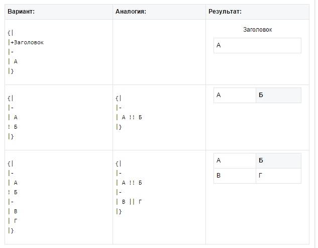
The table is created using a special set of characters, where each of them is responsible for a certain part tables:

In this article, we will take a step-by-step look at how to properly create, configure and properly design a VKontakte community
Community building
You can create a VKontakte community by going to the "groups", "management", "create a community" tab.
Community type and topic
To begin with, you will need to decide on the type of community, depending on your goals and choose the topic of the community.
Group decoration
After choosing the type of community, you can proceed to the most important one, this is the design. Designing your community is a kind of business card company, depending on how high-quality the design will be, your potential subscribers will draw conclusions about your work.
You can download the cover by going to "settings", then click "download".

You can place on the cover:
- title
- the logo
- motto
- contact information
- promotions or call to action
An important point: The cover is the first thing a client sees when they go to your group, so the cover should be bright and attract attention.

Cover in the MTS community

Cover in the Tinkoff Bank community

Cover in the "HeadShot" community
Sizes of images for the design of the VKontakte community.
Cover size for VKontakte group 1590x400px
Avatar thumbnail size - 200px circle


Also VKontakte not so long ago appeared dynamic covers for communities.
Dynamic covers have a very rich functionality, with which you can display the last subscriber, the best commentator on the cover, set the background change as you wish, add a weather, time widget and much more.
Community Description
In the description, the main thing is to describe as briefly as possible the main advantages of the company.
An important point: there is no need to describe everything that your company has been doing, is doing or will be doing. No one will read the long description. You have a few seconds to grab attention before the client starts looking at posts on the community wall. Therefore, the description should only contain key points reflecting the essence of the community / company.
Life hack: In order to make the description of the community in more detail (with photos, links and a beautiful layout), you must put in pinned post wiki post that will bright picture and a call to action.
Examples of wiki posts:


Group avatar
Community avatar is important detail v general structure high-quality design, in this article we have highlighted several very important points to consider when creating your community avatar.
Taking into account the fact that community covers are now predominantly used, the avatar itself in the group is displayed as a miniature. Therefore, here we will talk about how important it is to design a miniature of an avatar. As mentioned above, the avatar thumbnail size is a circle with a diameter of 200px.
- Text
If you are placing text on an avatar thumbnail, it is important that it is large and does not extend beyond the avatar. - Understanding
It is necessary to place an image on the avatar, on which it will be clear what is shown. - Minimalism
To make your avatar look relevant, you can make it in a minimalist style: fewer words and unnecessary elements that do not carry almost any semantic load. The avatar thumbnail should be as simple and readable as possible. - Attract attention
So that the thumbnail of the avatar attracts attention. It is necessary to arrange it so that it is not too white and boring, otherwise it will get lost against the background of more colorful competitors' avatars.
- Text
What to place on the avatar thumbnail?
Consider the options for using an avatar thumbnail to attract followers to the community.

Community settings
Going to the "community management" tab, you can come up with a short page address and indicate Additional information.
Further, in the "Links" tab, indicate links to your page in other social networks and a link to your site. 
In the "Sections" tab, enable the required. It is more convenient to set up a limited community wall so as not to rake it out from spambots' publications in the future.
Include products if your community is to sell products or services. 
You can also add applications to the community and customize them for your own purposes. For example, the Applications application is the most convenient for working with leads. This is an online appointment and taking orders. Or, for example, the "Maps" application, with the addresses of your stores, offices, events. With the Buy Ticket application, you can sell tickets to events right on the community page, ie. subscribers / customers will be able to buy a ticket without going to your site. 
Wiki menu - beautiful and informative
This is another way to show the uniqueness of your community, to grab the attention of customers, and also to structure services, products and all information about the page. Plus, using the wiki menu, you can set up direct links to go directly to the company's website.
Examples of wiki menus: 


You can see a detailed guide on how to create a wiki menu here -
If so, then you have come to the right article. Here we will discuss how to design a group [um, get better community] on the VK social network and you have a good impression from users. Times are changing, and people are getting smarter and can immediately guess
As you probably already know, VK provides 3 options for creating groups [communities]:
- Group
- Public page
- Event
Based on your goals and objectives, determine for yourself which option suits you best. Naturally, events are created for any events. Let's figure it out - what to choose - a group or a public?
In fact, the capabilities of the group and the VKontakte public are not too different.
Create a public, not a group.
There are a number of advantages to going public instead of being a group. The public is easier to design and use, it is also in the block interesting pages users. Based on this, you can find out the interests of the user. V in this case- this is photography and everything connected with it.

As for the group, they can ask questions on its wall potential clients... At first, this looks like an advantage, but only if you do not have a content plan and your goal is only for people to start asking. But in such groups, engagement is very low.

Also in groups there is an opportunity to invite friends. In public, this function has been curtailed. But your friends are unlikely to be your target audience, to whom you are going to sell services or goods. Therefore, it makes little sense to focus on inviting either.
Another advantage of the group is the ability to add an online store application to secure protocol https via iframe application, which will allow the user to place an order without leaving the social network.

Community header
Now let's touch on the topic of our community header. How to make a headline correctly so that it works for our business and starts generating traffic. For example, your occupation is selling women's clothing in Nizhny Novgorod.
Going to Yandex you can see that ...

The group got into the top search engine results for this request and is somehow ranked for this request. Accordingly, it would be reasonable to name your group that way in order to get into the results of both Yandex and Vkontakte search.
Occupation - keyword, by which users can potentially search for you - if your occupation is tied to a city, then in the group itself you can also indicate the city where you are, search engines will identify your group by geolocation.
Ideally, the title format looks like this:
Online store of women's clothing | Lovandzzoo
where, "Online store of women's clothing" - key request
Lovandzzoo - your brand name
Avatar and cover
Design is not an important gear in the mechanism of Internet business, but a nicely designed group without suspicious and cheap design inspires more confidence. And the design of the community starts with a well-designed avatar and community cover.
The community avatar is the face of your company and should reflect both the company's positioning and contact information.
- occupation
- logo and brand name
- telephone
- a call to action - for example, "Sign up to take care of your health and appearance."
- arrow indicating subscribe.
- also indicate the address and external resource - the site.
An example of a good ava:
![]()
Now let's talk about the design of the cover, which has now gained popularity after the innovations of Vkontakte. In principle, the approach is the same as for the design of the avatar, only now we translate everything into horizontal position... Here are some examples good covers with different design styles. One thing they have in common is that it is clear where the person got to and what he sees. Cover should answer questions "What is it?".


Notice the last cover and the pointing arrows on:
- the logo
- the brand
- what is the public about
- why the content is useful for subscribers
- and what the user will get if they subscribe
You can do the same - this is a standard working structure for a competent community cover design.
Wiki menu
You can incorporate popular wiki menus into your community design. The main thing is to think over the structure of the menu, because in a sense, by creating a menu using wiki markup, you create a mini-site on a social network and the user should not get lost in it. Look at this wiki menu and understand what a competent wiki menu structure means.
An example of a good and attractive menu.

Depending on the niche, the wiki menu may contain the following sections
- if it is a sale of nat. goods and services - delivery terms, product categories, price lists, how to order, description, etc.
- if the sale of information products
- this is structured base content such as
Another example of a good menu:

Links
In the links, indicate all your external resources- lead magnets, main sites, channels in other social networks, where the audience will go. This will help increase traffic to your resource from social networks.

Read also >>>>
Content is King
Content is King
Bill Gates once said and he was right. Social networks exist and are popularized due to their constantly generated content. Without it, the group is burned out and forgotten about. Therefore, it is necessary to post regularly to remind of yourself.
But how to properly design posts to be liked and shared?
Everything is very simple here - you don't need to use pictures with cheap design and dull copywriting in your posts - it's not that users don't like them, the social network itself ignores this content format. This is how the picture should look roughly.

No one demands design work from you, but only a pleasant and non-irritating design. If the content is visually perceived well, then the likelihood of its sharing is high.
NPV (Human UnderstandableLinks) in posts
Try not to indicate original links, or links with UTM tags, but shorten them using the service vk.com/cc in the title, under the title of the post. VK users ignore posts with long links (especially at the beginning). They are interested in content. Shrink links in posts with vk. com/ cc
Here on specific example you can see how such a link looks in the post:

Also try not to use obvious and banal headlines. The purpose of the headlines is to grab the attention of the community subscribers in news feed... For example the title "16 + 1 Effective and Healing Properties Pumpkin Oil That 95% Of The People On The Planet Don't Know About " will work better on the audience's attention than the nondescript "Properties of pumpkin seed oil". Try to add numbers and specifics to the title. Then the post will grab attention.
Are you ready to challenge your dream and realize your ideas and ideas on the Internet, start making serious money online?
Diversify your content
Identify at least 30 topics (needs) that may closely relate to your direction and use a timer to start posting.

Make up interesting content in their niche. For example, in the topic of sports - you can write motivational content, educational and expert content. The list of needs can be made endless and the problem is in choosing a format that will no longer post by itself. In each post, use a different call to action with a justification of the reason - "Like it if it was helpful", "Repost if you think that all your friends should know about it."
Add emoji to posts to make them more colorful and attractive. But don't over-spam.

Find out,
Video
In all videos uploaded to YouTube, insert a cover so that there is a packaging and a wrapper that will catch the user's attention. Videos without a wrapper look very raw, in which it is already clear what will happen and there is no interest in uploading them.
Here's an example of what a video cover should look like:

The click-through rate of a video with a cover is several times higher, because there is a package - a wrapper that attracts an audience. The picture should play its role - to arouse interest in what is inside.
Implement!
Goods
Products section - prices are indicated in ascending order - the showcase should have the lowest prices.

Detailed description in the product card itself. And if there is a website - up to a link to the product card. The "Contact seller" button is bound to personal messages the person who leads the group, or the manager who follows the group

Finishing the community
We fill the discussion section and create subsections in it - "Your questions", "How to order", "Vacancies". You can also create a questionnaire for variety.

Contacts - do not forget to fill in too. So that a person understands who to contact - about ordering goods, advertising or your services.
To understand who to ask the question - write the position - manager and responsibilities of the person. So you will quickly make it clear to the user who he should contact with his question.

Most importantly, I almost forgot 🙂 - we fill in the description of the group the necessary information with all outgoing links. Be sure to separate the description in blocks of text of 3-4 lines so that the text is readable - the copywriting rules for the readability of the text have not yet been canceled.
Here's an example of how well a description should be in the community:

P.S.
Well, what do you say? Was the content helpful?
Do you understand how you need to arrange a group on Vkontakte?
If yes, then I'm waiting feedback in the comments - I reply instantly. Before you can blink. I love to discuss the topic of promotion on social networks. If I don't have time - then write
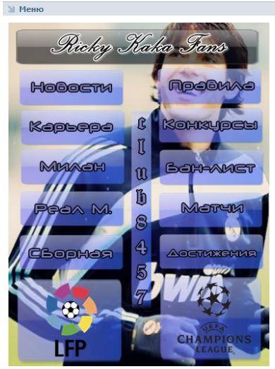
Good afternoon. In this post it will be about how to independently arrange a VKontakte group. More recently, we looked in detail and talked about what size and quality the image should be. But the designers went further and now you can find many communities in which the menu and the avatar represent a single whole. It looks amazing. And today you will learn how to do beautiful design for a group or public with your own hands, without the help of freelancers and professional web designers.
So that you immediately understand what in question- I post an example of a decorated group:

If in 2 words, then in graphic editor(the same edob photoshop) are created in 2 pictures. One of them is cut into several fragments and links are added using the VKontakte wiki markup. If you are not afraid of these terrible words - I will continue.
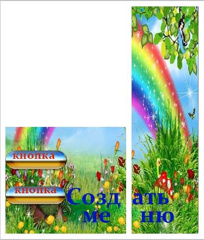
Step 1... In a graphics editor (it is best to use adobe photoshop) you need to create a document with a size of 630 by 725 pixels. Next, in the first layer, cut out 2 windows, which will be the menu and the avatar. First, select a 200 x 500 px rectangle and press the DEL key.
__________________
I'll make a reservation right away that in the lessons on other sites you can find tips where they say that you need to crop a rectangle with a size of 200 * 710. IT IS NOT RIGHT. Now in the social network VKontakte there is a limitation on the height of the ava, and in the case of using a height of 710 px, it will turn out to be cropped.
__________________
Now we cut out the menu - another 382 by 232 rectangle and press the “divide” key as well. The rectangles should be connected at the bottom.

The workpiece is ready.
Step 2... Now our blank needs to be covered with a background. Write text if needed and create future buttons below the menu. In the example there are 5 of them, but you can make as many as you need, but you should not make them too small, thereby you reduce usability, forcing the user to enlarge the page or squint to read the text.

Step 3... The right rectangle can be saved. Don't forget about the size 200 by 500. This is a ready-made avatar for your group. You can immediately download it in the right upper corner groups / public.

As for the rectangle with marked menu items, it will need to be cut into several pictures (in this case, 5). The width is 382, but the height is calculated individually, but must be at least 50 pixels.

Step 4... Now you need to upload 5 resulting photos to the community album.

As soon as the job is done, you need to start editing the news block in the group. Go to "fresh news" and click on the "edit" button

You must have photo albums and documents open in the group settings. This is important, because without this you will not be able to upload a photo and make a menu.
Step 5... In the “editing” tab, insert the following code:
[]
[]
[]
[]
[]
We begin to edit it.
photo - presenting a link to a photo. Open one of the 5 photos you uploaded from the group menu and in the browser bar you will see something like this -
http://vk.com/photo72120765_272239411
72120765_272239411 - and there is the same required code photos. You can just use the filename.

Step 6... It is necessary to combine the pictures from the avatar of the menu, if they are gone. To do this, you need to do 3 things:
The name of the group should be on one line
Description in 10 lines (sometimes fitting is needed here)
The website is also one line.
Here's what you should get roughly:

As you can see, it is not difficult to make a design for a VKontakte group. If you have questions - ask them in the comments, and if you don’t want to “take a steam bath” - you have a direct road to freelancing.
The creation of the design described in this article will cost you 15-25 USD.
Today we again return to the theme of VKontakte groups design. We have already learned earlier. Today we will learn how to make a graphic menu with pinned top banner and a link to inner page with the items of the extended menu. In general, any information can be found on the inner page. It is especially convenient to place there, for example, catalogs with a range of products. Both the dropdown menu and the pinned menu have their pros and cons. The main disadvantage of the dropdown menu is that it is closed by default. But on the other hand, you can place several links at once on it.
Pinned menu looks more impressive due to general impression, but he can have only one link leading either to the internal page of Vkontakte, or to an external site (moreover, the link to the external site will not go from the picture, but from text link under the picture). Also from the obvious disadvantages is that on mobile devices graphical menu presented in the form regular recording in the ribbon on top, not pinned next to the avatar. In general, when choosing a design, these nuances should be taken into account. So let's see how pinned is created Top Menu with a link to an internal page.
I design Vkontakte groups
High-quality design of VK groups and publics, pinned menu, dropdown menu, internal graphical menu, catalogs, internal navigation - prices and portfolio.
Step 1
How to create in Photoshop new document about 900x700 pixels, fill it with white. Now we need to cut out two windows in the layer, through which itself will look through graphic design... First, select a 200x500 pixel rectangle (avatar) and press Del. Then select a 510x352 rectangle (align to the bottom line of the avatar and make the distance between the shapes 50 pixels) and also press Del.
After another design update by VKontakte (10/31/2016), the banner dimensions are 510x307 (not 510x352).
Step 2
Now, below the white layer, put some single picture, which will form the basis of the design. 
Step 3
After that, we supplement the picture. various elements- a logo, text labels and a button calling to click on the menu. Then we save two separate pictures on the computer - one avatar (on the right), the second menu with a click button (on the left). 
Step 4
Also in Photoshop we create a graphical menu consisting of several items. The width of this menu should be 600 pixels, height at discretion, depending on the number of items. Use the lesson ““ to help. 
Step 5
We cut our menu into several horizontal stripes in accordance with the number of menu items. We save it as separate files. 
Step 6
We go to our Vkontakte group, click on "Community Management" (when you click on the three dots under the avatar, a drop-down menu opens) and check the correctness of the settings. The group must be open and the materials must also be open. 
Step 7
Now load new avatar... Move the mouse to the place of the avatar and select "Update photo" on the pop-up menu. Loading right photo from Step 3, stretch the selection area up and down to the edges of the picture, click "Save" and then select the area for the circular thumbnail. 
Step 8
Now we need to create the inner page. How to do this is described in detail in the lesson. Another alternative way for creating an internal page is described in the lesson "" in Steps 5 and 6. 
Step 9
After we have created the internal page, you can go to it. To do this, you need to click on the group's drop-down menu (by default, this item is called "Fresh News" - I renamed it to "Menu") and there click on the "Menu" link. After that we will go to the newly created blank page. 
Step 10
Now we need to create a graphical menu with five items. To do this, we upload our five pictures from Step 5 to the group's album. We click on the camera icon and upload the cut pictures from the computer. The pictures will be stored somewhere on the VKontakte servers with a link to the group, so create separate album for sliced pictures is optional. You need to upload pictures in Wiki markup modes. 
Step 11
Now, in wiki layout mode, we will create a graphical menu. It is very important to create it in the wiki-markup mode (the icon in the upper right corner of two triangular brackets), and not in visual mode editing. For more information on creating code in wiki markup, see Step 4 and Step 5 of Lesson "". There is also a template for the embed code. If everything is done correctly, you should get a ready-made graphical menu, as in the figure below. 
Step 12
Now back to home page groups, we take the url of our internal page (it should look like https://vk.com/page-78320145_49821289) and insert it into the window where the news is created. A window with a link to this very internal page should be attached automatically. After that, we move the cursor to the "Attach" label and attach a photo to the record, namely our picture on the left from Step 3. After that, we erase the line from the url of the inner page, leaving empty place... Important! On the this step you must tick the box (if you have such rights, this mainly applies to groups with open wall) in the "On behalf of the group" checkbox. If this checkbox is not checked, the entry cannot be pinned. At the end, click "Send". 
Step 13
Move the cursor to the three dots next to the title of the post and in the drop-down window select the item "Pin". Accordingly, the news is also unpinned, if necessary. 
Step 14
There is one caveat. Sometimes, after you unfasten the news, it goes far down the tape, according to the date of creation, and it is quite difficult to find it again. Therefore, it is better to immediately write down the URL of the fixed news somewhere. To do this, move the cursor to the time of creating the news and click on the link. 
Step 15
Now we are updating the main page of the group. Our graphical menu will be adjacent to the top next to the avatar. And when you click on the picture, we are taken to an internal page with a menu of five items.