Today, dear reader, we will deal with the problem of vertical alignment in a block. div.
Chances are you already know about the wonderful CSS property vertical-align. And God himself told us to use this property for vertical alignment (it's not for nothing that it has such a self-explanatory name).
Formulation of the problem: It is necessary to center the content of the variable height block relative to the vertical.
Now let's get down to solving the problem.
And so, we have a block, its height can change:
The first thing that comes to mind is to do the following trick:
There is every reason to believe that the phrase Block content will align to the center of the container div's height.
But it was not there! We will not achieve any expected center alignment this way. And why? It would seem that everything is indicated correctly. It turns out that this is the catch: the property vertical-align can only be used to align the contents of table cells or to align inline elements relative to each other.
As for the alignment within the table cell, I think everything is clear. I'll explain another case with inline elements.
Vertical alignment of inline elements
Suppose you have a string of text that is broken up with inline tags into parts:
You welcomes piece text!
An inline tag is understood as a container, the appearance of which does not lead to content wrapping to a new line.
The action of the block tag leads to the wrapping of the contents of the container on a new line.
Is a block tag. If we enclose chunks of text in blocks, then each of them will appear on a new line. Using the tag which, unlike, is lowercase, there will be no wrapping of containers to a new line, all containers remain on one line.Container It is convenient to use when specifying a part of the text with special formatting (highlighting with color, a different font, etc.)
For containers apply the following CSS properties:
#perviy (vertical-align: sub;) #vtoroy (vertical-align: 3px;) #tretiy (vertical-align: -3px;)
As a result, the line of text will look like this:
This is nothing but the vertical alignment of inline elements, and the CSS property vertical-align copes with this task perfectly.
We digress a little, now we return to our main task.
Vertical alignment in a div container
Regardless, we will use the property to align inside the div container. vertical-align... As I already said, this property can be used in the case of alignment of inline elements (we discussed this case in detail above and it does not suit us for alignment in a div container); it remains only to use the fact that vertical-align works for table cells.
How can we use this? We do not have a table, we are working with a div container.
Ha, it turns out to be very simple.
CSS property display allows us to turn our div block into a table cell, it can be done easily and naturally:
Let's have a class div textalign:
Block contentFor this block, specify the following CSS property:
Textalign (display: table-cell;)
This CSS instruction will miraculously turn our div into a table cell without visually altering it in any way. And for a table cell, we can apply the property vertical-align the desired vertical alignment will fully work.
However, everything cannot end so simply. We have a wonderful IE browser. He does not know how to work with the property display: table-cell(I suggest that you familiarize yourself with the table illustrating the performance of this CSS property in different browsers on the website htmlbook.ru). Therefore, we will have to go to various tricks.
There are many ways to achieve alignment in a div container for all browsers:
- Method using an additional auxiliary div cotneyer
- Method using expression. It is associated with a clever calculation of block heights. Knowledge of JavaScript is indispensable here.
- Using the line-height property. This method is only suitable for vertical alignment in a block of known height, which means that it is generally not applicable.
- Using absolute and relative content offset in case of IE browser. This method seems to me the most clear and simple. Also, it is implementable for a variable-height container div. We will dwell on it in more detail.
As you understand, it remains for us to solve the problem of vertical alignment in IE, associated with its misunderstanding of the property display: table-cell(neither IE6, nor IE7, nor IE8 are not familiar with this property). Therefore, using conditional comment specifically for browsers of the IE family, we will specify other CSS properties.
Conditional comment
Type design:
... Инструкции, действующие только в случае выполнения условия в квадратных скобках...
is called a conditional comment (be careful, the form of a conditional comment must fully match the given example, up to a space).
The instructions contained in such a conditional comment will only be executed if the browser interpreting this code belongs to the IE family.
Thus, using a conditional comment, we can hide a piece of code from all browsers except IE.
The solution of the problem
Because of all this parsley, we'll need to feed our HTML with two additional containers. This is how our text block will look like:
This is some kind of verification text.
It consists of two lines.For class container div textalign sets CSS properties that align its content vertically for all normal browsers (except IE, of course):
Display: table-cell; vertical-align: middle;
And two more properties that set the width and height for the block:
Width: 500px; height: 500px;
This is quite enough to align the contents of the container in the center with respect to the vertical, in all browsers. except IE.
Now we begin to add properties related to alignment. for browsers of the IE family(it was for them that we used additional blocks div and span):
Referring to the tag div inside a class block textalign... To do this, you first need to specify the name of the class, and then, separated by a space, the tag to which we are referring.
Textalign div (position: absolute; top: 50%;)
Such a construction means: for all div tags inside a block with the class textalign apply the listed properties.
Accordingly, the styles specified for the block textalign are modified:
Textalign (display: table-cell; vertical-align: middle; width: 500px; height: 500px; position: relative;)
The top-left point of the text box is now offset downward by 50%.
To clarify what is happening, I drew an illustration:
As you can see from the picture, we have made some progress. But that's not all! The top left point of the yellow box has indeed moved 50% down from the parent (purple) box. But we need something at fifty percent of the height of the purple block to be center of yellow block, not its top-left point.
Now the tag will be used span and its relative positioning:
Textalign span (position: relative; top: -50%;)
Thus, we have shifted the yellow block upwards by 50% of its height, relative to the starting position. As you can imagine, the height of the yellow box is equal to the height of the centered content. And the last operation with the span container positioned our content in the middle of the purple block. Hooray!
A little shaman
First of all, we need to hide the parsley from all normal browsers and open it up for IE. This can be done, of course, with the help of a conditional comment, it was not for nothing that we got acquainted with it:
There is a small problem. If the centered content is too high, then it leads to unpleasant consequences: extra vertical scrolling height appears.
Solution: need to add property overflow: hidden block textalign.
Get to know the property in detail overflow can be in.
The final look of the CSS block instructions textalign looks like:
Textalign (display: table-cell; vertical-align: middle; width: 500px; height: 500px; position: relative; overflow: hidden; border: 1px solid black;)
Sorry, I forgot to mention one important point. If you try set the height of the class block textalign as a percentage then you have nothing will come of it.
Centering in variable height block
It is very often necessary to set the height of a class block. textalign not in pixels, but as a percentage of the height of the parent block, and align the content of the div container in the middle.
The catch is that it is impossible to do this for a table cell (and after all, the class block textalign turns into a table cell, thanks to the property display: table-cell).
In this case, you need to use an external block for which the CSS property is specified display: table and already for it to set the percentage value of the height. Then the block nested inside it, with the CSS directive display: table-cell, will happily inherit the height of the parent block.
In order to implement a variable-height block in our example, we will slightly tweak the CSS:
Class textalign we will change the property value display With table-cell on the table and remove the alignment directive vertical-align: middle... Now we can safely change the height value from 500 pixels to, for example, 100%.
Thus, the CSS properties for the class block textalign will look like this:
Textalign (display: table; width: 500px; height: 100%; position: relative; overflow: hidden; border: 1px solid black;)
It remains to implement the centering of the content. To do this, a container div nested in a class block textalign(this is the same yellow block in the picture), you need to set the CSS property display: table-cell then it will inherit 100% height from parent block textalign(purple block). And nothing prevents us from aligning the contents of the nested div container in the center with the property vertical-align: middle.
We get another additional list of CSS properties for the div nested in the container textalign.
Textalign div (display: table-cell; vertical-align: middle;)
That's the whole trick. Optionally, you can variable height with centered content.
For more information on vertically aligning a variable height block, see.
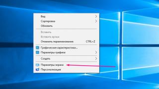
If you cut any website based on html, then you will see a certain layer-by-layer structure. Moreover, in its appearance, it will be similar to a puff pastry. If you think so, then most likely you have not eaten for a long time. So feed your hunger first, and then we'll show you how to center the div layer on your site:
Benefits of tagging
There are two main types of building a site structure:
- Tabular;
- Blocky.
Table layout has been dominant since the dawn of the Internet. Its advantages include the accuracy of a given positioning. But, nevertheless, it has obvious drawbacks. The main ones are the volume of the code and the low download speed.
When using a tabular layout, the web page will not be displayed until it is fully loaded. Whereas when using div blocks, the elements are displayed immediately.
In addition to the high loading speed, the block-based construction of the site allows several times to reduce the amount of html code. Including through the use of CSS classes.
However, tabular layout should be used to structure the display of data on a page. A classic example of its use is displaying tables.
Block building based on tags
also called layer-by-layer, and the blocks themselves are layers. This is because when using certain property values, they can be stacked one on top of the other, like layers in Photoshop.Positioning aids
In block layout, layer positioning is best done using cascading style sheets. The main CSS property responsible for positioning
, is a float.
Property syntax:
float: left | right | none | inherit,
Where:
- left - aligns the element to the left of the screen. The flow around the rest of the elements occurs on the right;
- right - alignment to the right, flow around other elements - to the left;
- none - no wrap is allowed;
- inherit - inherit the value of the parent element.
Let's look at a lightweight example of positioning divs using this property:
Left block
Right block
Now let's try to use the same property to position the third div in the center of the page. But unfortunately float has no center value. And when you set a new block to the alignment value to the right or left, it is shifted in the specified direction. Therefore, it remains only to set float: left to all three blocks:
But this is not the best option either. When the window is reduced, all layers are arranged in one row vertically, and when the size is increased, they stick to the left edge of the window. Therefore, a better way to center align the div is needed.
Centering layers
In the next example, we will use a container layer in which we will place the rest of the elements. This solves the problem of blocks shifting relative to each other when the window is resized. Centering the container in the middle is done by setting the margin properties to zero for the top margin and auto on the sides (margin: 0 auto):
Left block
Central block
Right block
This same example shows how you can center a div horizontally. And if you slightly edit the above code, you can achieve vertical alignment of the blocks. To do this, you just need to change the length of the container layer (reduce it). That is, after editing its css, the class should look like this:
After the change, all blocks will line up strictly in a row in the middle. And their position will not change at any size of the browser window. This is what the vertical centering of the div looks like:
In the following example, we used a number of new css properties to center the layers inside the container:
A short description of the css properties and their values that we used in this example to center the div inside the div:
- display: inline-block - Aligns a block element to a line and ensures that it is wrapped around another element.
- vertical-align: middle - aligns the element in the middle with respect to the parent;
- margin-left - sets the margin to the left.
How to make a link from a layer
Oddly enough it sounds, but this is possible. Sometimes a div block as a link may be needed when laying out various types of menus. Let's look at a practical example of implementing a link layer:
Link to our site
In this example, using the line display: block, we set the link to the value of the block element. And to make the entire height of the div block a link, set height: 100%.
Hiding and Showing Block Elements
Block elements provide more options for extending the functionality of the interface than the outdated table layout. It often happens that the design of a website is unique and recognizable. But for such an exclusive you have to pay with a lack of free space.
This is especially true of the home page, which has the highest cost of ad placement. Therefore, there is a problem where to "shove" another advertising banner. Aligning the div to the center of the page is not enough!
A more rational solution is to make some block hidden. Here's a simple example of such an implementation:
This is a magic button. Clicking on it will hide or show the hiding block.
In this example, the position of the div blocks does not change in any way. This is a simple JavaScript function that changes the value of the css display property after clicking the button ( onclick event).
Display syntax:
display: block | inline | inline-block | inline-table | list-item | none | run-in | table | table-caption | table-cell | table-column-group | table-column | table-footer-group | table-header-group | table-row | table-row-groupAs you can see, this property can take many values. Therefore it is very useful and can be used for positioning elements. In one of the previous examples, using one of its values ( inline-block) we have implemented center aligning divs inside divs.
We used two values for the display property to hide and show the layer.
Very often in layout it is required to center some element horizontally and / or vertically. Therefore, I decided to make an article with various centering methods, so that everything is at hand in one place.
Horizontal alignment
margin: auto
Horizontal alignment with margin is used when the width of the centered element is known. Works for block elements:
Elem (margin-left: auto; margin-right: auto; width: 50%;)
Specifying the auto value for the right and left padding makes them equal, which centers the element horizontally within the parent block.
text-align: center
This method is suitable for center aligning text within a block. text-align: center:
Aligning with text-align I'm center aligned
position and negative margin to the left
Suitable for centered blocks of known width. We give the parent block position: relative to position relative to it, the centered element is position: absolute, left: 50%, and a negative margin-left, which is equal to half the element's width:
Aligning with position I'm center aligned
display: inline-block + text-align: center
This method is suitable for aligning blocks of unknown width, but requires a parent wrapper. For example, in this way you can center a horizontal menu:
Alignment with display: inline-block + text-align: center; Vertical alignment
line-height
To align one line of text, you can use the same height and line spacing for the parent block. Suitable for buttons, menu items, and more.
line-height I am vertically aligned
position and negative margin up
An element can be vertically aligned by giving it a fixed height and applying position: absolute and a negative margin upward equal to half the height of the element being aligned. The parent block must be assigned position: relative:
Wrapper (position: relative;) elem (height: 200px; margin: -100px 0 0; position: absolute; top: 50%;)
Thus, using positioning and negative margins, you can center the element on the page.
display: table-cell
For vertical alignment, the display: table-cell property is applied to the element, which makes it emulate a table cell. We also set the height and vertical-align: middle to it. We will wrap all this in a container with the dislpay property: table; :
Vertical alignment display: table-cell I am vertically aligned
Dynamically aligning an element on the page
We've covered ways to align elements on a page using CSS. Now let's take a look at the implementation of the jQuery variant.
Let's include jQuery on the page:
I suggest writing a simple function to center an element on the page, let's call it alignCenter (). The element itself acts as an argument to the function:
Function alignCenter (elem) (// code here)
In the body of the function, let's dynamically calculate and hang the coordinates of the center of the page to the CSS left and top properties:
Function alignCenter (elem) (elem.css ((left: ($ (window) .width () - elem.width ()) / 2 + "px", top: ($ (window) .height () - elem. height ()) / 2 + "px" // remember to add position: absolute to the element to trigger the coordinates)))
In the first line of the function, we get the width of the document and subtract from it the width of the element, divided in half - this will be the center of the page horizontally. The second line does the same thing, only with the height, for vertical alignment.
The function is ready, it remains to hang it on the DOM ready and window resize events:
$ (function () (// call the centering function when the DOM is ready alignCenter ($ (elem)); // call the function when the window is resize $ (window) .resize (function () (alignCenter ($ (elem));)) // function for centering the element function alignCenter (elem) (elem.css ((// calculating left and top coordinates left: ($ (window) .width () - elem.width ()) / 2 + "px", top: ($ (window) .height () - elem.height ()) / 2 + "px")))))
Using Flexbox
New features of CSS3, such as Flexbox, are slowly becoming commonplace. The technology helps to create layout without using floats, positioning, etc. It can also be used to center elements. For example, let's use flexbox on the parent .wrapper and center the content inside:
Wrapper (display: -webkit-box; display: -moz-box; display: -ms-flexbox; display: -webkit-flex; display: flex; height: 500px; width: 500px;) .wrapper .content (margin: auto; / * margin: 0 auto; horizontally only * / / * margin: auto 0; vertically only * /)
Lorem ipsum dolor sit ametThis rule centers the element horizontally and vertically at the same time - the margin now works not only for horizontal alignment, but also for vertical alignment. And without a known width / height.
Related resources
Help the project
The horizontal and vertical alignment of elements can be done in different ways. The choice of method depends on the type of element (block or inline), on the type of positioning, dimensions, etc.
1. Horizontal alignment to the center of the block / page
1.1. If the block has a width:
div (width: 300px; margin: 0 auto; / * center the element horizontally within the parent block * /)If you want to align an inline element in this way, it needs to be set to display: block;
1.2. If the block is nested in another block and no width is set / set for it:
.wrapper (text-align: center;)1.3. If the block has a width and needs to be fixed to the center of the parent block:
.wrapper (position: relative; / * set the relative positioning for the parent box, so that later we can absolutely position the box inside it * /) .box (width: 400px; position: absolute; left: 50%; margin-left: -200px; / * shift the block to the left by a distance equal to half of its width * /)1.4. If no width is specified for the blocks, you can center using the parent wrapper block:
.wrapper (text-align: center; / * position the content of the block in the center * /) .box (display: inline-block; / * arrange the blocks in a row horizontally * / margin-right: -0.25em; / * remove the right indent between blocks * /)2. Vertical alignment
2.1. If the text spans one line, for example, for buttons and menu items:
.button (height: 50px; line-height: 50px;)2.2. To align a block vertically within a parent block:
.wrapper (position: relative;) .box (height: 100px; position: absolute; top: 50%; margin: -50px 0 0 0;)2.3. Vertical alignment by table type:
.wrapper (display: table; width: 100%;) .box (display: table-cell; height: 100px; text-align: center; vertical-align: middle;)2.4. If a block has a width and height and needs to be centered on the parent block:
.wrapper (position: relative;) .box (height: 100px; width: 100px; position: absolute; top: 0; right: 0; bottom: 0; left: 0; margin: auto; overflow: auto; / * to content did not creep * /)2.5. Absolute positioning in the center of the page / block using CSS3 transform:
if the element is dimensioned
div (width: 300px; / * set the block width * / height: 100px; / * set the block height * / transform: translate (-50%, -50%); position: absolute; top: 50%; left: 50% ;)
if the element is not dimensioned and is not empty
h1 (margin: 0; transform: translate (-50%, -50%); position: absolute; top: 50%; left: 50%;)Some text here
There are several fundamentally different ways to center an object vertically using CSS, but it can be tricky to choose the right one. We will look at some of them, and also make a small site using the knowledge gained.
Center vertical alignment with CSS is not easy to achieve. There are many ways, and not all work in all browsers. Let's take a look at 5 different methods and the pros and cons of each. Example.
1st way
This method assumes that we are setting some element
the way of displaying is like a table, after that we can use the vertical-align property in it (which works differently in different elements).
#wrapper (display: table;) #cell (display: table-cell; vertical-align: middle;)Some useful information that should be centered.pros
- Content can dynamically change height (height is not defined in CSS).
- Content is not cropped if there is not enough space for it.
Minuses
- Doesn't work in IE 7 or less
- Many nested tags
2nd method
This method uses the absolute positioning of the div, which sets its top to 50% and its margin-top minus half the height of the content. This implies that the object must have a fixed height, which is defined in the CSS styles.
Since the height is fixed, you can set overflow: auto; for the div containing the content, so if the content does not fit, then scroll bars will appear.
Content Here#content (position: absolute; top: 50%; height: 240px; margin-top: -120px; / * minus half the height * /)pros
- Works in all browsers.
- No unnecessary nesting.
Minuses
- When there is not enough space, the content disappears (for example, the div is inside the body, and the user has shrunk the windows, in which case the scroll bars will not appear.
3rd method
In this method, we will wrap the content div with another div. Let's set its height to 50% (height: 50%;), and the bottom margin to half the height (margin-bottom: -contentheight;). The content will clear the float and be centered.
#floater (float: left; height: 50%; margin-bottom: -120px;) #content (clear: both; height: 240px; position: relative;)here is the contentpros
- Works in all browsers.
- When there is not enough space (for example, when the window is reduced) the content is not clipped, scrollbars will appear.
Minuses
- I think only one thing: that an extra empty element is used.
4th method.
This method uses the position property: absolute; for divs with fixed dimensions (width and height). Then we set the coordinates to it top: 0; bottom: 0; but since it has a fixed height, it cannot stretch and is centered. This is very similar to the well-known method of horizontally centering a fixed-width block element (margin: 0 auto;).
Important information.#content (position: absolute; top: 0; bottom: 0; left: 0; right: 0; margin: auto; height: 240px; width: 70%;)pros
- Very simple.
Minuses
- Doesn't work in Internet Explorer
- Content will be clipped without scroll bars if there is not enough space in the container.
5th method
You can use this method to center-align one line of text. We just set the text height (line-height) equal to the element's height (height). After that, the line will be displayed in the center.
Some line of text#content (height: 100px; line-height: 100px;)pros
- Works in all browsers.
- Doesn't cut text if it doesn't fit.
Minuses
- Works only with text (does not work with block elements).
- If there is more than one line of text, it looks very bad.
This technique is very useful for small items, such as centering text in a button or text box.
Now that you know how to achieve vertical center alignment, let's create a simple website that looks like this in the end:
Step 1
It's always good to start with semantic markup. Our page will be structured as follows:
- #floater (to center align content)
- #centred (center element)
- #side
- #logo
- #nav (list
- #content
- #bottom (for copyrights and stuff)
Let's write the following html markup:
A centered company A CompanyPage Title
Holisticly re-engineer value-added outsourcing after process-centric collaboration and idea-sharing. Energistically simplify impactful niche markets via enabled imperatives. Holisticly predominate premium innovation after compelling scenarios. Seamlessly recaptiualize high standards in human capital with leading-edge manufactured products. Distinctively syndicate standards compliant schemas before robust vortals. Uniquely recaptiualize leveraged web-readiness vis-a-vis out-of-the-box information.
Heading 2
Efficiently embrace customized web-readiness rather than customer directed processes. Assertively grow cross-platform imperatives vis-a-vis proactive technologies. Conveniently empower multidisciplinary meta-services without enterprise-wide interfaces. Conveniently streamline competitive strategic theme areas with focused e-markets. Phosfluorescently syndicate world-class communities vis-a-vis value-added markets. Appropriately reinvent holistic services before robust e-services.
Copyright notice goes here
Step 2
We will now write the simplest CSS to position the elements on the page. You must save this code in your style.css file. It is to him that the link is registered in the html file.
Html, body (margin: 0; padding: 0; height: 100%;) body (background: url ("page_bg.jpg") 50% 50% no-repeat # FC3; font-family: Georgia, Times, serifs; ) #floater (position: relative; float: left; height: 50%; margin-bottom: -200px; width: 1px;) #centered (position: relative; clear: left; height: 400px; width: 80%; max -width: 800px; min-width: 400px; margin: 0 auto; background: #fff; border: 4px solid # 666;) #bottom (position: absolute; bottom: 0; right: 0;) #nav (position: absolute; left: 0; top: 0; bottom: 0; right: 70%; padding: 20px; margin: 10px;) #content (position: absolute; left: 30%; right: 0; top: 0; bottom: 0; overflow: auto; height: 340px; padding: 20px; margin: 10px;)
Before we can make our content centered, we need to set the body and html height to 100%. Since the height is calculated without internal and external margins (padding and margin), we set them (margins) to 0 so that there are no scrollbars.
The bottom padding for the "floater" -a element is equal to minus half the height of the content (400px), namely -200px;
Your page should now look something like this:
The width of the #centered element is 80%. This makes our site already on small screens and wider on large ones. most sites look obscene on the new wide monitors in the upper left corner. The min-width and max-width properties also constrain our page so that it doesn't look too wide or too narrow. Internet Explorer does not support these properties. You need to set a fixed width for it.
Since the #centered element is set to position: relative, we can use the absolute positioning of the elements within it. Then set overflow: auto; for the #content element, so that scrollbars appear in case the content will not fit.
Step 3
And the last thing we will do is add some styles to make the page look a little more attractive. Let's start with the menu.
#nav ul (list-style: none; padding: 0; margin: 20px 0 0 0; text-indent: 0;) #nav li (padding: 0; margin: 3px;) #nav li a (display: block; background-color: # e8e8e8; padding: 7px; margin: 0; text-decoration: none; color: # 000; border-bottom: 1px solid #bbb; text-align: right;) #nav li a :: after ( content: "" "; color: #aaa; font-weight: bold; display: inline; float: right; margin: 0 2px 0 5px;) #nav li a: hover, #nav li a: focus (background: # f8f8f8; border-bottom-color: # 777;) #nav li a: hover :: after (margin: 0 0 0 7px; color: # f93;) #nav li a: active (padding: 8px 7px 6px 7px;)
The first thing we did to make the menu look better was to remove the bullets by setting the list-style attribute to none, and also to set padding and padding, as they are very different by default in different browsers.
Note that we then instructed the links to be displayed as block elements. Now, when displayed, they stretch across the entire width of the element in which they are located.
Another interesting thing we used for the menu is the: before and: after pseudo-classes. They allow you to add anything before and after an element. This is a good way to add icons or symbols such as an arrow at the end of each link. This trick does not work in Internet Explorer 7 and below.
Step 4
Last but not least, we will add some twists to our design for even more beauty.
#centered (-webkit-border-radius: 8px; -moz-border-radius: 8px; border-radius: 8px;) h1, h2, h3, h4, h5, h6 (font-family: Helvetica, Arial, sans- serif; font-weight: normal; color: # 666;) h1 (color: # f93; border-bottom: 1px solid #ddd; letter-spacing: -0.05em; font-weight: bold; margin-top: 0; padding-top: 0;) #bottom (padding: 10px; font-size: 0.7em; color: # f03;) #logo (font-size: 2em; text-align: center; color: # 999;) #logo strong (font-weight: normal;) #logo span (display: block; font-size: 4em; line-height: 0.7em; color: # 666;) p, h2, h3 (line-height: 1.6em;) a (color: # f03;)
In these styles, we set rounded corners for the #centered element. In CSS3, this will be the responsibility of the border-radius property. This is not yet implemented by some browsers, except to use the -moz and -webkit prefixes for Mozilla Firefox and Safari / Webkit.
Compatibility
As you've probably guessed, the main source of compatibility issues is Internet Explorer:
- The #floater element must be set to its width.
- IE 6 has extra padding around menus
235,882 views
Top related articles